This site is supported by our readers. We may earn a commission, at no cost to you, if you purchase through links.
You’ve fallen in love with five different fabrics at the quilt shop, but when you get them home, they clash like a bad karaoke duet. Sound familiar?
Learning how to coordinate fabrics in a bundle transforms that frustrating guesswork into confident choices that make your projects sing.
The secret isn’t about matching everything perfectly—it’s about understanding how colors play together, why pattern scale matters, and which textures create that “wow, did you really make this yourself?” effect.
Once you know the simple framework behind fabric coordination, you’ll walk into any fabric store and pull together stunning combinations without second-guessing every choice.
Table Of Contents
- Key Takeaways
- What Does Coordinating Fabrics Mean?
- How to Choose a Main Fabric for Bundles
- Using The Color Wheel for Fabric Pairing
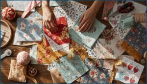
- Mixing Patterns Effectively in Fabric Bundles
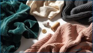
- Adding Texture and Depth to Fabric Bundles
- Common Mistakes When Coordinating Fabrics
- How Precut Bundles and Fabric Collections Help
- Practical Tips for Confident Fabric Coordination
- Frequently Asked Questions (FAQs)
- Conclusion
Key Takeaways
- Start with one hero fabric that sets your color palette, then pull coordinating pieces by echoing at least two colors from that main print to create instant harmony.
- Balance your bundle using the 40-40-20 rule: 40% large-scale patterns, 40% medium-scale, and 20% small-scale prints to prevent visual chaos while maintaining interest.
- Include 20-30% neutral fabrics as anchors that give your eyes breathing room and make bold patterns shine instead of fighting each other.
- Test your fabric coordination by taking a black-and-white photo of your stack—if everything blends into similar grays, you need more contrast between light, medium, and dark values.
What Does Coordinating Fabrics Mean?
Coordinating fabrics means bringing together different prints, colors, and textures that work in harmony instead of fighting for attention. It’s the secret sauce that transforms random fabric choices into a polished, professional-looking project.
Once you’ve nailed your fabric pairings, coordinating thread with fabric ensures those seams blend seamlessly or stand out exactly where you want them to.
Coordinating fabrics is the secret sauce that transforms random choices into polished, harmonious projects
Let’s break down what fabric coordination actually involves and why it matters for your next creation.
Definition of Fabric Coordination
Fabric coordination means selecting fabrics that look harmonious together in a bundle for your project. You’re aligning colors, patterns, and textures so they feel connected rather than jarring. This planned approach to coordinating fabrics ensures your collection complements your project’s mood and style from start to finish.
For inspiration, browse a variety of designed specifically for quilting, bedding, and sewing projects.
- Color harmony creates balance through visual flow
- Pattern mixing adds interest without chaos
- Texture mixing brings depth and dimension
Importance for Sewing and Quilting Projects
When you nail fabric coordination in your quilting and sewing projects, you’re not just saving time—you’re taking control of the entire creative process.
Coordinating fabrics speeds up fabric selection, reduces guesswork during assembly, and slashes fabric waste. Your finished quilt or garment shows off flawless color harmony and polished craftsmanship.
That unified fabric bundle transforms chaotic scraps into a cohesive masterpiece that screams confidence and skill!
Key Elements: Color, Pattern, Texture
So how do you get there? Three core elements anchor every winning bundle: color harmony, pattern mixing, and texture layering.
Color theory guides your palette choices—warm reds versus cool blues shift the entire mood. Pattern mixing balances large florals with tiny geometrics and calm solids. Texture blending adds depth through subtle surface variation.
Master these, and you’ll achieve visual balance that makes fabric coordination feel seamless! For deeper insight, consider how texture, pattern, color, and form each contribute to creating a visually striking interior.
How to Choose a Main Fabric for Bundles
Your main fabric is the star of the show—it sets the entire direction for your bundle. Think of it as your color palette in one piece, telling you exactly which shades to pull in next.
Here’s how to pick a main fabric that makes coordinating the rest a breeze.
Selecting a Standout Print or Solid
Your bundle needs a hero fabric—one fabric that grabs attention and sets the entire color palette in motion. Look for a print with high fabric contrast, featuring bold hues and clear light-dark areas that guide your pattern mixing decisions.
Or choose a solid with strong color saturation to anchor your visual balance. This focal piece defines your bundle’s mood and makes print scaling easier down the line.
Analyzing Colors in The Main Fabric
Once you’ve picked your hero print, pull out those color threads one by one. Scan the Main Fabric for every hue—reds, blues, creams—and note their Color Saturation and Shade Balance.
This Color Palette becomes your roadmap for Fabric Coordination. Strong Color Harmony happens when you echo the main hue in at least two supporting Fabric Tones, anchoring your bundle with smart Hue Selection guided by Color Theory.
Setting The Mood for Your Project
Emotion drives every successful bundle. Your color palette whispers a mood—warm reds and oranges cozy up a space, while cool blues calm it down.
Pairing solids with patterns takes practice, so choosing fabric patterns that balance scale and energy helps your bundle feel intentional instead of chaotic.
Sketch quick mood boards with fabric swatches to test emotional triggers before you commit. Color psychology and lighting effects shift how texture reads, so layer samples under your project’s actual light.
Color theory confirms what your gut already knows: the right vibe starts here.
Using The Color Wheel for Fabric Pairing
The color wheel isn’t some mysterious design school secret—it’s your shortcut to fabrics that actually work together. Once you understand how colors relate to each other, you’ll stop second-guessing every choice and start pairing prints like a pro.
Here’s what you need to know to make the color wheel your best friend.
Understanding Color Relationships
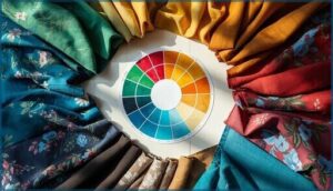
The color wheel shows you exactly how hues interact—it’s your roadmap for color harmony! Primary, secondary, and tertiary colors reveal relationships that guide smart pairing.
Understanding color theory means you’ll confidently balance hue contrast, tint shades, and saturation levels. Value scales matter too: they control how light or dark your palette feels.
Master color interaction, and you’ll design fabric bundles that sing!
Finding Complementary and Analogous Colors
Want bold contrast or soft harmony? That’s the power of complementary pairs and analogous hues! Complementary colors—like red and green or blue and orange—sit opposite on the color wheel, creating chromatic balance with high-impact pop.
Analogous colors are neighbors that blend smoothly for serene color harmony. Master these color theory basics, and you’ll build a color palette with perfect color interaction every time!
Achieving Balance With Color Values
Think of value gradation as your secret weapon for unstoppable color harmony! Light fabrics bring airiness, medium tones bridge the visual flow, and dark anchors create jaw-dropping contrast.
Apply contrast analysis by snapping a grayscale photo—you’ll spot gaps instantly. Balance your color values with neutral balance across the palette, and watch color consistency transform your bundle into a masterpiece worthy of any color theory textbook!
Mixing Patterns Effectively in Fabric Bundles
Mixing patterns is where your fabric bundle really comes to life.
The secret is balancing different scales and styles so nothing fights for attention.
Here’s how to create that perfect mix without making your eyes go crossed.
Combining Large, Medium, and Small Scales
Pattern scale creates the visual hierarchy that makes your bundle sing. Start with a large-scale pattern as your star—it sets the overall vibe. Then add medium-scale pieces to bridge the gap and keep things flowing smoothly.
Small-scale bits add texture and detail without fighting for attention. Aim for roughly 40 percent large, 40 percent medium, and 20 percent small for balanced pattern proportion that feels cohesive, not chaotic.
Blending Florals, Geometrics, and Solids
Once you’ve nailed your scales, it’s time to play matchmaker with pattern styles. Florals bring organic curves that soften sharp geometric lines—think bold blooms paired with crisp chevrons for serious visual balance.
Toss in one or two solids as your solid foundations, and suddenly you’ve got breathing room. This pattern mixing magic creates texture blending without the chaos, proving coordinating fabrics for sewing isn’t rocket science!
Preventing Overwhelm With Pattern Variety
Here’s the secret to pattern mixing without the headache: limit yourself to three to five different pattern scales. That pattern hierarchy creates visual rhythm while keeping your fabric bundles from screaming for attention.
Choose one dominant print as your star, then let supporting patterns play backup. This contrast moderation through motif blending keeps simplifying fabric selection real—and your sanity intact!
Adding Texture and Depth to Fabric Bundles
You’ve nailed the color scheme and balanced your patterns—now it’s time to add some serious dimension.
Texture is the secret weapon that takes your fabric bundle from flat to fabulous.
Let’s break down three key strategies that’ll give your projects the visual richness they deserve.
Incorporating Blenders and Textured Fabrics
Blender fabrics and textured prints are your secret weapons for fabric coordination. These lightweight blends—think subtle tonal heathers or tiny dobby weaves—add textile depth without stealing the show from your bold prints.
When integrating blenders and textured fabrics, you’re creating visual balance that makes coordinating fabrics for sewing straightforward. Texture mixing prevents flat looks while blender selection bridges color transitions between standout patterns!
Using Neutrals to Anchor Bundles
Once you’ve chosen your textured pieces, it’s time to lock everything down with a neutral base. Neutral fabric selection acts as the visual glue that holds your entire bundle together!
Here’s how to choose anchor color choices that create bundle harmony:
- Pick one neutral matching the lightest or darkest value across your prints
- Keep saturation mid level so it complements rather than overpowers
- Test blender fabrics alongside all prints in natural light
Aim for 20 to 30 percent neutral coverage to balance texture and maintain color harmony. This value proportions strategy creates fabric coordination that feels intentional, not accidental!
Layering for Visual Interest
Think of layering as building visual harmony from the ground up! Start with your boldest print, then stack medium and small scale patterns on top to create dimensional contrast.
Weaving texture mixing into this pattern balance gives you serious color depth. Place your darkest fabric behind lighter ones to boost visual hierarchy—it’s pattern mixing with purpose, and it transforms fabric coordination into pure art!
Common Mistakes When Coordinating Fabrics
Even seasoned quilters stumble when coordinating fabrics—and it’s usually the same few traps that ruin an otherwise beautiful bundle.
The good news? Once you know what to watch for, these mistakes are ridiculously easy to avoid. Here’s what trips people up most often and how to sidestep each one.
Overusing Busy Patterns
Too many busy patterns create visual chaos and destroy fabric harmony faster than you’d think! Large-scale prints dominate your bundle, fighting for attention instead of working together.
When you mix fabric patterns effectively, you need scale balance—one bold focal print paired with calmer supporting fabrics. Pattern overload happens when busy print mixing overshadows your design. Give your star fabric room to shine!
Ignoring Contrast and Color Value
A weak tonal range drains energy from your fabric bundle faster than you’d imagine! When you ignore color value and contrast balance, your project loses visual hierarchy and depth. Color harmony demands a clear light-to-dark progression.
- Too many mid-tones muddy your palette and flatten dimension
- Skipping true darks removes grounding your composition needs
- Similar values hide details and blur pattern mixing
- Brights without muted tones confuse the eye and kill visual harmony
Value scales aren’t optional—they’re essential for mastering color theory!
Failing to Include a Neutral
Neutrals are the secret weapon your fabric bundle can’t live without! Without a neutral fabric anchoring your color palette, even beautifully coordinated prints feel harsh and overwhelming.
Neutrals absorb pattern energy, prevent eye fatigue, and create breathing room for bolder prints to shine. They’re essential for visual harmony and design clarity—plus they make choosing binding and backing fabrics so much easier!
How Precut Bundles and Fabric Collections Help
You don’t have to start from scratch every single time you coordinate fabrics. Designer-curated bundles and precut collections do the heavy lifting for you, bringing together patterns and colors that already work in harmony.
Let’s explore how these ready-made options can save you time and give you the confidence to create stunning projects without second-guessing your choices.
Benefits of Designer-Curated Bundles
Designer curated collections take the guesswork out of fabric coordination—seriously! When professionals hand-pick coordinated fabric bundles for you, here’s what you gain:
- Instant color harmony across every print and solid in the set
- Pattern variety at multiple scales that play well together
- Time saved from hunting down compatible yardage piece by piece
- Exclusive prints often available only through bundle subscription services
- Built-in inspiration with ready-to-sew fabric curation that sparks project ideas
These curated fabric bundles deliver confidence in every stitch.
Types of Precuts: Fat Quarters, Charm Packs, More
Precuts give you fabric selection without the commitment—and the variety is awesome! Fat quarters (18 by 22 inches) offer flexibility for mixing prints.
Charm packs deliver 5-inch squares for quick patchwork. Layer cakes stack 10-inch squares for bigger blocks. Jelly rolls bundle 2½-inch strips perfect for borders.
Each precut format unlocks different quilting essentials, making fabric curating faster and more fun!
Using Bundles for Quick Coordination
Bundles simplify fabric coordination by handing you ready-made color stories in one package. You skip the guessing game and jump straight into creating.
Here’s how to optimize your bundle planning and quick picks:
- Photograph your bundle in natural light for accurate color coding
- Sort fabrics by value—light, medium, dark
- Identify one anchor fabric to guide the palette
- Assess pattern scale variety across precut fabrics
- Edit ruthlessly—remove anything that feels off
Bundle editing keeps your fabric selection sharp and your project confident!
Practical Tips for Confident Fabric Coordination
You’ve got the basics down, but a few smart tricks can take your fabric coordination from good to great. These simple techniques help you spot problems before you cut, build visual balance, and make sure you have exactly what you need.
Let’s walk through three game-changing tips that’ll boost your confidence every time you pull together a bundle.
Taking Photos in Black and White for Contrast
Here’s a trick that’ll blow your mind: snap a quick photo of your fabric stack and switch it to black and white. This simple test reveals tonal range and contrast like nothing else. If everything blends into muddy gray, you need more shadow detail and high contrast. Monochrome editing exposes weak spots in your color harmony and pattern mixing before you even cut a single piece.
| What You See | What It Means |
|---|---|
| All similar grays | Add darker or lighter fabrics for visual harmony |
| Clear dark-to-light progression | Strong tonal range—perfect for fabric coordination |
| One fabric disappears | Boost contrast with bolder prints or solids |
| Busy visual chaos | Simplify with blenders to improve color theory balance |
Balancing Light, Medium, and Dark Fabrics
You just checked your photos for contrast—now it’s time to own the fabric value game. Light pieces create breathing room, medium ones bridge the gaps, and dark fabrics anchor your whole vision. That’s visual balance in action!
Here’s how to master contrast theory and color harmony:
- Pick one light fabric to lift the mood
- Add two medium prints for smooth transitions
- Include one dark solid to ground your bundle
- Test all three values side by side
- Swap any piece that fights the flow
This texture mixing formula delivers rock-solid pattern mixing every time.
Planning Yardage for Your Project
You’ve nailed contrast—but nothing kills a project faster than running out of fabric halfway through! Fabric measurement starts with your pattern pieces, then add 10 percent for waste reduction. Check fabric width before yardage calculation—quilting cotton runs 44 inches, home decor hits 54. Pattern scaling matters too: big prints need extra for matching repeats.
| Fabric Type | Yardage Strategy |
|---|---|
| Main print | Map each piece + 10% cushion |
| Coordinating solids | Calculate borders and bindings separately |
| Large-scale patterns | Add 1-2 inches per piece for alignment |
| Precuts | Skip estimation—bundles include set amounts |
Master fabric estimation now and you’ll never face a mid-quilt panic!
Frequently Asked Questions (FAQs)
What fabrics pair well together?
The magic of fabric pairing comes alive when you combine bold patterns with quiet solids, mix smooth cottons with textured linens, and let neutrals anchor your color harmony—creating perfect fabric combinations every time!
How to pair fabrics together?
Start with a standout fabric, then pull coordinating pieces that echo its colors.
Mix pattern scales, balance light and dark values, and layer textures for visual flow—that’s fabric pairing done right.
What fabrics are not to mix together?
Don’t mix fiber conflicts like silk with wool—they’ll telegraph common fabric coordination mistakes.
Avoid color bleed by separating non-colorfast from light fabrics.
Skip texture mix disasters: satin paired with canvas creates friction and wear.
How to coordinate fabric patterns?
Coordinating fabric patterns means balancing different scales—pair one large focal print with medium and small designs.
Include geometrics, florals, and solids for print harmony, then add texture blending for depth and visual interest.
Can I mix fabrics from different collections?
Forget those old rules about staying locked into one line. You can absolutely blend fabrics from different collections by repeating two or three main colors for unified color harmony and scale balance.
How do I coordinate fabrics for seasonal projects?
Match your palette and prints to the season—soft pastels and florals for spring, warm earth tones and leaves for autumn.
Layer texture neutrals with themed fabrics, and adjust fabric weight for holiday coziness.
What if my main fabric has unusual colors?
Pull coordinates from the same designer collection to keep odd colors intentional.
Use neutrals like gray or cream to soften vibrant contrasts, and focus on matching color values for bold combinations that still feel balanced.
Should I wash fabrics before bundling them together?
Washing first addresses shrinkage control, prevents dye bleed, and removes residues from factory finishes.
These fabric management steps protect your fabric bundles from uneven puckering and color transfer, making fabric coordination techniques far more reliable long-term.
How many fabrics should one bundle contain?
Most fabric bundles contain anywhere from five to eight fabrics for manageable coordination, though precut collections can include forty or more.
Match bundle size to your project scale and comfort with pattern mixing for ideal color harmony.
Conclusion
Practice makes perfect, and you’ll get better at spotting winning combinations every time you shop. You’ve now got the framework to coordinate fabrics in a bundle like a pro—color theory, pattern scale, texture balance, and that all-important neutral anchor.
Stop second-guessing yourself at the cutting table. Trust your eye, test your choices with a quick photo, and watch your projects transform from “nice try” to “absolutely stunning.

