This site is supported by our readers. We may earn a commission, at no cost to you, if you purchase through links.
Understanding complementary colors (opposites on the wheel) creates stunning contrast, while analogous colors (neighbors) deliver smooth blends. Keep physical thread samples handy since digital colors can lie under different lighting.
Most pros swear by the 60-30-10 rule: dominant color, secondary shade, and one bold accent. Smart thread coordination isn’t rocket science—it’s about having the right tools and knowing a few color theory tricks that transform guesswork into confident choices.
Table Of Contents
Key Takeaways
- You’ll master thread coordination by starting with a basic color wheel and understanding complementary colors (opposites) for contrast and analogous colors (neighbors) for smooth blends—this eliminates guesswork from your selection process.
- You’ll save time and money by assembling essential tools first: physical color charts beat digital versions, mobile color-matching apps help scan fabrics, and building a starter palette with neutrals plus primary colors handles most projects.
- You’ll achieve professional results by applying the 60-30-10 rule (dominant color, secondary shade, bold accent) and testing thread combinations under natural daylight since artificial lighting distorts color perception.
- You’ll prevent costly mistakes by pre-washing fabric to test for shrinkage and color fastness, purchasing thread from the same dye lot, and keeping detailed notes of successful color combinations for future reference.
Essential Tools for Thread Color Coordination
You’ll save hours of frustration by assembling the right tools before you start coordinating thread colors for any project. A basic color wheel, brand-specific color charts, and a reliable mobile app will transform your workflow from guesswork into systematic color matching that produces professional results every time.
Color Wheels and Color Theory Basics
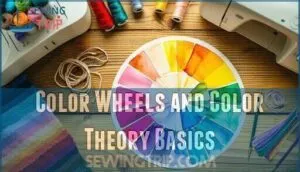
Understanding color theory transforms thread selection from guesswork into strategic decision-making. You’ll master hue selection by grasping how primary, secondary, and tertiary colors relate on the wheel.
Complementary colors create vibrant contrast, while analogous schemes offer harmony. Tint shades and saturation levels determine color intensity—essential for fabric coordination.
Monochromatic schemes using varied tints provide refined depth. Color matching thread to patterned fabric becomes instinctive once you identify dominant hues and their relationships.
Thread Brand Color Charts and Numbering Systems
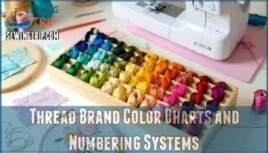
Each major thread brand uses its own numbering system, making coordinating colors across manufacturers tricky. Physical color charts beat digital versions every time for accurate matching.
- DMC offers 482 solid colors with unique numbering
- Gutermann spans 400+ hues across product lines
- Brand comparison reveals subtle differences in "equivalent" shades
- Conversion charts help but aren’t foolproof for precision work
- Physical thread samples remain essential for color-critical projects
To achieve accurate color matching, embroiderers rely on thread conversion tools to guarantee consistency across different brands.
Mobile Apps and Digital Color Matchers
Digital Color Tools transform coordinating thread colors from guesswork into precision. Color Matching Algorithms in mobile apps instantly scan fabrics to suggest thread matches, while Virtual Thread Swatches let you preview combinations before purchase. Online Color Communities share real project results, helping you avoid costly mismatches.
| Feature | Best Apps |
|---|---|
| Color scanning | ColorReader, Adobe Color |
| Thread databases | ThreadAlgo, StitchPalette |
| Community sharing | ColorHub, SewingCircle |
| Pattern matching | CraftMaster, ThreadWise |
Choosing Thread Colors for Any Project
You’ll save hours of frustration when you establish clear color selection criteria before starting any sewing project.
Smart thread selection involves matching your fabric weight, considering the project’s end use, and building a flexible starter palette that works across multiple applications.
Matching Thread to Fabric Types and Patterns
Thread weight determines everything when matching thread to fabric. Heavy fabrics need thick threads (10-30 weight), while delicate materials require fine threads (60-80 weight).
Consider fabric texture—smooth cottons accept precise matching, but patterned fabrics hide slight mismatches.
**Material blending creates unique color harmony challenges.
Dark neutrals blend effortlessly into textured fabrics**, giving you pattern contrast without overwhelming sewing results.
Selecting Starter Palettes for Beginners
Building your first thread collection doesn’t require coordinating hundreds of colors. Start small with essential shades that handle most sewing projects. Strategic Palette Building ensures Color Harmony while keeping Thread Selection manageable for beginners.
Essential Starter Kits include:
- Black, white, and gray for basic construction and utility sewing
- Primary colors (red, blue, yellow) for vibrant accents and children’s projects
- Neutral beiges and browns that complement natural fabric tones
- Navy blue and cream as adaptable alternatives to stark black and white
- One metallic thread for decorative touches and special occasion garments
These Beginner Tips create a foundation for coordinating thread with any fabric while maintaining cost-effective organization.
Adjusting for Seasonal and Trending Colors
Stay ahead by weaving seasonal trends into your thread selection. Cherry red dominates 2025, while mocha mousse and tangerine orange reflect current fashion influences.
Color forecasting helps you anticipate palette updates before they peak. Test trending shades like aqua blue with classic neutrals for adaptable coordinating effects.
Monitor trend analysis through social media and brand collections to keep your sewing projects fresh and contemporary. Understanding the latest color trend forecasts is essential for making informed design decisions.
Techniques for Mixing and Matching Thread Shades
You’ll master thread shade coordination by applying proven color theory principles that eliminate guesswork from your selection process.
These systematic approaches transform overwhelming color choices into simplified decisions that improve your project’s visual impact while saving valuable crafting time.
Using Complementary and Analogous Color Schemes
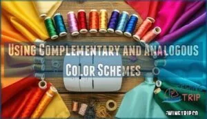
Color harmony becomes your secret weapon when coordinating thread with fabric. Complementary hues—those opposite on the color wheel—create striking contrasts that make your sewing pop. Analogous palettes use neighboring colors for gentle, flowing transitions. Monochromatic shades in varying intensities add refined depth without overwhelming your design.
Color harmony becomes your secret weapon when you master complementary contrasts and analogous transitions that make professional sewing pop
Master these schemes and you’ll coordinate thread colors like a pro.
Balancing Neutrals With Bold Accents
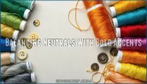
Smart sewers know that neutral backgrounds serve as your canvas for coordinating thread colors effectively. When you’re sewing with beige or gray fabric, place bold contrast threads strategically for maximum visual balance.
Match one vibrant accent thread with two neutrals to maintain color harmony. This approach prevents overwhelming your project while ensuring the bold elements pop against subdued backgrounds.
Creating Depth With Light and Dark Threads
Mastering thread layering transforms flat sewing into rich, dimensional artwork. Grey and black threads create stunning shade gradation when you layer light over dark, building visual texture through strategic color contrast. This technique delivers professional dimensional effects that make your fabric come alive.
- Light thread over dark fabric creates subtle highlights that catch the eye
- Black base threads with grey topstitching add refined depth layers
- Gradual shade transitions from white to charcoal build realistic shadow effects
Troubleshooting Common Thread Coordination Challenges
Even with careful planning, you’ll encounter color coordination hiccups that can throw off your entire project.
Don’t panic when threads look different than expected—these common challenges have straightforward solutions that’ll save your sanity and your stitching time.
Dealing With Dye Lot and Brand Differences
Two major hurdles threaten coordinating thread colors: dye lot variance and brand compatibility issues. Each thread batch differs slightly, even with identical color codes.
When sewing, purchase all thread from the same lot to avoid visible transitions. For thread substitution between brands, use color conversion charts as starting points, but always test samples on your actual fabric first.
Brand compatibility varies substantially due to different dye formulas and fading factors.
Preventing Color Mismatches in Different Lighting
Lighting conditions dramatically affect thread color perception, making visual assessment unreliable without proper color calibration techniques. Natural daylight provides the most accurate shade consistency for coordinating thread and fabric combinations.
Fluorescent lights cast cool tones while incandescent bulbs add warmth, distorting your matching decisions. Test thread selections near windows during midday hours to guarantee color stability across different environments before committing to your project.
Handling Thread Fading and Fabric Wash Tests
Before coordinating thread colors with fabric, you’ll want to tackle the elephant in the room: thread fading and fabric shrinkage can destroy your carefully planned color schemes. Smart sewing starts with wash test methods that prevent heartbreak later.
- Test color fastness on thread samples before committing to your project
- Pre-wash fabric to check for shrinkage that affects thread tension
- Store threads away from sunlight to maintain fading resistance
- Use quality threads with proven durability for long-lasting results
Expert Tips for Professional-Looking Results
You’ve mastered the basics, but now it’s time to refine your thread coordination skills with techniques that separate amateur work from professional results.
These sophisticated strategies will transform your projects from good to stunning while streamlining your workflow and saving precious time.
Top-stitching and Decorative Effects
Top stitching transforms ordinary sewing projects into professional masterpieces when you’re coordinating thread strategically. Fabric manipulation through coordinated top stitching adds dimensional interest to seams and edges.
Choose contrasting thread textures for bold stitch patterns that pop against fabric backgrounds. Metallic threads create stunning decorative stitches on dark materials, while matte cotton provides subtle embellishment techniques.
Expanding Your Palette as Skills Grow
Experienced practitioners understand that palette expansion represents systematic skill building rather than random color accumulation. Seasoned sewers develop instinctive color gradation abilities through deliberate practice with thread blending techniques, transforming basic coordinating skills into refined artistic expression.
- Start with monochromatic variations within familiar fabric color families
- Add intermediate shades between existing colors for smoother transitions
- Experiment with metallic and specialty threads for enhanced texture effects
- Document successful combinations in a reference system for future sewing projects
Frequently Asked Questions (FAQs)
How to store thread colors properly long-term?
Don’t put all your eggs in one basket—store threads in clear, airtight containers away from direct sunlight and moisture. You’ll prevent fading and tangling while maintaining organization for years.
Can metallic threads coordinate with regular cotton?
Yes, metallic threads can absolutely coordinate with regular cotton! You’ll want to test combinations first since metallic threads have different sheen properties.
Choose metallics that complement your cotton’s undertones for flawless blending.
What about coordinating threads for quilting projects?
Quilting coordination becomes absolutely straightforward when you’re armed with color wheel knowledge.
You’ll need consistent thread weight across blocks—cotton or polyester work well. Test combinations on fabric scraps first, ensuring they complement your quilt’s dominant colors while maintaining visual balance.
How to match threads for embroidery machines?
Match your embroidery thread colors by testing samples under natural light first. **Keep a color reference card nearby for quick comparisons during stitching.
Use brand conversion charts when switching thread types.
Should thread weight affect color coordination choices?
Like choosing paint brushes before colors, thread weight creates your foundation. You’ll find heavier threads dominate lighter ones visually, so match weights first, then coordinate colors.
This prevents your careful color choices from looking unbalanced or muddy in the finished piece.
Conclusion
Don’t put all your eggs in one basket when coordinating thread colors easily—diversify your thread collection strategically. Build a solid foundation with essential neutrals, then gradually expand into specialized shades as your projects demand them.
Keep detailed notes about successful color combinations in a dedicated notebook or app. Test thread colors under various lighting conditions before committing to major projects.
Remember that coordinating thread colors easily becomes second nature with consistent practice and systematic organization of your supplies.
- https://zolliemakes.com/blogs/notes/color-theory-for-embroidery-how-to-choose-thread-colors
- https://www.maggieframes.com/blogs/embroidery-blogs/ultimate-madeira-rayon-thread-color-chart-complete-guide-for-machine-embroidery
- https://www.magnetichoop.com/blogs/news/ultimate-madeira-thread-chart-conversion-guide-for-perfect-embroidery-color-matching
- https://www.needlenthread.com/2018/03/real-thread-color-cards.html
- https://whitearborquilting.com/try-complementary-color-threads/

