This site is supported by our readers. We may earn a commission, at no cost to you, if you purchase through links.

You’ll want to vary your pattern sizes—think large florals with thin stripes and tiny polka dots.
Keep your color palette cohesive by pulling matching hues from each pattern. Don’t forget solids—they’re your best friend for grounding busy designs and giving the eye a place to rest.
The secret lies in balancing bold statements with quieter supporting players, creating visual harmony rather than chaos.
Table Of Contents
Key Takeaways
- Follow the "rule of three" – You will create perfect balance by combining one small, medium, and large-scale pattern while maintaining a shared color palette throughout your design.
- Start with one dominant pattern as your anchor – You are establishing the room’s personality with this primary choice, then building supporting patterns around it rather than competing with it.
- Use solids as your secret weapon – You will ground busy patterns and give your eyes a place to rest by incorporating solid fabrics that echo colors from your main patterns.
- Limit bold patterns to prevent chaos – You are distributing pattern strength like an orchestra, with one bold statement piece supported by medium-strength and subtle designs for visual harmony.
Choosing Main Patterns
Choosing the right main patterns sets the foundation for your entire design, so you’ll want to start with one standout fabric that speaks to you.
Think of this primary pattern as your design’s anchor – it should reflect the room’s personality while playing nicely with the colors and scale you’re planning to layer throughout the space, making it a crucial element in setting the overall tone.
Your primary pattern becomes the anchor that sets your entire room’s personality and tone.
Selecting Primary Fabric Patterns
Start by picking your main pattern as your room’s anchor—it’s like choosing the lead singer for your band. Your dominant pattern choice sets the entire mood, so go with something you absolutely love.
When mixing prints, fabric quality matters more than you’d think; cheap fabrics stick out like a sore thumb next to gorgeous ones.
Follow this pattern style guide: choose one print that makes your heart sing, then build around it. Your main pattern becomes the star while others play supporting roles in this beautiful fabric symphony.
Considering Scale and Color
When choosing your main patterns, scale and color are like best friends who need to play nice together.
Think of Pattern Repetition size as your visual weight distributor—pair large motifs with tiny ones for dynamic contrast.
Your Dominant Palette should tie everything together while Accent Colors add just enough pop.
Smart Color Harmony prevents your fabric pattern combinations from looking like they’re having an argument!
Understanding Pattern Styles
After considering scale and color, you’ll need to grasp pattern styles—they’re your design compass.
Geometric vs. organic patterns create amazing fabric pattern combinations when you understand their personalities. Geometric prints like stripes and polka dots bring structure, while organic florals add softness.
Think of texture as pattern too—a cable-knit throw works like a subtle design element. Your style personalization shines when you mix these pattern mixing tips thoughtfully.
Mixing Pattern Sizes
When you’re mixing pattern sizes, think of it like creating a conversation between your fabrics—you want some voices to be loud and others to whisper.
Start with one large-scale pattern as your star player, then add smaller patterns that support rather than compete with it.
Combining Large and Small Scales
Once you’ve chosen your primary fabric patterns, mastering scale contrast becomes your secret weapon for stunning pattern mixing.
Think of it like pairing a bold statement necklace with delicate earrings—the contrast makes both pieces shine.
Here’s your scale pattern mixing game plan:
- Pattern Dominance: Let one large-scale print take center stage while smaller patterns play supporting roles
- Visual Hierarchy: Use medium-scale patterns as bridges between your largest and smallest designs
- Pattern Grounding: Small-scale prints act like visual solids, anchoring busy layered patterns
- Scale Contrast: Mix tight geometrics with sprawling florals for maximum impact
- Fabric Pattern Mixing Balance: Follow the rule of three—one large, one medium, one small pattern per space
This approach creates depth without chaos, letting each pattern breathe while contributing to the overall harmony.
Consider how you can use varying pattern intensity to enhance this balance.
Creating Visual Interest and Balance
When you mix different pattern sizes, you’re creating visual rhythm that keeps your eye engaged.
Pattern mixing transforms rooms from flat to fabulous through strategic visual contrast.
Pattern layering with varied scales prevents monotony—think large florals paired with tiny polka dots.
This texture contrast adds depth while maintaining color harmony. Your focal points emerge naturally when bold patterns meet subtle ones, creating perfect pattern balance that makes fabric pattern mixing feel effortless and sophisticated.
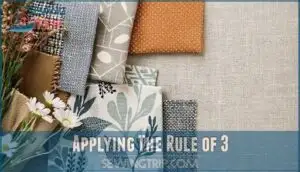
Applying The Rule of 3
Through the rule of 3, you’ll achieve perfect Pattern Variety by layering one small, medium, and large-scale fabric pattern together.
This designer trick creates natural Scale Harmony while maintaining Visual Balance throughout your space.
The Boldness Distribution guarantees no single pattern overwhelms, while shared colors provide essential Color Cohesion.
Think of it like a visual recipe—each pattern scale plays its part in the perfect fabric patterns combination.
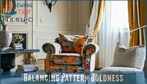
Balancing Pattern Boldness
Think of pattern boldness like the personalities in your friend group—you need the quiet listener, the chatty storyteller, and the life of the party to create perfect balance.
When you’re mixing fabric patterns, distribute them by strength so one bold statement piece gets support from subtle sidekicks, preventing visual chaos while keeping things interesting.
Distributing Patterns by Boldness
Visual strength in pattern mixing works like conducting an orchestra—you need one lead performer while others play supporting roles. Start with one bold pattern as your star, then choose secondary designs with decreasing intensity to create harmony without chaos.
- Select one dominant bold pattern with the largest scale or highest contrast as your focal point
- Choose medium-strength patterns for secondary elements that complement without competing
- Add subtle patterning through fine textures or micro-motifs as background support
- Distribute bold elements strategically across the space rather than clustering them together
- Limit bold patterns to 30-40% of surface area, using conservative designs for balance
This bold distribution approach guarantees balanced aesthetics where pattern contrast enhances rather than overwhelms your design. To avoid overwhelming a space, it’s vital to reflect on pattern scale variety.
Pairing Bold and Subtle Patterns
When you’re mastering bold pattern mixing, think of it like a dance between show-offs and wallflowers.
Your bold accents should take center stage while subtle anchors provide support.
Pattern dominance works best when one statement piece commands attention—maybe a vibrant geometric throw—while subtle pattern mixing in smaller doses keeps things grounded.
This balanced contrast creates visual hierarchy that feels intentional, not chaotic.
Adding Pops of Color
Once you’ve mastered bold and subtle pattern pairing, it’s time to sprinkle in some magic with accent colors.
Think of color coordination as your secret weapon—unexpected pops from the color wheel can transform any color scheme instantly.
Whether you’re working with complementary hues in bright or pastel color schemes, bold accents from different color families create that "wow factor" that makes rooms sing.
Selecting Secondary Patterns
Once you’ve nailed down your primary pattern, it’s time to choose supporting fabrics that’ll make your design sing without stealing the show.
Think of secondary patterns as the backup singers – they should complement your star performer while adding their own subtle charm to the mix, making your design sing.
Choosing Complementary Patterns
When choosing complementary patterns, you’re basically playing matchmaker for your fabrics.
Look for similar colors that create harmonious combinations—think of the color wheel as your dating app for pattern coordination.
Choose texture shapes that complement rather than compete, like pairing delicate florals with structured stripes.
This thoughtful fabric pattern coordination adds personality interest without overwhelming your space.
You can explore various harmonious fabric designs for inspiration.
Considering Texture and Weight
When choosing secondary patterns, texture and weight matter just as much as visual appeal.
Smart fabric quality decisions prevent that awkward moment when your gorgeous velvet attracts every speck of lint from nearby fuzzy fabrics.
Here’s your texture game plan:
- Balance smooth and rough textures – pair linen’s crisp feel with plush velvet for instant texture contrast that adds depth to your layered design
- Match material weight thoughtfully – heavy wool shouldn’t compete with delicate silk, as mismatched weights create awkward draping and poor functionality
- Consider fabric types strategically – leather pairs beautifully with soft throws, while avoiding velvet lint traps near chenille or other fuzzy materials
Texture variety creates that "wow factor" your space needs.
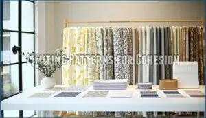
Limiting Patterns for Cohesion
While texture and weight matter, don’t let pattern excitement cloud your judgment—more isn’t always merrier.
Stick to two or three patterns max to avoid pattern overload and maintain visual harmony. This pattern restraint creates cohesive design rather than chaos.
Think intentional limits, not limitations. Smart coordinating fabrics and thoughtful fabric combinations beat throwing everything together.
Your style coherence depends on knowing when to stop mixing. To achieve this, consider using pre-coordinated fabric collections.
Working With Solids
Solid fabrics aren’t just background players—they’re the secret weapon that makes your pattern mixing look intentional instead of chaotic.
Think of solids as the calm friend who keeps the party from getting too wild, anchoring busy patterns while letting each design shine without competing for attention, and thus serving as a calm friend.
Using Solids to Ground Patterns
Think of solids as your pattern mixing’s best friend—they’re the calm voice that helps busy patterns play nice together.
When you’re working with multiple patterns, solid colors act like visual anchors, giving your eyes a place to rest while keeping your fabric palette balanced.
Smart designers use neutral solid benefits to ground bold florals or geometric prints, preventing that "circus tent" effect.
These solid color selections should reflect your dominant color scheme, creating harmony between patterned pieces and ensuring your pattern mixing tips actually work in practice.
Selecting Solid Colors That Complement
Color harmony starts with your fabric palette—pick solid colors that echo one hue from your busiest pattern.
Use the complementary color wheel to find perfect matches, then anchor busy patterns with neutral solid textures.
Matching color undertones creates seamless flow, while strategic solid color placement in bright color schemes prevents visual chaos and maintains balance.
Adding Texture to Neutral Solids
Neutral solids need a little personality boost, and texture pattern mixing is your secret weapon.
When you’re working with grounding solids in neutral color schemes, adding varied fabric weaves and material weights creates visual interest without overwhelming your mix and match fabric palette.
- Chunky cable-knit throws draped over smooth linen sofas create sheen contrast that makes neutral warmth feel more inviting
- Rough textures like jute rugs paired with velvet pillows add dimension through tactile variety
- Woven grasscloth wallpaper behind sleek furniture introduces subtle pattern without competing with your solid color selection.
Consider the jute and velvet options for added texture.
Mixing Patterns in Rooms
When you’re ready to mix patterns throughout different rooms, remember that each space has its own personality and purpose.
You’ll want to tailor your pattern choices to match the room’s function while keeping your overall design story cohesive from space to space.
Living Room Pattern Mixing
Before diving into the living room’s pattern mixing potential, consider how room size affects your choices.
You’ll want to establish one dominant pattern through your sofa or area rug, then layer complementary designs via throw pillows and artwork integration.
Strategic furniture placement helps distribute patterns evenly, while proper lighting effects enhance color schemes and create visual depth through thoughtful rug layering.
Bedroom Pattern Mixing
When you’re ready to retreat for the night, your bedroom deserves calming aesthetics that promote restful sleep.
Mix floral patterns with geometric prints through throw pillows and bedding, ensuring texture integration through varied fabrics like cotton and linen.
Focus on pattern placement by limiting bold designs to 40% of surfaces, while personalization tips include choosing soothing colors that reflect your style for seasonal updates.
Dining Room Pattern Mixing
Transform your dining room into a designer showpiece by starting with a statement tablecloth pattern that’ll anchor your entire space.
Mix chair upholstery with complementary scales—pair bold florals with subtle stripes.
Your rug considerations should balance the tablecloth’s intensity, while lighting fixtures and wall decor echo shared colors.
You might even explore options for a Thanksgiving quilted table runner to add a seasonal touch.
This pattern mixing approach creates sophisticated interior design that’s both cohesive and visually dynamic.
Home Office Pattern Mixing
Your home office’s pattern combination can boost productivity while impressing clients on video calls.
Bold geometric patterns energize focus, but balance them with subtler designs to prevent pattern distractions during long work sessions.
Consider ergonomic considerations when selecting patterned upholstery and make certain zoom backgrounds complement your pattern mixing ideas.
- Productivity Patterns: Choose stimulating geometric prints behind your desk to maintain energy levels throughout workdays
- Client Perception: Select professional pattern combinations that enhance credibility during virtual meetings and presentations
- Ergonomic Considerations: Incorporate patterned textiles on ergonomic furniture that supports comfort without overwhelming visual focus
- Zoom Backgrounds: Position subtle home decor patterns strategically to create appealing video call backdrops without competing for attention
Mixing Different Fabric Types
You’ll love mixing cotton with linen for that perfect texture contrast—one’s smooth, the other’s got character.
When selecting decorative fabrics, avoid pairing velvet with anything fuzzy since velvet attracts lint like a magnet.
Quality considerations matter here: high-end materials paired with cheap ones look awkward together.
A great option is to explore a versatile fabric blend, which creates natural material interaction that elevates your entire space, making smart fabric selection crucial for a visually appealing result, and ultimately achieving a perfect texture.
Paying Attention to Material Weight
Material weight shapes your room’s entire vibe and functionality. Lightweight Materials like linen and cotton create airy, coastal feels, while Heavy Fabrics such as velvet add luxury and warmth. Choose textiles that match your space’s design story.
- Seasonal Weight considerations – lighter fabrics for summer rooms, heavier for cozy winter spaces
- Material Functionality – durable decorative fabrics for high-traffic areas, delicate ones for display
- Quality fabrics consistency – make certain all fabric matching maintains similar weight categories for cohesion
Combining Smooth and Rough Textures
Smooth-meets-rough fabric pairings create irresistible visual engagement through strategic texture variation.
You’ll want to pair sleek silk with nubby linen, or glossy leather with chunky knit throws.
This material interaction adds sophisticated design layering that prevents your textile design from feeling flat.
Think of it as creating a tactile conversation—your quality fabrics need both whispers and bold statements.
Smart fabric matching through contrasting textures elevates pattern mixing from amateur to professional-level interior design, making it a key element in achieving professional-level results.
Applying Pattern Mixing Principles
Now that you’ve mastered the basics of pattern mixing, it’s time to put these principles into action with confidence.
These three essential techniques will transform your fabric choices from guesswork into professional-looking designs that feel both balanced and intentional.
Creating Harmonious Color Combinations
Color coordination makes or break your pattern mixing success.
Start with a color wheel to identify complementary hues that naturally work together. Pick one dominant palette, then repeat those colors across different patterns to create visual flow.
Use neutral anchors like cream or gray to ground bold combinations. Smart color repetition ties everything together, making even busy patterns feel intentional and polished.
Using The 60-30-10 Rule
Break down your pattern mixing game with this designer-approved formula that’ll transform chaos into cohesion.
Distribute your dominant pattern across 60% of your space, letting it anchor the entire look.
Your secondary pattern takes up 30%, while accent placement gets the final 10% for that perfect pop.
This visual hierarchy creates natural pattern distribution that guides the eye smoothly.
To achieve this, align grainline and pattern for a seamless match.
Remember, rule flexibility means you can bend these numbers slightly—your living room isn’t a math problem, after all, and allows for a natural pattern distribution.
Avoiding Common Pattern Mixing Mistakes
Skip the rookie errors that’ll sabotage your beautiful design dreams.
Clashing styles create chaos when you mix unrelated patterns without considering their relationship. Scale imbalance happens when you use similar-sized prints, making everything compete for attention.
Overwhelming palettes occur without color coordination between fabrics. Quality conflicts arise when mixing cheap materials with expensive ones, instantly cheapening your whole look, due to scale imbalance, clashing styles, and quality conflicts.
Frequently Asked Questions (FAQs)
How to mix fabric patterns?
Picture a cozy living room where bold floral pillows clash horribly with busy geometric curtains—that’s what happens without proper pattern mixing.
Start with one dominant pattern, then add smaller-scale complementary designs sharing similar colors.
Use the rule of three: combine large, medium, and small patterns while maintaining a common color palette for cohesion.
Can I mix and match fabric patterns like a designer?
You’ll master designer-level pattern mixing by following the rule of three: combine one small, medium, and large-scale pattern while maintaining a common color palette throughout your design.
How do you mix textured fabrics?
Mix textured fabrics by balancing smooth with rough textures.
Pair velvet with linen, leather with soft wool, or silk with burlap.
This creates visual depth and tactile interest without overwhelming your space.
How do you mix patterns?
Success hinges on three simple rules: start with a common color thread, balance bold patterns with subtle ones, and vary your scales—pair large florals with tiny stripes for magic.
How do you mix patterns with different textures?
Combine smooth and rough textures thoughtfully to create visual balance.
Pair soft velvet with woven linen, or sleek leather with chunky knits.
You’ll achieve depth and interest without overwhelming your space.
What is the rule for mixing patterns?
Ready to master pattern mixing without looking like a walking design disaster?
Follow the "rule of three": use one small, one medium, and one large-scale pattern while maintaining a shared color palette throughout your design scheme.
What is the 3-5-7 rule in decorating interior design?
The 3-5-7 rule helps you group decorative objects in odd numbers for visual appeal.
You’ll arrange items in clusters of three, five, or seven pieces, creating natural balance that’s more pleasing than even-numbered groupings, following the principle of arranging items in odd numbers.
Can you mix patterns from different time periods?
Yes, you can absolutely mix patterns from different time periods.
The key is finding common elements like color, scale, or style that create harmony.
A Victorian floral pairs beautifully with mid-century geometric prints when they share similar hues or complementary scales, creating a sense of harmony.
How do you fix clashing pattern combinations?
When patterns clash, adjust the scale or swap one pattern for a solid.
Find a shared color between them, or add a neutral buffer like white or cream to separate competing designs and restore visual harmony.
These steps help to improve the overall aesthetic and ensure that the designs work well together.
What patterns work best for small spaces?
Picture Sarah’s cramped studio apartment where her busy floral curtains made the space feel even smaller.
You’ll want small-scale patterns like tiny polka dots, thin stripes, or delicate florals that won’t overwhelm your room and actually make it appear larger.
Conclusion
Congratulations, you’ve discovered the magic carpet to pattern paradise!
Armed with these expert tips for mixing fabric patterns, you’re ready to transform any space from bland to breathtaking.
Remember, confidence is your secret weapon—trust the golden rule, embrace those solids, and don’t be afraid to experiment.
Your home will thank you for the visual feast you’re about to create!
- https://blog.spoonflower.com/2023/07/25/guide-to-mixing-patterns/
- https://www.sunbrella.com/blog/the-art-of-layering-patterns
- https://fibreguard.com/blog/how-to-mix-patterns-and-upholstery-fabrics-like-a-pro
- https://www.theinteriordesignnook.co.uk/blog/how-to-mix-patterns
- https://www.foyandco.co.uk/blogs/news/mix-match-how-to-pair-fabrics-like-a-pro


