This site is supported by our readers. We may earn a commission, at no cost to you, if you purchase through links.
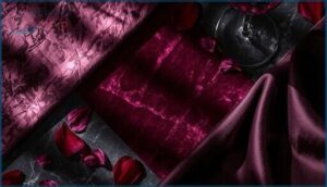
Velvet doesn’t describe a single color, though most people picture a deep, saturated red when they hear the word. The term refers to a specific shade that hovers between burgundy and purplish-red, defined by hex code #902C3E and RGB values that prioritize red intensity while keeping green and blue subdued.
This misconception between velvet fabric and velvet color creates confusion in design contexts, where accurately reproducing the hue requires understanding its precise digital specifications.
The color’s richness stems from high saturation combined with low lightness, producing the luxurious warmth that distinguishes velvet tones from ordinary reds. Whether you’re matching paint swatches, selecting textile colors, or building digital palettes, knowing velvet’s exact color properties ensures your projects capture its signature depth.
Table Of Contents
Key Takeaways
- Velvet describes a specific color with hex code #902C3E (RGB 144, 44, 62), not just fabric texture—this deep burgundy-to-purplish-red sits between maroon and wine tones with high saturation (60-80%) and low lightness (20-35%).
- The color’s technical specifications remain consistent across digital formats (hex, RGB, HTML) and print systems (CMYK values of 0%, 70%, 57%, 44%), ensuring accurate reproduction whether you’re matching paint swatches or building web palettes.
- Velvet’s richness stems from how light interacts with its perceived surface—the same color codes appear dramatically different depending on lighting conditions, shifting from deeper burgundy under warm yellow light to purplish-red under cool blue light.
- You’ll achieve maximum design impact by pairing velvet’s saturated crimson against complementary colors like teal for bold contrast, or with analogous burgundy and claret tones for harmonious transitions, while gold and champagne metallics enhance its inherent warmth without competing for visual dominance.
What Color is Velvet?
When you hear “velvet,” you might picture the plush fabric draped across a Victorian settee, but velvet also exists as a specific color with its own technical identity.
This deep, wine-toned hue carries the same richness as its textile namesake, sitting somewhere between burgundy and maroon on the color spectrum.
Understanding velvet as a color requires looking at how it’s defined, what makes it visually distinct, and how it differs from the fabric that shares its name.
The care and maintenance of velvet fabric—including whether you can safely iron velvet—depends heavily on its fiber composition.
Defining Velvet as a Color
Velvet color lives in the spectrum where deep reds meet purples, evoking that luxe aesthetic you’d recognize from plush fabric. Understanding color perception here means recognizing how velvet hues convey visual depth and rich textures through precise color codes. Color theory shows us that velvet sits at the intersection of warmth and drama, creating distinctive luxe aesthetics that mirror the fabric’s opulent character.
- Velvet color usually ranges from deep burgundy to purplish-red tones with high saturation
- RGB values place red dominant (R≈139–179) while keeping green and blue lower for richness
- Hex codes like 902C3E capture velvet’s signature warmth and intensity in digital formats
- The color embodies visual depth through low lightness (L≈20–35%) and high saturation (S≈60–80%)
- Velvet hues distinguish themselves by reading as both warm and luxurious across design contexts
The origins and luxurious associations of velvet are closely tied to its.
Visual Characteristics of Velvet Color
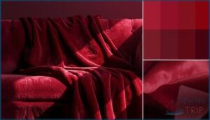
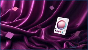
When you look at velvet color, you’re witnessing dramatic color depth perception shaped by how light interacts with imagined pile fibers. RGB values around (144, 44, 62) create visual saturation levels that shift based on viewing angle, mimicking texture influence from fabric nap. This color shift phenomenon produces a multi-dimensional warmth that color theory can’t fully capture—velvet hues literally glow differently under changing light.
One key factor contributing to these unique color effects is the, which plays a significant role in how light and shade interact with the surface.
| Lighting Condition | Color Appearance | Saturation Effect |
|---|---|---|
| Warm yellow light | Deeper burgundy tone | Enhanced richness |
| Cool blue light | Purplish-red shift | Slightly muted |
| Direct spotlight | Luminous jewel glow | Heightened vibrancy |
| Matte ambient | Uniform intensity | Cleaner saturation |
| Moving fabric angle | Marbled variation | Variable depth |
Distinction Between Velvet Color and Velvet Fabric
Understanding this visual phenomenon requires you to grasp a fundamental distinction: velvet color describes the perceived hue (defined by RGB values and color codes), while velvet fabric refers to the physical material with pile density and nap orientation.
The nap’s directional sheen can also shift when the fabric creases, which is why proper velvet care and wrinkle removal techniques matter for maintaining consistent color appearance.
Fabric texture and material finish dramatically alter color perception—the same color theory coordinates appear radically different depending on weaving technique, fiber content, and how light catches the surface.
Velvet Color Codes and Properties
Understanding velvet’s technical specifications helps you work with this color across different mediums and platforms. Each color model fulfills a specific purpose, from screen design to print production, and knowing these codes ensures accurate color reproduction.
You’ll find that velvet’s warm, dark properties remain consistent whether you’re specifying it in hexadecimal notation or breaking it down into component values.
Hex, RGB, and HTML Codes
When you’re working in digital design or web development, knowing the precise color codes for velvet transforms your creative vision into reality. The hex code 902C3E acts as velvet’s digital fingerprint, enabling accurate color reproduction across platforms. Here’s how you’ll find velvet expressed in different coding systems:
- Hex Code: 902C3E (the standard six-character format for HTML and CSS)
- RGB Value: (144, 44, 62) representing red, green, and blue light intensities
- HTML Code: 750851 with RGB (117, 8, 81) as an alternative specification
Understanding these color codes and conversion methods ensures your velvet hue remains consistent whether you’re optimizing code for a website or matching fabric swatches to screen displays.
CMYK, HSV, and HSL Values
Beyond RGB, designers translate velvet into three essential color systems. CMYK values (0%, 70%, 57%, 44%) guide printing techniques for physical textiles, while HSV/HSB measurements (349°, 69%, 56%) align with natural color perception in digital design. HSL coordinates position velvet precisely within the visual hierarchy, ensuring accurate color conversion across platforms.
| Color System | Velvet Values |
|---|---|
| CMYK | C:0 M:70 Y:57 K:44 |
| HSV/HSB | 349°, 69%, 56% |
| HSL | 349°, 69%, 26% |
| RGB | (144, 44, 62) |
Lightness, Darkness, and Temperature
Velvet color perception depends on three factors: lightness (26%), darkness (74%), and temperature shift. You’ll notice light effects alter how warm tones read against cool surroundings, creating unexpected color harmony.
Dark accent pieces absorb ambient light, enhancing velvet texture depth.
When planning your color palette, remember temperature influences color theory applications—warm velvet color codes pair naturally with gold, while cool variations demand contrasting treatments.
Shades and Variations of Velvet
Velvet isn’t locked into a single shade—you’ll find it dancing across a spectrum of deep reds and purples, each carrying its own character.
The color shifts depending on whether you’re looking at traditional natural dyes or modern synthetic variations, and understanding these differences helps you choose the right tone for your project.
Let’s explore the shades, tints, and historical shifts that give velvet its range.
Common Shades, Tints, and Tones
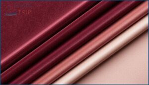
You can transform velvet’s richness through systematic shade theory and palette development. Adding black creates deeper tones like burgundy (reaching 74% darkness), while white produces lighter tints with reduced saturation.
Tone analysis reveals that mixing gray yields muted, dusty variations suitable for understated color palettes.
These color variations maintain velvet’s inherent warmth while offering flexibility across tint effects ranging from soft wine to intense plum.
Similar Colors (Burgundy, Claret)
Burgundy shades and claret tones stand as velvet’s closest chromatic relatives, sharing that wine-dark intensity you’ll recognize instantly. These rich hues overlap in the purple-red family but diverge in subtle ways:
- Burgundy (hex 560019) delivers warmer, garnet-like depth with stronger red dominance
- Claret (hex 5A0F16) leans cooler with blue-brown undertones reminiscent of aged Bordeaux
- Both create stunning color harmony alongside velvet accents in luxurious textile applications
Historical Vs. Modern Velvet Colors
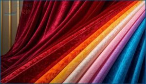
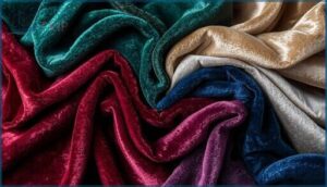
You’ll find historical velvet colors dramatically evolved from early natural dyes that yielded deep reds, blues, and emerald greens—traditional vintage hues reserved for royalty.
Dye technology transformed the palette during the 19th century, expanding color evolution beyond plants and minerals.
Modern trends in luxury fabrics now embrace both classic jewel tones and experimental pastels, neons, and metallics that honor the history of velvet while pushing velvet color theory into contemporary luxury textiles.
Velvet Color Combinations and Palettes
You can pair velvet with a range of colors to create striking visual effects, whether you’re working on a design project, choosing fabric for upholstery, or planning a color scheme for fashion. Understanding complementary and analogous relationships helps you build harmonious palettes, while contrasting hues add drama and visual interest.
Here’s how velvet works with different color theories and popular pairings that designers rely on.
Complementary and Analogous Colors
Understanding color theory and harmony unlocks the full potential of velvet’s deep crimson character. The color wheel guides you in hue selection for palette design that achieves visual balance through strategic color harmonies:
- Complementary colors like teal (2C7090) create maximum contrast and energetic visual tension
- Analogous palettes featuring neighboring burgundy and claret tones offer cohesive, harmonious transitions
- Split-complementary schemes introduce subtle variation while maintaining chromatic interest
- Contrast theory principles determine whether pairings feel bold or refined
- Color harmonies balance warm velvet tones against cool accents for compositional depth
Contrasting Colors for Design
Contrast rules rooted in color theory and design principles help you achieve visual hierarchy while honoring velvet’s regal warmth. Palette optimization requires balancing saturation levels and temperature differences to maintain both legibility and color harmonies that respect complementary colors while supporting compositional emphasis.
You’ll find maximum impact by pairing this saturated crimson against desaturated neutrals or cool hues—teal provides striking opposition on the color wheel, while gray buffers intensity without losing contrast.
Popular Color Pairings (Gold, Champagne, Teal)
Gold accent metallics heighten velvet color’s warmth through champagne mix pairings that soften intensity while maintaining luxury design appeal. Teal contrast introduces cooling balance on the color wheel, establishing vibrant color harmony that designers favor for premium applications.
You’ll achieve ideal color palette results by positioning teal as your dominant hue with gold highlighting focal points, creating visual hierarchy that honors velvet’s regal character without competing saturation levels.
Symbolism and Uses of Velvet Color
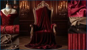
Velvet’s deep red-purple hue carries centuries of meaning that stretches from ancient royal courts to modern design studios. This color communicates luxury, power, and sensuality across cultures, making it a deliberate choice in fashion, interiors, and textile work.
You’ll find velvet color deployed in three key areas where its symbolic weight matters most.
Cultural and Historical Significance
Throughout centuries, velvet color has carried profound Cultural Identity and Historical Significance tied to Royal Heritage and power. You’ll notice these Velvet Traditions woven into society’s fabric:
For centuries, velvet color has symbolized cultural identity, royal heritage, and power woven into society’s fabric
- Renaissance courts draped themselves in velvet regalia to broadcast status and authority
- Victorian gowns used deep velvet hues for dramatic elegance and luxury
- Ceremonial robes employed velvet’s richness to convey solemnity during rituals
- Museums preserve antique velvet pieces as artifacts illuminating the history of velvet and trade routes
- Velvet in Art and Culture symbolizes aristocracy, refinement, and Luxury Symbolism across folklore and literature
Velvet Color in Fashion and Interior Design
Modern Fashion Design transforms velvet color into statement pieces—jackets in emerald or sapphire capture fashion trends while establishing luxury brands’ seasonal identity. Interior Design utilizes velvet’s color psychology through strategically placed accents: burgundy cushions paired with gold brass fixtures create warmth, while teal upholstery introduces drama. Consider how these color palette choices reflect your desired mood:
| Application | Popular Velvet Hues |
|---|---|
| Evening wear | Ruby, amethyst, midnight blue |
| Living rooms | Emerald, charcoal, champagne |
| Bedroom accents | Wine, ivory, forest green |
| Boutique hotels | Sapphire, taupe, deep teal |
| Statement furniture | Jewel tones, metallic blends |
Velvet textures shift with lighting, making color selection vital for achieving luxury across spaces.
Velvet Color in Sewing and Textile Projects
When you’re planning a velvet project, fabric selection demands attention to color matching across dye lots—inconsistencies ruin garment cohesion. Understanding velvet fabric‘s unique weaving helps you anticipate how different fabric types will hold their shade through construction and wear.
Thread choices should complement velvet color without overpowering pile texture, while sewing techniques like directional stitching preserve hue consistency.
Textile finishing protects color integrity through careful press settings.
Frequently Asked Questions (FAQs)
Is velvet a color or fabric?
Picture a designer holding a swatch of deep burgundy cloth—velvet describes both the fabric’s plush texture and the rich color perception it creates.
Velvet functions as fabric, color codes, and textile design colors simultaneously, blending material science with aesthetic value.
Is velvet black a color?
Yes, velvet black is a color—a near-black shade with subtle warm or cool undertones. The hex code 241f20 captures this dark hue, though color perception shifts with velvet texture and lighting conditions.
What color is velvet?
Velvet isn’t a single fixed color—it’s a fabric that can be dyed virtually any shade.
Classic velvet tones include deep reds, rich blues, and lush greens, all enhanced by the pile’s light reflection and luxurious depth.
What color is velvet HTML?
Here’s the full picture: digital velvet translates to hex #750851 in HTML, encoding RGB values (117, 8, 81).
This CSS color code captures velvet hues for web colors, ensuring web-safe velvet shades display consistently across browsers.
What color is red velvet fabric?
Red velvet fabric usually displays deep wine or ruby velvet tones, ranging from burgundy to bright crimson.
Shades vary based on fabric dyeing processes, textile finishing techniques, and fiber composition, which affect color perception in luxury fabrics.
Is velvet always red?
No—this is one of the biggest Velvet Color Myths. Red Velvet History shows traditional royal courts favored deep crimson, but Fabric Variations include emerald, sapphire, and ivory based on Velvet Dyeing techniques and fiber content.
What color is black velvet fabric?
Black Velvet fabric appears as a deep, saturated black with a subtle reflective glow from its dense pile structure, differing from flat matte finishes through light interaction that creates rich, luxurious depth in Dark Luxe applications.
What colors are similar to Velvet?
Burgundy, wine, claret, and mulberry share velvet’s luxurious depth through rich purples and deep reds that create harmonious color schemes.
These similar hues capture velvet tones’ regal character, offering designers refined options for achieving perfect color harmony.
What color matches with velvet?
You can pair velvet with neutrals like cream or taupe for understated elegance, or choose contrasting colors such as gold and teal for rich contrasts that elevate luxe combinations and color harmony.
What is velvet color paint?
Velvet color paint delivers a soft, matte texture mimicking fabric’s plush surface on walls.
These mineral-based emulsions create rich, saturated burgundy or plum tones with low sheen, perfect for luxury interiors seeking warmth and depth.
Conclusion
Velvet’s true colors reveal themselves once you move past the fabric and into the pigment. What color is velvet? It’s that saturated burgundy-red (#902C3E) where warmth meets depth, refusing to fade into the background.
You’ve traced its codes, explored its variations, and discovered how it transforms spaces through deliberate pairings. Now you possess the technical knowledge to capture velvet’s richness across any medium—whether you’re mixing paint, selecting textiles, or building digital palettes that demand attention.

