This site is supported by our readers. We may earn a commission, at no cost to you, if you purchase through links.
Consider your fabric’s undertones – warm fabrics need warm threads, cool fabrics work best with cool shades. Monochromatic palettes create subtle elegance using different tones of one color, while triadic schemes offer vibrant energy with three equally spaced colors.
Always test thread colors against your fabric in natural light, since texture affects how colors appear. The secret to professional-looking embroidery lies in strategic color placement and understanding how different thread weights impact your final design.
Table Of Contents
- Key Takeaways
- Choosing Embroidery Thread Colors
- Applying Color Theory to Embroidery
- Exploring Color Palette Types
- Blending and Shading Thread Techniques
- Creating and Organizing Thread Palettes
- Using Blended Threads in Embroidery
- Practical Examples and Color Trends
- Frequently Asked Questions (FAQs)
- Conclusion
Key Takeaways
- You’ll master professional thread color selection by using the color wheel to create complementary pairs for bold contrast or analogous combinations for smooth harmony.
- You must consider your fabric’s undertones when choosing threads—warm fabrics need warm thread colors, while cool fabrics work best with cool shades.
- You can create stunning depth and dimension by blending multiple thread strands together and using strategic shading techniques with light and dark values.
- You should always test your thread colors against fabric in natural light, since texture affects color appearance, and organize your collection by color families for easy access.
Choosing Embroidery Thread Colors
You’ll discover that choosing the right thread colors transforms your embroidery from ordinary to exceptional, especially when you understand how fabric color affects your thread selection. Thread color charts become your best friend for matching exact shades, while brand conversion codes help you switch between different thread manufacturers without losing your perfect palette.
Considering Fabric and Pattern Colors
The foundation of stunning thread color combinations starts with your fabric choice. Your fabric’s base color sets the stage for everything that follows.
Consider these key factors when selecting threads:
- Fabric Color Harmony – Choose threads that complement your fabric’s undertones, whether warm or cool.
- Pattern Color Contrast – On patterned fabric, make sure your thread colors don’t clash with existing motifs.
- Background Considerations – Light fabrics need different color weight balance than dark ones.
Texture color impact matters too—smooth cotton shows colors differently than textured linen.
Using Thread Color Charts
Beyond simple eyeballing, thread color charts provide the roadmap you need for precise embroidery thread colors selection. These digital charts offer chart accuracy that eliminates guesswork when choosing thread colors.
Brand variations mean DMC’s red differs from Anchor’s version, making thread color charts essential for color matching consistency. You can find helpful resources for selecting thread charts online.
Custom palettes let you create thread color combinations suited to your projects, while chart updates guarantee you’re working with current shade options available.
Matching Thread Brands and Codes
Different thread brands use unique color codes, making brand equivalents essential for project success. DMC 310 doesn’t match Anchor 310—you’ll need conversion charts to find true color matches. Online resources help translate these code variations between thread brands.
To accurately translate between brands, it’s helpful to consult embroidery thread conversion. Always check dye lot numbers for consistency, as even identical color numbers can vary between production runs.
Color matching becomes easier with digital tools that cross-reference color codes across manufacturers.
Applying Color Theory to Embroidery
You’ll transform your embroidery from good to stunning when you understand how colors work together on fabric. The color wheel becomes your best friend for creating thread combinations that make your stitches pop against any background material.
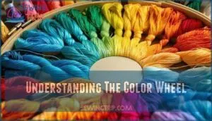
Understanding The Color Wheel
The color wheel acts as your roadmap for creating stunning thread combinations. This circular diagram organizes twelve basic hues by their color relationships, showing how colors connect and interact.
Understanding hue saturation value helps you pick threads that complement each other perfectly. Color psychology influences your fabric choices, while digital color wheels make planning easier.
Mastering color theory transforms random thread picks into intentional, beautiful color schemes for any embroidery project.
Primary, Secondary, and Tertiary Colors
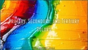
Mastering color theory begins with understanding the building blocks. Primary colors (red, blue, yellow) can’t be created by mixing others, while secondary colors emerge when you combine two primaries. Tertiary colors result from mixing primary and secondary hues, creating twelve total locations on the color wheel.
Understanding primary colors unlocks the secret to creating every other shade in your embroidery palette
Consider these Color Mixing Rules for your embroidery palette:
- Primary colors create bold, striking focal points in your designs
- Secondary combinations offer balanced, harmonious color relationships
- Tertiary Creation provides subtle Hue Variations for refined shading
Understanding Color Wheel Placement helps you predict how colors interact in your finished piece.
Color Impact on Embroidery Designs
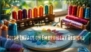
Smart color choices transform your embroidery from ordinary to exceptional. Colors create Visual Hierarchy, guiding viewers’ eyes through your design. Warm hues spark Emotional Response, while cool tones soothe. Cultural Significance matters—red means luck in some cultures, mourning in others. High Color Contrast makes details pop; low contrast creates subtle blending. To achieve stunning results, consider how color wheels are essential for understanding color harmony.
| Color Impact | Design Result |
|---|---|
| High contrast threads | Bold, eye-catching details |
| Monochromatic palette | Elegant, cohesive appearance |
| Warm color combinations | Energetic, welcoming feel |
| Cool embroidery thread colors | Calm, professional look |
| Complementary pairs | Vibrant visual tension |
Exploring Color Palette Types
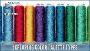
You’ll work with four main color palette types that transform your embroidery from ordinary to stunning.
Each palette type creates different visual effects, from the calm harmony of monochromatic schemes to the bold contrast of complementary colors that make your stitches pop against the fabric.
Monochromatic Palettes
Working with one color family creates stunning visual depth through shade variations and hue intensity. Your monochromatic color scheme uses different tones of the same embroidery thread colors, like pale pink through deep rose.
This approach delivers tonal harmony while maintaining subtle contrast between light and dark values. These monochromatic color palettes offer refined color combinations that feel naturally balanced, perfect for creating elegant designs with understated beauty.
Complementary Palettes
High-contrast pairings create striking visual drama in your embroidery projects. Complementary color schemes use opposing hues on the color wheel to heighten visual impact and create bold statements.
Here are three powerful complementary combinations:
- Red and green threads – Perfect for holiday motifs and nature designs
- Blue and orange pairs – Creates vibrant combinations for modern patterns
- Purple and yellow contrast – Delivers rich palette variations with visual harmony
These color theory principles guarantee your embroidery color palettes pop with energy while maintaining professional results.
Analogous and Triadic Palettes
Analogous Harmony creates soothing color schemes using three neighboring colors on the wheel, like blue-green-purple. These palettes feel naturally balanced in embroidery designs.
Triadic Vibrancy uses three equally spaced colors for bold contrast while maintaining color balance.
Both analogous color schemes and triadic color palettes offer distinct design applications for your embroidery thread colors selection.
Split Complement Palettes
Split complement palettes offer Color Harmony with a twist on traditional complementary schemes. You’ll choose one base color, then select the two colors flanking its opposite on the color wheel.
This Color Scheme creates Vivid Contrast while maintaining Palette Versatility.
For Thread Selection, try navy blue with yellow-orange and red-orange for striking Design Applications in your embroidery projects.
Blending and Shading Thread Techniques
You’ll create smooth color transitions and realistic depth in your embroidery by mastering blending and shading techniques with multiple thread colors.
These methods use adjacent colors on the color wheel to build gradients, while layering light and dark values adds three-dimensional effects to your stitched designs.
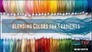
Blending Colors for Gradients
Creating color gradients with blended threads transforms flat embroidery into dimensional artwork. You’ll achieve smooth transitions by selecting colors positioned close together on the color wheel.
Start with your lightest shade, then gradually introduce darker tones using the railroading technique. Control color intensity by adjusting strand ratios – try two light strands with one dark strand for subtle gradients.
Blended thread combinations create realistic shading effects that make flowers, landscapes, and portraits come alive through careful color intensity control and gradient color theory application.
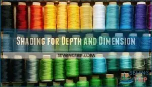
Shading for Depth and Dimension
Shading creates three-dimensional effects by strategically placing darker and lighter thread colors. Start with your darkest shade in shadow areas, then layer medium tones in the middle sections. Use light colors for highlights where natural light would hit your design. Pay attention to light direction when planning shadow placement.
These layering techniques build realistic depth through careful color gradation. Dimensional stitching combined with proper color theory transforms flat embroidery into lifelike artwork that seems to pop off the fabric. The thread texture impacts the final appearance.
Creating and Organizing Thread Palettes
You’ll build your essential thread collection by selecting core colors from each section of the color wheel, then organize them using simple storage methods that prevent tangling and fading.
Smart organization systems, like color-coded boxes or numbered thread cards, keep your palette accessible and help you quickly grab the right shades for any embroidery project.
Building a Starter Color Palette
Your starter color palette needs smart planning, not random collecting. Start with twelve adaptable neutrals like white, cream, black, and gray—these core colors work with everything. Add primary colors (red, blue, yellow) and key secondaries (green, orange, purple). Choose one warm neutral (beige) and one cool neutral (soft gray).
This foundation gives you expandability options while reflecting your personal style preferences.
Consider how seasonal palettes inspire designs, which can inform your color choices.
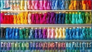
Organizing Threads for Easy Access
How do you tackle thread chaos? Smart thread storage ideas transform your embroidery workspace organization. Use color-coded systems with bobbins or boxes arranged by hue families. Thread color organization becomes straightforward when you group similar embroidery thread colors together.
Create portable thread kits for projects, keeping color charts nearby. Proper inventory management prevents duplicate purchases and streamlines choosing thread colors for every design. Consider various thread storage solutions for ideal organization.
Preventing Color Fading and Mixing
Proper storage methods keep your thread colors vibrant longer. Store threads away from direct sunlight to prevent UV damage and color fading. Use airtight containers or storage boxes to maintain dye fastness.
Keep different thread colors separated to avoid color bleeding during humid conditions.
Test colorfast properties before washing finished projects using gentle techniques that preserve thread integrity.
Using Blended Threads in Embroidery
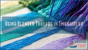
You’ll create stunning color transitions when you combine multiple thread strands in your needle, mixing colors like a painter blends paint on canvas.
This blending technique lets you achieve smooth gradients and custom shades that aren’t available in single-color threads, giving your embroidery projects professional depth and visual interest.
Two-Stranded and Three-Stranded Blends
Combining two or three strands creates rich blended threads that produce stunning gradient effects. Two-stranded blends offer subtle color mixing while maintaining thread weight consistency.
Three stranded combinations provide deeper texture variation but create blending limitations due to increased bulk.
These thread blending methods allow designing with blends that showcase refined color transitions in your embroidery work.
Loop Method and Single-Strand Blends
Using the loop method creates flawless single-strand blends that deliver professional results. You’ll thread your needle with one strand, then loop it back through to double the working thread. This technique produces subtle transitions between colors. One can even add French knot embellishments to augment the design.
- Achieve smooth color fading without harsh lines
- Create blended textures that mimic watercolor effects
- Master single-strand shading for delicate details
- Build confidence with forgiving blending filament
- Develop your signature style through thread blending methods
Railroading Technique Overview
Railroading keeps blended thread techniques neat and organized. This method separates individual strands so they lie flat against fabric, preventing a twisted appearance. You’ll achieve smoother Color Blending and better Texture Enhancement when threads stay parallel.
Practical Examples and Color Trends
You’ll apply classic thread colors like navy blue and forest green alongside trending shades such as teal and lavender to create stunning embroidery projects.
These practical color combinations work across seasonal patterns, from spring pastels to rich autumn tones, helping you choose threads that match current design trends while maintaining timeless appeal.
Classic and Timeless Thread Colors
Some embroidery thread colors never go out of style. Classic colors like white, black, cream, red, and navy blue work perfectly for traditional motifs and heirloom projects.
These neutral thread options form the backbone of vintage embroidery palettes. Thread color charts show that these classic colors for embroidery create timeless appeal in any design.
Seasonal and Trending Palettes
Several trending embroidery thread colors capture 2025’s seasonal spirit perfectly. Spring brings tender pastels like lavender and pistachio, while summer showcases tropical pinks and neon greens. Fall’s trending color forecasts emphasize mocha browns and cranberry reds. Winter holiday color schemes feature frosty blues with metallic golds.
These modern embroidery hues help you create palette adaptation tips for year-round projects. Some designers are now using organic threads to promote sustainability.
Application in Modern Embroidery Patterns
Contemporary embroidery patterns showcase modern color trends through strategic complementary colors and analogous colors placement. Digital pattern adaptation allows color psychology to guide embroidery thread colors selection based on pattern complexity levels.
Mixed media embroidery projects benefit from bold color schemes that reflect current design aesthetics. You’ll find success adapting traditional embroidery patterns using trending palettes while maintaining visual harmony through proper color theory application.
Frequently Asked Questions (FAQs)
How do lighting conditions affect thread color appearance?
Natural illumination can play tricks on your thread selection. Fluorescent bulbs cast cooler tones, while incandescent creates warmer hues.
You’ll notice silk threads shift dramatically between daylight and evening lighting, making test stitching essential.
What causes thread colors to look different when stitched?
Thread colors shift when stitched due to fabric texture, thread tension, and stitch density. Your fabric’s weave catches light differently, while tight stitches compress fibers, making colors appear darker or muted compared to loose skeins.
Can you mix different thread brands in one project?
While purists might cringe, you absolutely can mix different thread brands in one project.
Just test color compatibility first, since dye lots vary between manufacturers. Use conversion charts to match shades closely and maintain consistent thread weight for even stitching.
How do you fix mismatched thread color mistakes?
You can fix mismatched thread colors by carefully removing the wrong stitches with a seam ripper, then rethreading with the correct shade. Test new colors on fabric scraps first.
Which thread colors photograph best for social media?
Bright, saturated colors like royal blue, emerald green, and crimson red photograph beautifully under natural light. You’ll get crisp contrast against neutral backgrounds, while metallics add eye-catching sparkle that pops on camera.
Conclusion
Mastering thread color combinations tutorial skills transforms your embroidery from amateur to professional artistry. You’ve learned to read color wheels, blend harmonious palettes, and test combinations before stitching. **Practice these techniques with small samples first.
Remember that fabric undertones guide your thread choices, while proper lighting reveals true colors. Your newfound understanding of complementary, analogous, and monochromatic schemes will enhance every project, creating stunning visual impact that captivates viewers.

