This site is supported by our readers. We may earn a commission, at no cost to you, if you purchase through links.
You grab what looks like the perfect thread, stitch up a seam, and step outside — only to watch it flash bright white against navy fabric. Sunlight doesn’t lie the way store lighting does. That mismatch isn’t bad luck; it’s metamerism, and every sewist runs into it eventually.
Good sewing thread color tips fix this before you ever thread a needle. A shade darker recedes into a seam. A snipped test strand tells the truth faster than guessing.
Get the basics right, and your stitches disappear exactly where you want them to.
Table Of Contents
Key Takeaways
- Test thread color against fabric in natural daylight between 10 a.m. and 2 p.m., since artificial and LED lighting can distort true shade.
- Choose thread one shade darker than your fabric for seams, since darker tones recede into stitching while lighter shades highlight every seam.
- Match your fabric’s undertone (warm, cool, or neutral) and dominant color, not just its overall hue, for the most seamless blend.
- Build a small core thread collection of key neutrals like white, black, navy, gray, and beige, and store them away from sunlight to prevent color fading over time.
How to Match Sewing Thread Color to Fabric
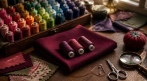
Matching thread to fabric feels tricky until you know a few simple tricks. You don’t need a fancy color degree, just a handful of smart habits that pros swear by. Here’s exactly what to check before you thread that needle.
If you’re working with tricky materials, this guide on handling slippery fabrics while sewing can help you get cleaner stitches alongside the right thread match.
Test a Single Strand
Snip a 1-2 centimeter piece of thread and lay it flat against your fabric. Check it in natural light—avoid metamerism issues where colors shift under artificial bulbs. Note fabric sheen and glare.
- Cut a straight strand
- Remove frayed ends
- Test tension lightly
- Document your results
Choose Slightly Darker Thread
Once your strand test shows a close match, go one shade darker instead of identical. This small gap creates seam recession, letting stitches sink into the fabric rather than sit on top. Darker shades hide lint, prevent color creep, and mask rough texture beautifully. On dark fabrics especially, that subtle depth keeps seams looking intentional, not exposed.
You can also select contrasting colors to create bold and eye-catching design elements.
Match Fabric Undertones
Color match gets you close, but undertone seals the deal. Every fabric leans warm, cool, or neutral, think caramel beige versus icy charcoal. Dye and fiber content shift this subtly, so check under daylight for true color matching.
Warm threads darken beautifully on golden fabrics; cool grays vanish into blue-based ones. Match the lean, and seams disappear.
Compare Only Three Options
Once undertones look right, you’ll still face a spool rack of near-matches. That’s decision fatigue waiting to happen.
Pick three: your baseline guess, one shade lighter, one darker. Compare all three against the fabric in daylight, then eliminate the weakest link first. This baseline challenger method cuts cognitive load fast, letting the true match win without staring at forty spools for an hour.
Best Lighting for Accurate Thread Matching
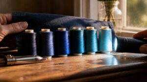
You could pick the perfect thread color and still get it wrong if the lighting fools you. Light changes color more than most people realize, and thread is unforgiving that way. Here’s what you need to know before you hold that spool up to the fabric.
Use Natural Daylight
Sunlight is the most honest judge of color you’ll ever find, no artificial bulb comes close. Aim for midday spectrum accuracy, since morning brings blue undertones and afternoon warmth shifts hues golden.
For trickier fabrics, this thread color matching guide for natural light walks through picking the right window and time of day to nail the shade.
Seasonal light shifts and diffused window lighting change things too. Whenever possible, hold fabric near a window instead of overhead lights. Your eyes will thank you when seams disappear instead of clashing.
Avoid LED Color Distortion
Ever wonder why that "perfect" match under your sewing lamp looks off the second you step outside? LED wavelength shifts are the culprit—phosphor mix accuracy drifts, driver current wavers, and thermal color drift creeps in as bulbs heat up. Warm whites can turn magenta or yellow without warning.
Skip the guesswork: natural light keeps color appearance honest, no calibration required.
Check Between 10 and 2
Ten o’clock to two o’clock isn’t just clock talk, it’s your window for daylight testing. Aim for those midday hours when the sun sits high and steady.
That same 10-to-2 mindset applies to symmetrical pattern alignment and edge stitching checkpoints, keeping your needle path accurate and your color judgment sharp.
Test Indoors and Outdoors
One quick color check isn’t enough. Match your thread indoors under calibrated artificial light, then step outside for natural light fidelity—color temperature shifts, and what looked perfect under bulbs might read differently in daylight.
Humidity and terrain won’t change thread hue, but they’ll test tension and feed. If you travel for fittings, pack weatherproof testing gear so cloudy days don’t derail your color matching plans.
Thread Color Tips for Prints, Patterns, and Seams
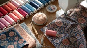
Prints, patterns, and seams each come with their own color puzzle, and thread choice can make or break the finished look.
You’ll want a game plan for busy fabrics, hidden seams, and those sneaky bobbin details that show more than you’d think.
Here are five practical tips to help you handle color decisions on any project with confidence.
Match The Dominant Color
Printed fabric rarely has just one color, so start by finding whichever hue covers the most surface area — that’s your dominant color, and it’s what your thread needs to match. Skip the tiny accent flecks.
For saturated prints, go a touch more muted so your stitching blends instead of competing. Heathered fabrics work the same way: match the dominant tone, not every fleck in the weave.
Blend Construction Seams
Want your seams to vanish? Go a shade darker than your fabric, never lighter — lighter thread catches light and highlights every stitch.
- 1/4 inch seams for standard garments
- Press seams open to reduce bulk
- Secure stitch starts and ends
- Serge or zigzag raw edges
- Use 2.0–2.5mm stitches on wovens
This creates receding stitch lines for truly invisible seams.
Highlight Topstitching
Now flip the rule: topstitching wants contrast, not camouflage. This is where color theory earns its keep—pull a complementary or split-complementary shade for pockets and yokes. Keep edges crisp within 2mm, respect twin needle spacing (6-8mm), and strengthen stress points with bar tacks. Match technique to fabric, and let decorative motifs make a statement.
Match Bobbin Thread Carefully
Your bobbin thread isn’t just a backstage player—it affects underside visibility and tension balance. Keep top and bobbin within 1-3 sizes (a 138 top pairs with a 92 bobbin) to prevent bulk.
- Match fabric backing color for hidden seams
- Use neutral gray or white on darker fabrics
- Test tension with a light tug
- Confirm colorfastness before committing
Hide Quilt Binding Stitches
Once your bobbin’s dialed in, turn your attention to the binding.
A ladder stitch with fine 50-weight cotton, matched to your backing, keeps stitches nearly invisible. Work slow, even bites through mitered corners, use a size 7-9 needle, and let the blind stitch tuck thread ends under the fold—no puckers, no peeking seams.
Using Color Theory for Sewing Thread Choices
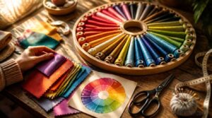
Once you’ve got matching down, it’s time to get intentional with your choices. The color wheel isn’t just for art class, it’s a genuine tool for planning thread that works with your fabric on purpose. Here are five ways to put it to work.
Monochromatic Thread Colors
One color, endless depth — that’s the trick behind a monochromatic thread palette. You’ll pick light-to-dark shades of a single hue for tonal depth, using value contrast instead of new colors.
- Matte finishes recede, satin advances
- Textured threads add interest
- Metallics accent topstitching
Build a monochrome swatch kit for quick, confident shade selection on the go.
Analogous Color Schemes
When neighbors on the color wheel team up, you get harmonious hue transitions instead of jarring jumps. Think blue, blue-green, green — a cool trio built for calm.
Pick your dominant hue selection first, then add one or two supporting shades. Keep moderate saturation levels so the palette stays soft, not shouty. These analogous groupings mimic natural color groupings, giving your thread color palette genuinely calm visual effects.
Complementary Accent Stitching
Opposites attract, and that’s the whole idea here. Pull one color from directly across the wheel, and your stitching pops with real visual contrast.
Opposites attract—pull thread color from across the wheel and let your stitching pop with vivid contrast
Pick your contrast level first, then match stitch type—satin for motifs, topstitching for rails:
- Bold pop
- Medium accent
- Subtle edge
- Woven couching
- Crisp outline
Test on scraps first; fabric texture changes how depth reads.
Triad Color Combinations
Ever notice how three colors can feel more balanced than two? That’s triad color schemes at work—pick hues 120 degrees apart on the color wheel for instant color balance.
Primary Triad Impact (red, yellow, blue) brings bold energy; Secondary Triad Mood (orange, green, violet) feels softer. Try Color Ratio Distribution—60/30/10—for your dominant, support, and accent threads. Desaturated Palette Balance and Tertiary Triad Versatility keep things wearable, not circus-tent loud.
Split Complementary Palettes
Want vibrant without the clash? Split complementary palettes give you that. Pick a base color, skip its direct opposite, and use the two colors flanking it instead—roughly 75-90 degrees away.
Apply the 60-30-10 rule: base dominates, splits accent seams or topstitching. This creates visual tension while balancing warm and cool tones, giving you controlled color balance without overwhelming your project.
Building and Organizing a Useful Thread Color Collection
You don’t need fifty spools to be ready for anything, you just need the right ones. A smart thread collection is about picking colors that work together and keeping them in order, not stuffing a drawer full of random shades. Here’s what actually belongs in your stash, and how to keep it all easy to find.
Essential Neutral Thread Colors
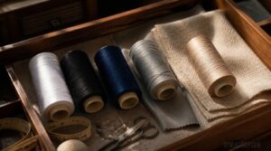
Five spools cover almost everything: White, Black, Navy, Light Gray, and Beige. That’s your adaptable starter set for most sewing essentials.
Beige and taupe vanish into woven cottons under daylight, while universal midtone grays work wonders on polyester and poly-blends. Always think about matching fabric undertones—warm fabrics want warm neutrals. This small collection, kept in your thread storage drawer, takes care of thread color matching for nearly any project.
Magic Neutrals for Matching
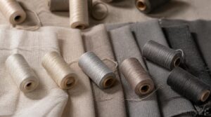
Some neutrals just disappear, no matter what fabric they meet — that’s the magic.
Off-white, cream, and stone gray melt in without competing, shifting warm or cool based on undertone blending with nearby colors. They mimic natural shadow instead of stark contrast, which is why they suit almost any project.
- Off-white – warms toward ecru
- Cream – softens light fabrics
- Stone gray – cools slate and charcoal
- Taupe – bridges beige and camel
- Charcoal – resists fading longest
Physical Color Cards

Screens lie. Physical color cards don’t, thanks to standardized color codes tied to real dye batches.
Flip through matte and gloss finishes to preview sheen against your fabric, then check Delta E tolerances for how close a match really is. Bonus: many decks link to digital card syncing and color conversion charts, plus seasonal trend forecasts for planning ahead.
Organize Threads by Hue
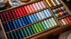
Once your color cards confirm the match, give each spool a home.
Sort by hue labeling systems first—reds together, blues together—then rank light to dark within each family for a gradient effect. Use color bin dividers to stop crowding, and add undertone notes for warm versus cool. Specialty thread sorting (metallics, variegated) gets its own mini-section within each hue.
Prevent Thread Color Fading

Beautiful sorting means nothing if the sun bleaches your reds by summer’s end. Store spools in UV protective storage—amber jars work great, blocking light while you still see colors.
- Test thread colorfastness on scrap fabric first
- Wash in cold water to prevent dye migration
- Choose coated threads resisting UV and washing wear
Cold washing and shade drying protect textile dyes long after you’ve organized that gorgeous rainbow shelf.
Frequently Asked Questions (FAQs)
Should thread color be lighter or darker than fabric?
Picture a rotary phone cord tangled with thread spools — that’s shade-matching confusion.
Go slightly darker, not lighter. Darker thread sinks into fabric, blending seams cleanly, while lighter shades create visible outlines that highlight every stitch, ruining that clean, professional finish.
Does thread color matter when sewing?
Yes, it absolutely matters. Thread color affects seam visibility, either creating invisible seams for a clean finish or bold accents for intentional design.
Mismatched color choices can throw off the look of the garment, so thoughtful matching keeps your project looking professional, start to finish.
What are tips for picking thread color?
Think of thread color like a good handshake—it should feel natural, not forced. Test in natural light, pick shades slightly darker, match undertones, follow dominant pattern colors, and limit choices to avoid decision fatigue.
Should thread color match binding or backing?
Match the binding, not the backing, for a smooth edge. When contrast is strong, pick a neutral bobbin color instead. Test a sample seam first—it saves headaches when coordinating scrappy bindings or busy prints.
How to choose thread color for sewing?
Like choosing a shadow instead of a spotlight, pick thread one shade darker than your fabric for seams that vanish. Test in natural daylight, matching the dominant tone and undertone—when torn, darker always blends smoother than lighter.
Should thread be lighter or darker than fabric?
A shade darker mimics natural fabric shadow, keeping seams visually recessive instead of dominant.
For prints, mix it with the dominant background color; for solids, that darker tone hides construction lines beautifully, giving you clean, professional-looking stitching every time.
How would you choose the appropriate color of the thread?
Funny how the right shade often hides in plain sight—just look at your fabric’s dominant hue and undertone. Go slightly darker for seams that recede visually, or match exactly for topstitching. Compare only three options to dodge decision fatigue.
What happens if you use a different color thread and bobbin?
You’ll get visible stitch shifts where top and bobbin colors clash, especially on light fabrics. Underside color peeking becomes obvious, and mismatched tension exaggerates it further. It’s a fun decorative contrast effect for quilting, but risky for everyday seams needing that invisible look.
Can direct sunlight affect thread color over time?
Yes—that sunny windowsill you love is quietly wrecking your thread stash. UV dye degradation hits cotton and silk fastest, dulling hue over time. Check lightfastness ratings, then store spools away from light to protect color long-term.
How do neon and metallic threads behave differently?
Neon threads deliver intense pigment brightness but slip under tension, needing steady speed.
Metallic threads offer consistent luster yet fray easily, causing needle wear and breakage.
Slower stitching, quality spools, and proper tension keep both looking sharp under any lighting.
Conclusion
Picture your thread box like an old-fashioned telegraph key: one small tap, in the right color, sends the whole message clearly. That’s the quiet power behind good sewing thread color tips — testing strands, chasing daylight, reading undertones, until stitches vanish instead of shouting. You’ll stop guessing and start choosing with open eyes.
Your seams will keep their secrets. Your topstitching will speak only when invited. That’s real mastery, built one careful thread at a time.
- https://auribuzz.com/2025/09/26/thread-matters-tips-for-matching-thread-to-fabric
- https://charlottekan.com/blogs/sewingblog/6-tips-for-matching-thread-to-fabric
- https://www.thesprucecrafts.com/choose-sewing-thread-color-type-and-fibers-2978366
- https://brambleberrymeadow.com/2025/02/09/blending-threads-in-cross-stitch
- https://siemachtsewingblog.com/2017/08/color-blocking-tips