This site is supported by our readers. We may earn a commission, at no cost to you, if you purchase through links.
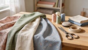
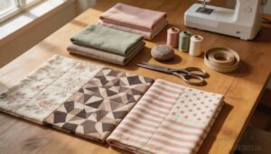
Most sewing projects don’t go wrong at the machine. They go wrong on the table when three fabrics look perfect alone but become awkward the moment they touch.
I’ve seen beginners blame their stitching when the real problem was floral fighting a stripe or a heavy fabric dragging down a soft one.
Coordinating fabrics for sewing gets easier when you know what to look for: color direction, print scale, texture, and drape.
Once those pieces line up, your fabric pull starts to feel calm instead of being confusing, and the finished project looks cleaner, sharper, and more intentional from the moment you cut.
Table Of Contents
Key Takeaways
- Good fabric coordination starts before you sew, because fabrics that look fine alone can clash when their colors, print scales, textures, or drape don’t work together.
- A clear color plan makes fabric choices easier, so use shared undertones, balanced light-to-dark contrast, and one main color with accent and neutral support.
- Print mixing looks polished when one fabric leads, pattern sizes vary from large to small, shared colors repeat across prints, and solids give busy combinations room to breathe.
- Matching fabric weight, texture, drape, care needs, grain, and stretch helps the project hang better, sew more smoothly, and avoid common beginner mistakes like distortion, shrinkage, and unstable seams.
What Fabric Coordination Means
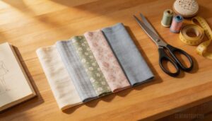
Fabric coordination means choosing fabrics that work well together in color, print, weight, and feel. It shapes how your project looks, hangs, and comes together once you start sewing.
For a simpler approach, these baby quilt sewing tips on coordinated fabric collections explain why matching fabrics feels easier.
The points below will show you what to notice first, so fabric choices feel simpler and more intentional.
Definition and Importance in Sewing
Clarity starts with Purposeful Coordination in sewing. fabric coordination means choosing fabrics that share Visual Harmony and Functional Benefits, so your Project Planning leads to Smooth Integration.
- color coordination enhances design aesthetics
- fabric selection affects care and wear
- pattern harmony keeps the project unified
Done well, fabric coordination helps your work look intentional, balanced, and easier to sew every day.
How Coordinated Fabrics Improve The Finished Look
Once your fabrics start working together, the whole project looks more intentional. Good fabric coordination creates Visual Harmony through color palette coordination and careful pattern mixing.
That gives you a Cohesive Aesthetic, stronger design cohesion, and a Professional Finish. The result is a Polished Presentation with Elevated Style, where visual harmony helps every piece look planned beautifully, not patched together.
Why Fabric Choices Affect Drape, Balance, and Style
That polished look also depends on how each fabric behaves.
Fiber Content, fabric weight, and fabric texture shape fabric drape, Structural Drape, and Silhouette Shaping.
Finish Influence can make cloth crisp or fluid. Texture Balance matters too.
When you’re Balancing patterns and textures in design with color theory, the garment hangs better, feels steadier, and looks intentional every time.
Common Coordination Challenges for Beginners
Even when drape makes sense, beginners hit three snags:
- Saturation Balance and Mood Palette choices.
- Light Testing, Transparency Effects, and Bleeding Risk surprises.
- Fabric selection for sewing projects, Understanding Scale and Pattern Size in Design, and Balancing patterns and textures in design.
These are Tips for Balancing Color Pattern and Texture, and for Mixing and Matching Textiles to Create Balance.
Choose a Color Direction
Choosing colors gets much easier when you start with a clear direction. The next points will help you sort through your options and make your fabric choices feel more intentional.
Once you have that path in mind, the rest of your fabric pull becomes easier to build.
Using The Color Wheel for Fabric Pairing
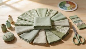
Need a roadmap for color? The color wheel helps you build a steady color palette before you cut. Check Hue Saturation, Color Temperature, and value on fabric swatches under good light.
Sure thing! Here are the top six keywords for planning with confidence in any sewing project: color theory, complementary colors, analogous colors, Triadic Pairing, Split Complementary, and Tetradic Schemes.
Complementary, Analogous, and Monochromatic Schemes
Because color theory works best when you test fabric swatches, compare three paths:
- complementary colors: strong Hue Pairing, improved by Neutral Balancing
- analogous colors: easy Tone Harmony
- monochromatic scheme: texture leads
- Palette Sequencing and Accent Placement keep prints steady
Each scheme changes energy, contrast, and focus, so choose the one that fits your project, not just your favorite color, well.
Picking Dominant, Accent, and Neutral Colors
While color theory helps, use complementary colors or analogous colors to shape your custom fabric color palette for Coordinating Fabric for Quilting.
| Role | Job |
|---|---|
| Dominant Color Ratio | 60–70% base |
| Accent Placement Strategy | 20–30% detail |
| Neutral Base Proportion | calm support |
| Undertone Consistency | steady Color Mood Impact |
This keeps focus clear, makes prints behave, and gives your project a controlled, confident finish.
Balancing Warm and Cool Tones
Think of temperature like volume: too much heat or chill throws off the room. Use color theory to shape a steady color scheme through fabric blending and visual balance.
- Warm-Cool Contrast
- Mood Temperature Balance
- Skin Tone Pairing
- Seasonal Mood Alignment
- Swatch Temperature Test reinforces pattern hierarchy
Keep one side dominant, use the other as an accent for calm prints and focus.
Checking Light, Medium, and Dark Value Contrast
Want sharper fabric choices? Use Value Ladder Swatches to sort light, medium, and dark fabrics before you commit.
A Neutral Background Test helps you see visual balance clearly, while Lighting Influence can shift value all day. Check Glossy vs Matte too, since finish changes material contrast.
In your color scheme, solid colors build Contrast Rhythm and protect pattern hierarchy better.
Mix Prints With Confidence
Mixing prints gets easier when each fabric has a clear role. A simple plan helps you avoid combinations that feel too busy or uneven.
The next tips will show you how to put prints together in a way that looks balanced and intentional.
Starting With a Focus Print
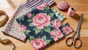
Your focus print sets the Visual Hierarchy for the whole project. Check Fabric Grain Alignment, Seam Placement, Print Edge Treatment, and Pattern Continuity first.
Then add patterned coordinating fabric for quilting, bedding, sewing projects, layering fabrics with similar fabric weight and fabric texture when you mix patterns. This keeps the main motif clear, balanced, and placed where it shows best.
Combining Small, Medium, and Large-scale Patterns
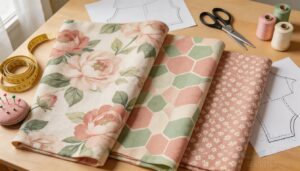
Once your main print is set, use Scale Hierarchy to mix patterns with calm control. Pattern Scale Harmony comes from Scale Shift Planning: one large print, one medium, one small.
This Proportional Pairing keeps pattern scale and pattern proportion balanced, adds visual interest, and facilitates fabric coordination. Check Seam Alignment Strategies too, so large motifs stay clean at joins, always.
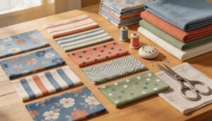
Pairing Florals, Geometrics, Stripes, and Dots
After scale is set, use Print Pairing Psychology to mix and match with control.
- Florals soften geometrics.
- Narrow stripes steady dots.
- Use Print Placement Strategies for pattern proportion and visual interest.
Mood Board Curation helps test color scheme, texture, Seasonal Print Trends, and Fabric Care Pairing, so your fabrics feel intentional, balanced, and easy to sew well.
Repeating Shared Colors Across Different Prints
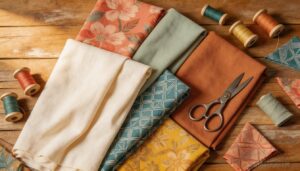
Once your pattern scale feels steady, use Shared Color Anchors to link prints. A Hue Repetition Strategy keeps your color scheme clear.
Aim for Shade Variation Balance, so one hue appears light, medium, and dark for visual interest and Print Color Sync. Check Lighting Consistency.
Save Incorporating Solid Colors to Ground Patterns, plus Tips for Balancing Color Pattern and Texture.
Using Solids to Calm Busy Fabric Combinations
After repeating shared colors, give your eye a break. Solid Anchor adds Visual Rest and creates Print Relief between lively prints.
Use solid colors or solid fabrics in larger areas to form a Pattern Pause and a Calm Palette. This helps pattern scale feel balanced while layering fabrics.
Match weight, drape, and texture so everything works together smoothly overall.
Match Weight, Texture, and Drape
Color and print matter, but they aren’t the whole story. The way your fabrics feel and fall will shape how your project looks, wears, and comes together at the machine.
These next tips will help you choose fabrics that work well side by side.
Keeping Fabric Weights Compatible
Think of fabric weight as your project’s backbone. Follow Weight Ratio Guidelines to control fabric weight contrast and improve fabric compatibility.
Use Prewash Shrinkage Matching, Interfacing Weight Balance, Seam Strength Planning, and Bulk Perception Adjustment before cutting.
Matching fabric weight and texture to project needs keeps fabric weight and texture working together, so seams stay stable and reliable after washing.
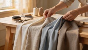
Coordinating Crisp, Soft, and Fluid Drape
Although drape seems subtle, it decides how your project moves and holds shape.
- Check fabric weight.
- Compare Fiber Length Ratio and Humidity Influence.
- Use Weave Selection for fabric types.
- Lowering Interfacial Friction creates fluid folds; aim for Softness Balance in material properties.
- Keep fabric grain true, and let texture variety support crisp, soft, or fluid behavior during cutting and wear.
Mixing Smooth Fabrics With Textured Fabrics
Because The Role of Texture in Fabric Coordination shapes Visual Depth, use Layering Techniques while Matching fabric weight and texture to project needs.
| Light Interaction | Handfeel Harmony | Seam Compatibility |
|---|---|---|
| satin tweed | light medium | flat allowances |
| matte bouclé | lining helps | avoid catching |
Combining multiple fabrics effectively improves Fabric selection for sewing projects and enhances Layering Fabrics for Depth and Visual Interest.
Pairing Wovens and Knits Carefully
Wovens and knits can work together, but only if you treat them like teammates. Use:
- Fiber Content Matching for easier care.
- Knit Stabilization with the right Interfacing Choice at seams.
- A smart Layering Strategy with fabric grain, Stitch Density, and matching fabric weight and texture to project needs for fabric compatibility in fabric types through textile matching.
Choosing Fabrics That Support The Project Shape
Shape starts with support. Match fabric weight to the design, because crisp jackets need Structural Support while soft dresses need flow.
Check fabric grain, since the impact of fabric grain and direction on fit is real.
Good fabric compatibility also depends on Fiber Interaction, fabric shrinkage, Stitch Density, Shape Retention, and Fusible Interfacing placed where edges must hold their shape.
Build a Balanced Fabric Pull
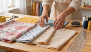
A balanced fabric pull helps your project feel planned instead of busy. The goal is to choose fabrics that work together before you start cutting.
These next tips will help you sort your options and build a group that feels clear and cohesive.
Choosing From Your Stash or Fabric Shop
Start with what you already own. Use Fiber Type Inventory, Yardage Assessment, and Stash Organization to see which coordinating fabrics work together by color theory and fabric weight.
At the shop, compare Shop Sample Swatches before fabric selection, and use Budget Prioritization to avoid impulse buys, especially when ordering from an online fabric store with uncertain texture, drape, or scale.
Using Collections, Precuts, and Curated Bundles
After checking your stash or shop picks, use fabric collections and fabric bundles to narrow choices fast. Collection Theme Alignment builds Coordinated Color Stories, while Precut Size Selection assists Efficient Fabric Sourcing and Bundle Layout Planning.
Many sewing supplies include coordinated fabric designs for sewing, even Patterned Coordinating Fabric for Quilting, Bedding, Sewing Projects, so choices stay balanced and easier.
Adding Blenders, Basics, and Low-volume Prints
Once a collection gives you a direction, use Blender Selection and Basic Solid Foundations to steady the mix. Neutral Fabric Layering softens a busy patterned fabric, while Low-Volume Print Integration keeps interest without noise.
Think of it as Print Color Echo: you mix and match solid colors, blenders, and even custom fabric prints so fabric coordination stays clear and controlled.
Auditioning Swatches Before Cutting
After blenders and solids settle the mix, pause and test small swatches first. Good Swatch Timing improves fabric coordination by letting you mix and match color, texture, and drape under careful Lighting Evaluation. Check Color Fastness, use a 12‑inch Sample Size, and keep a Documentation Log.
That’s applying color theory in textile design and understanding fabric types and properties.
Taking Photos to Review Color and Contrast
Once your swatches behave, photograph them with Lighting Setup, White Balance Calibration, and Consistent Exposure.
Add a Color Chart Reference for Post-Processing Verification.
This promotes Applying color theory in textile design, follows Guidelines for Coordinating Fabrics in Home Decor, shows The Role of Texture in Fabric Coordination, and assists with Incorporating Solid Colors to Ground Patterns and visual rhythm, clearly.
Avoid Common Coordination Mistakes
Even a pretty fabric pull can go off track if a few basic details get missed. Before you cut, it helps to know where coordination problems usually start.
Here are the common mistakes to watch for as you choose and combine your fabrics.
Using Too Many Competing Prints
Too many prints can turn a strong project into noise. Print Overload leads to Visual Clashing, Pattern Conflict, Texture Mismatch, and Orientation Chaos.
When you’re coordinating fabrics, let one patterned fabric lead the design scheme. Then repeat colors and keep supporting prints quieter.
That simple fabric coordination choice protects visual rhythm and helps your sewing look clear, controlled, and polished.
Ignoring Pattern Scale and Proportion
When you ignore scale, Scale Mismatch Effects show. Large prints can widen shapes, while tiny motifs on bulky fabric create Proportion Distortion Risks, Visual Weight Imbalance, Silhouette Disruption, and Seam Alignment Issues.
For scale and layering fabrics, scale consistency helps Coordinated fabric designs for sewing, Coordinating Fabric for Quilting, and Patterned Coordinating Fabric for Quilting, Bedding, Sewing Projects stay balanced.
Forgetting Care Requirements and Shrinkage
Skipping textile care invites Shrinkage Surprise, leading to fabric shrinkage, shade shifts, and Post-Wash Distortion. These issues disrupt Coordinating Fabric for Quilting, especially in projects involving mixed fibers that rarely wash uniformly.
Care Label Ignorance and neglecting Prewash Planning directly cause these problems. To avoid Fabric Care Mistakes, evaluate fabric shrinkage and care requirements before cutting. This step is critical for Patterned Coordinating Fabric in Quilting Bedding Sewing Projects, where pre-wash preparation prevents post-wash inconsistencies.
Overlooking Grain, Stretch, and Seam Behavior
Think of grain as your project’s backbone. Without Grain Alignment, fabric coordination falls apart fast, especially when layering fabrics with different Stretch Elasticity.
Grain is your project’s backbone—ignore alignment, and mixed-stretch fabrics quickly throw the whole design off balance
Bias Cutting and bias cut seams can shift drape and pull edges off balance.
Smart Interfacing Placement improves Seam Stability, while suitable seam finishes support fabric performance.
Get these basics right, and your work hangs flatter and stronger.
Skipping Test Swatches Before Sewing
Ever cut first and test later? That gamble weakens fabric coordination fast, especially when combining multiple fabrics effectively or coordinating fabric for quilting. Swatches expose:
- Color Shift Risks
- Texture Surprise
- Seam Fit Issues
- Project Delays and Cost Overruns
They also reveal fabric performance, which makes them one of the common sewing mistakes to avoid before you waste yardage and time.
Frequently Asked Questions (FAQs)
What fabrics work well together?
Fabrics work well together when Fiber Compatibility, fabric weights, Fabric Care Matching, Seasonal Pairings, Eco-friendly Combos, Stitching Thread Coordination, layering fabrics, fabric coordination, Applying color theory in textile design, and Combining multiple fabrics effectively align.
How to choose a coordinating fabric?
Bold prints, quiet solids: choose a coordinating fabric by pulling one shared color, matching weight and drape, and checking light, medium, and dark contrast.
Strong fabric coordination starts with Swatch Organization Tips and Budget-Friendly Pairings.
How do you coordinate fabric patterns?
Use a Fabric Mood Board to compare Motif Placement, Print Symmetry, and Pattern Continuity.
Keep one dominant print, repeat colors, stay within a Seasonal Palette, and add solids, so Coordinating Fabric for Quilting looks balanced.
How can I improve my sewing skills?
Theory first: skill beats talent.
Practice Stitch Techniques, Machine Maintenance, Thread Selection, Pattern Reading, Fit Adjustments, Patterned Coordinating Fabric for Quilting Bedding Sewing Projects, seam finishes, sewing techniques, fabric weight, Common sewing mistakes to avoid.
How do I choose a fabric color for a sewing project?
Choose Seasonal Color Trends, Skin Tone Matching, Fabric Dye Fastness, Color Psychology Basics, Affordable Color Picks, solid colors, Patterned Coordinating Fabric for Quilting Bedding Sewing Projects;
Texture plays a key role, visual flow, design scheme.
How do I choose a fabric pattern?
North-star Theme Inspiration, Seasonal Motifs, Cultural Influences, Project Functionality, and Pattern Mood shape Patterned Coordinating Fabric for Quilting, Bedding, Sewing Projects.
Patterned fabric for home textiles, DIY quilt-and-sewing project supplies, Themed textile designs for home-decor.
How do I choose a fabric color?
Balance Seasonal Color Trends, Personal Skin Tone, Mood Board Inspiration, Color Psychology, Solid colors.
Fabric Dye Sources, Colorful cotton fabrics for quilting, Coordinating Fabric for Quilting, Choosing a Dominant Fabric for Cohesive Interiors, Visual flow.
How much yardage for coordinating multiple garments?
Puzzle-like, use Garment Ratio Planning, Accessory Yardage Share, and Yardage Buffer for Nap Direction Matching.
Complex Layout Adjustments, Patterned Coordinating Fabric for Quilting Bedding Sewing Projects.
fabric weight, garment construction, sewing techniques, fabric store surprises.
Can you wash fabrics together before sewing?
Yes, but after a Prewash Compatibility Test and Colorfastness Swatch, watch for Separate Dye Release, use Laundry Load Segregation, while evaluating fabric shrinkage and care requirements from lightweight to heavyweight by checking fabric weight first.
What if fabrics fade at different rates?
Like a VHS in sun, fabrics fade unevenly because Fiber Fade Differences, Dye Chemistry Stability, and fabric weight vary; check Lightfastness Ratings, note UV Exposure Effects, and follow Maintenance Strategies plus shrinkage and care requirements.
Conclusion
Just as a master painter blends colors to evoke emotion, you can harmonize fabrics to bring your sewing projects to life. Coordinating fabrics for sewing is an art that combines intuition with technique.
By understanding color direction, print scale, texture, and drape, you’ll create cohesive, visually stunning pieces. Your fabric pull will transform from chaotic to curated, yielding projects that look polished and refined.
With practice, you’ll confidently mix and match fabrics always with ease.

