This site is supported by our readers. We may earn a commission, at no cost to you, if you purchase through links.
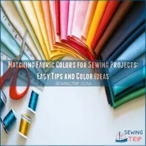 Matching fabric colors for sewing projects is easier than you think!
Start with a color wheel to identify harmonious combos like complementary (opposites) or analogous (neighbors) colors.
Stick to a dominant hue and add accents for pop—kind of like decorating a cake.
If patterns are involved, pick ones that share a common color to avoid a patchwork headache.
Need inspiration?
Let nature, paintings, or even your favorite outfit guide you.
Tools like color-matching apps or swatches can fine-tune your choices.
And don’t forget contrast—it creates depth and keeps things interesting.
Ready?
Let’s make your project a visual masterpiece!
Table Of Contents
- Key Takeaways
- Choosing Fabric Colors Wisely
- Matching Fabric Colors for Sewing Projects
- Understanding Color Harmony
- Creating a Color Palette
- Fabric Pattern Considerations
- Finding Inspiration for Fabric Color Selection
- Tools for Accurate Color Matching
- Tips for Coordinating Fabric Colors
- Finalizing Your Fabric Color Selection
- Frequently Asked Questions (FAQs)
- Conclusion
Key Takeaways
- Use a color wheel to find complementary or analogous combinations that work well together.
- Stick to a dominant fabric or color and add supporting shades or patterns for balance.
- Order fabric swatches to see true colors and textures before committing to your project.
- Mix and match pattern scales (large, medium, small) and coordinate shared colors for harmony.
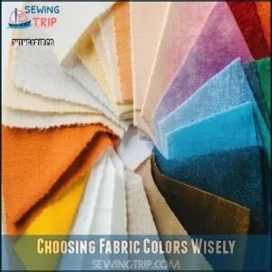
Choosing Fabric Colors Wisely
Picking the right fabric colors can feel tricky, but it doesn’t have to be.
With a little planning and the color wheel as your guide, you’ll create combinations that are both stunning and balanced.
Use the color wheel, and watch your fabric combinations transform into stunning, balanced works of art.
Color Wheel Basics
Mastering the color wheel is like discovering a secret sewing tool—it makes matching colors so much easier!
The wheel organizes primary colors (red, yellow, blue), secondary colors (like green, orange), and tertiary hues into a visual guide.
Understanding color relationships in the RYB model guarantees harmony, whether you’re picking fabrics for quilts or garments.
Master the RYB color wheel to create fabric combinations that feel harmonious and visually stunning every time.
Use color theory to experiment with bold complementary colors or soothing analogous combos. It’s creative, fun, and your project will thank you for it!
Primary, Secondary, and Tertiary Colors
Grab your color wheel and get mixing! Start with primary colors—red, yellow, and blue—the building blocks of all hues.
Combine these to form secondary colors like orange, green, and purple.
Feeling adventurous? Blend a primary with a secondary, and voilà, tertiary colors appear.
These unique shades, like teal or vermilion, reveal endless combos, perfect for creative fabric harmonies!
Understanding Color Value and Contrast
Colors aren’t all about hues—they’re about what jumps out.
That’s the magic of color value contrast. Pair a dark, rich navy with a soft, pale lavender and watch the visual hierarchy come alive.
Squinting helps spot standout shades on your value scale.
Think of this technique like balancing flavors in cooking. It adds depth perception and guarantees your fabric texture shines in any color scheme.
Matching Fabric Colors for Sewing Projects

Matching fabric colors for sewing projects can be fun and creative!
To get it right, consider these tips:
- Understand Fabric Undertones: Similar undertones in colors keep fabric combinations cohesive, while clashing ones can throw off your design.
- Rely on Color Psychology: Choose hues that set the right mood. Warm tones like red energize, while cooler blues calm a room.
- Experiment with Seasonal Palettes: Borrow fresh combinations from nature—think pastel pinks for spring or cozy oranges for fall.
Sewing’s like cooking—you just need the right ingredients!
Understanding Color Harmony
When you understand color harmony, choosing fabric combinations feels less like guesswork and more like art.
It’s all about balancing colors, so they look pleasing together—kind of like picking the perfect toppings for your pizza, which is an art that requires a good sense of harmony.
Monochromatic Colors
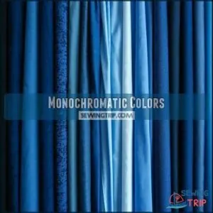
There’s magic in monochromatic color schemes—perfect for creating soothing, harmonious designs.
With monochromatic quilts, you’re working with tints and shades of one color, like navy to pastel blue, crafting understated elegance.
These single-color projects offer visual rest and subtle sophistication, especially when blending light and dark fabric variations.
Choosing monochromatic fabric schemes keeps things simple but never boring.
You’ll love the modern, polished feel and how easy it’s to combine fabrics.
Plus, who doesn’t adore effortless, cohesive sewing color schemes?
Complementary Colors
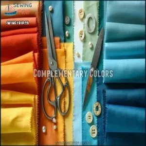
Ready to go bold? Complementary colors—your vibrant contrast champions—are opposites on the color wheel, like blue and orange.
They pack visual tension and energy into any project.
Here’s how to use them:
- Add pops of complementary colors to liven up dull palettes.
- Balance warm and cool tones for harmony.
- Pair complementary colors fabric for bold quilts or accessories.
Analogous Colors
Analogous colors are like best friends on the color wheel—they naturally blend for cozy harmony in fabric projects.
Think smooth gradients and subtle palettes perfect for creating harmonious designs.
Try these:
- Blues and greens for a serene, ocean-like fabric flow.
- Reds and purples for bold drama.
- Greens and yellows for fresh vibes.
- Yellows and oranges for sunny warmth.
- Purples and blues for soft tranquility.
Fabric color schemes never felt so effortless!
Split Complementary Colors
Think of split complementary colors as your "balancing act" in fabric color matching.
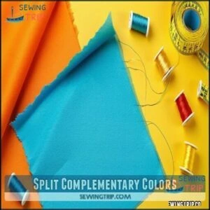
You pick one main color, then pair it with two neighbors of its opposite. This creates a dynamic yet soothing vibe.
For example, a blue fabric might shine with touches of orange and yellow tones. Perfect for sewing projects where you crave color vibrancy without overwhelming your design, achieving a soothing atmosphere.
Creating a Color Palette
When you’re creating a color palette for your sewing project, start with a dominant color to set the tone.
Add accent and neutral colors to keep things balanced, so your design feels polished, not like a fabric explosion.
Selecting a Dominant Color
Choosing a dominant color is like picking the lead actor for your sewing project—it sets the stage for your color palette and fabric selection.
This main color drives the project tone and guarantees balanced fabric dominance.
Use color psychology to align your choice with the mood you want, whether it’s calming blues or energizing reds.
Remember, the dominant color creates a clear visual hierarchy, guiding the eye smoothly.
For inspiration, explore color charts online to match your theme and simplify fabric color matching.
Choosing Accent Colors
Accent colors are like the sparkle in your fabric palette—they bring Contrast Creation and Visual Interest to your sewing projects.
Use them to highlight details, add personality, and create a Palette Enhancement that wows.
Start by exploring color combinations that align with your base shade—complementary tones add drama, while analogous ones maintain Color Harmony.
Don’t shy away from experimenting with trends or bold pops of color. Balance your scheme by pairing bright accents with subtle tones for a cohesive, polished look.
Understanding fabric grain and repeat guarantees a professional finish. Smart accents make sewing color palettes unforgettable!
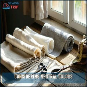
Considering Neutral Colors
Neutral colors are like the quiet heroes of your palette—they let bolder choices shine without stealing the spotlight.
Creamy whites, soft greys, or subtle beiges offer a steady base.
Neutral color palettes create balance, while versatile pairings can turn ordinary fabrics into stunning combinations.
Use neutral fabric colors with textures for depth or add neutral color accents to highlight details.
With neutral undertones, your design feels polished and cohesive without overwhelming.
Simple, yet brilliant!
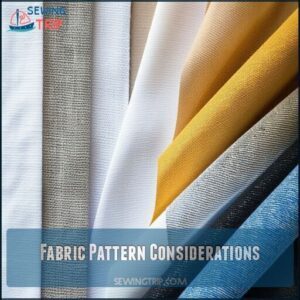
Fabric Pattern Considerations
Choosing fabric patterns is like assembling a puzzle—your pieces need to fit together without overwhelming the big picture.
Pay attention to scale, style, and shared colors to create a balanced, eye-catching design that works.
Mixing and Matching Patterns
Balancing fabric patterns is an artful mix of pattern scale, style coherence, and fabric texture.
Pair bold stripes with dainty florals, or geometric designs with soft polka dots. Keep patterns cohesive by repeating common elements like colors or themes.
To avoid chaos, create visual balance by mixing small, medium, and large-scale patterns.
Understanding fabric grain is key for professional results.
Trust your gut—mixing patterns is playful, not rigid!
Choosing Patterns With Common Elements
Think of fabric patterns as a team—each one should work together without stealing the spotlight.
Focus on pattern scale, color repetition, and motif linking to create harmony.
Stick to style consistency and texture blending for a polished look.
When mixing patterns, common elements like shared shapes or tones can tie everything together beautifully, making your project cohesive and eye-catching!
Balancing Patterns and Colors
When mixing fabric patterns, aim for visual harmony by balancing pattern scale and print density.
Use a dominant color to anchor the look and let supporting hues shine. Don’t overcomplicate—contrast textures for depth and interest.
Try these tips:
- Pick large, medium, and small-scale patterns for balance.
- Match textures like cotton or velvet for depth.
- Combine bold prints with subtle ones.
Finding Inspiration for Fabric Color Selection
You don’t have to overthink fabric color choices—great ideas are all around you.
Whether it’s a favorite painting, a bold patterned fabric, or a pre-designed collection, inspiration can strike when you least expect it!
Using Paint Schemes
Paint schemes are an unexpected goldmine for fabric color ideas.
Explore interior paint ideas or exterior paint schemes to uncover stunning color combinations inspired by color theory.
Mood boards and DIY paint projects can guide you in creating cohesive palettes.
Imagine pairing fabric colors like a pro—next thing you know, you’ll be turning rooms into quilts with style and flair!
Selecting a Fun Fabric as Inspiration
A bold-patterned fabric can kickstart your fabric inspiration by becoming your color guide. Pick one with a fun personality, then build around it using solids to complement its shades.
This keeps your sewing project’s colors balanced.
Here’s how to create harmony:
- Choose a fabric with dominant colors.
- Match accent choices to its details.
- Use neutrals for balance.
- Avoid overwhelming patterns.
- Experiment with sewing project colors digitally.
Curated Fabric Collections
Curated fabric collections are your go-to for inspiration when fabric selection feels overwhelming.
With pre-selected palettes and designer collections, you’ll find seasonal bundles, themed fabric, and even limited editions that make matching easy.
These fabric combinations are perfect for creative projects, offering harmony and polished results.
Many designers source pre-selected fabric options for inspiration.
Browse reviews or purchase fabric swatches to preview these cohesive color combinations before committing to your next masterpiece, and find inspiration in pre-selected fabric options.
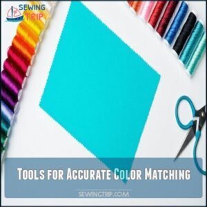
Tools for Accurate Color Matching
When you’re matching fabric colors, a few trusty tools can save you from frustrating mismatches.
From handy color charts to high-tech gadgets like colorimeters, finding the perfect match is easier than you think!
Color Charts
Color charts are like cheat codes for sewing projects—they make choosing the perfect color combinations a breeze.
Whether you prefer digital charts on your screen or physical ones you can hold, these tools sharpen your accuracy.
Need creative expansion? A fabric color wheel reveals endless ideas rooted in color theory.
Plus, charts boost project consistency by keeping shades aligned with your vision.
You can find a variety of fabric color charts online.
With countless chart types, there’s always a match for your style and sewing goals.
Colorimeters
Sometimes, fabric colors just don’t match the way you thought. That’s where a colorimeter steps in—trustworthy and quick.
- Color Measurement: Spot-on color accuracy, every time.
- Device Calibration: Guarantees consistent results.
- Color Comparison: Find perfect matches or alternatives.
- Cost Analysis: A small investment for frustration-free projects.
Think of a colorimeter as the personal shopper for your sewing table—precision guaranteed!
To guarantee an accurate match, consider referencing a Pantone thread system for universal color codes.
Pantone Matching System
Sometimes, matching fabric colors feels like chasing rainbows. Enter the Pantone Matching System (PMS)—your ace for color accuracy and consistency. PMS assigns unique codes to each shade, making fabric printing and design a breeze.
Whether you’re creating quilts, crafting apparel, or styling home décor, PMS guarantees industry-standard precision. Many designers find it useful to purchase products using these codes for physical reference.
Here’s how PMS helps across creative projects:
| Category | Use Case | Example |
|---|---|---|
| Fashion | Apparel Design | Trendy Runways |
| Home Décor | Styled Interiors | Bold Accent Walls |
| Sewing Projects | Fabric Swatches | Colorful Quilts |
With Pantone color codes in hand, skip second-guessing and embrace vibrant, coordinated projects with confidence—no more “close-enough” blues!
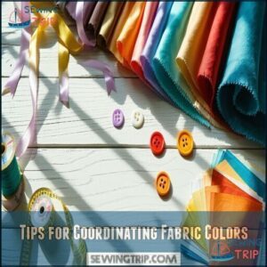
Tips for Coordinating Fabric Colors
Picking the right fabric colors doesn’t have to be tricky when you know a few simple tricks.
With a color wheel and a good eye for balance, you can create combinations that pop but still feel polished.
Considering Warm and Cool Colors
Think about color temperature when picking fabrics.
Warm colors like reds, yellows, and oranges bring energy, while cool colors like blues and greens feel tranquil.
Do you want sunny vibes or soothing calm?
For fabric blending, mix warm and cool colors thoughtfully.
Use seasonal palettes—autumn’s warm undertones or winter’s cool undertones—to inspire.
Warm and cool colors set the project’s mood perfectly.
Using a Color Wheel for Inspiration
Discover fabric magic with a color wheel—your ultimate brainstorming buddy for sewing projects.
Test complementary or analogous Wheel Color Harmonies, sparking fresh ideas and Scheme Experimentation. For best results, consider thread weight suitability to match your fabric.
- Experiment boldly: Spin the wheel to uncover daring color combinations.
- Visualize vividly: Let your project’s mood shine using Fabric Visualization and Project Moodboards.
- Blend creatively: Explore surprising tones shaped by Color Psychology.
Who’s ready to create?
Creating a Balanced Color Scheme
When creating balanced color schemes, mix color temperature (warm yellows with cool blues) for harmony.
Use value contrast to add depth, and apply color ratios thoughtfully—try 60% dominant, 30% secondary, 10% accent.
Here’s a handy guide:
| Term | Meaning | Example |
|---|---|---|
| Color Temperature | Warm vs. Cool hues | Yellow + Blue |
| Value Contrast | Light vs. Dark shades | Pale Pink + Deep Navy |
| Neutral Balance | Use neutrals for harmony | Beige + Any Bold Color |
Experiment until your fabric combinations feel cohesive!
Finalizing Your Fabric Color Selection
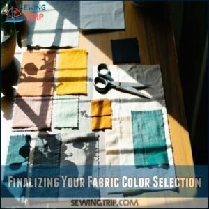
You’ve picked your fabrics, but now it’s time to see how they actually work together.
Order some swatches, lay them out, and tweak your choices until it feels just right—kind of like finding the perfect shoes for your outfit, which requires a bit of experimentation.
Visualizing Your Fabric Choices
Bring your sewing projects to life by visualizing fabric choices with tools like Fabric Mood Boards or Color Combination Apps.
Digital Mockups and Outfit Visualizers let you test designs virtually for better results.
Arrange fabric swatches or use simulations to tweak colors before cutting.
Don’t just rely on theory—experiment! Get inspired by blending bold shades or subtle tones, sparking creativity.
Remember, this process guarantees your fabric selection shines in any sewing masterpiece.
Ordering Fabric Swatches
Now’s the fun part—ordering fabric swatches! It’s the best way to see true colors and feel textures before committing. Choose swatches that show enough pattern to visualize the design.
- Swatch Benefits: Large pieces give a clearer view of fabrics.
- Swatch Limitations: Colors may shift under different lighting.
- Swatch Cost: Some are free, but others might’ve a fee.
- Swatch Organization: Keep them labeled for easy reference later.
Getting swatches keeps your project on track and stress-free!
Making Final Adjustments
Now that you’ve got your fabric swatches, it’s time for those final adjustments.
Step back and double-check your choices—are your light and dark tones creating enough contrast balance? Think about pattern scaling and how each fabric will work in your sewing project.
If something feels off, tweak the colors until they flow seamlessly. Fabric color swatches online can help if you need more examples.
Pay attention to visual coherence—does everything feel harmonious, or is it clashing? With a little color calibration and tone adjustments, you’ll nail that perfect color matching!
Frequently Asked Questions (FAQs)
Do you need a color chart for fabric?
Is a color chart necessary?
Well, not always, unless you enjoy mismatched chaos.
But seriously, it’s a lifesaver for pairing fabrics, keeping your projects cohesive, and avoiding “what was I thinking?” moments later.
How do I choose a color scheme for my quilting project?
Start with a focal fabric you love, then pull colors from it for your scheme.
You’ll want to think about complementary or analogous combinations, and don’t forget to balance with neutrals for visual rest.
How do I choose a fabric color match?
Like finding the perfect dance partner, choose fabrics that complement each other.
Start with a focal fabric you love, then pull colors from it for your supporting pieces.
Trust your eye, it’s rarely wrong.
What is the best fabric for a sewing project?
The best fabric depends on your project’s purpose.
Cotton works for everyday items, silk for elegant pieces, and stretchy knits for clothing.
You’ll want durable denim for bags and lightweight linen for summer garments.
How to match fabric colors and prints for a project?
Ever wondered why some fabrics clash while others sing in harmony?
Choose a dominant fabric first, then add complementary or analogous colors.
Consider print scale—mix large, medium, and small patterns for balance.
How do I choose the right fabric for my sewing project?
Consider your project’s purpose, difficulty level, and how the fabric drapes.
You’ll want to match weight and stretch to your pattern requirements, while ensuring it’s comfortable and appropriate for seasonal wear.
How do you match fabric colors?
Afraid of clashing colors?
Start with a dominant fabric you love, then select complementaries using a color wheel.
Use neutrals for balance, match thread colors carefully, and trust your eye—it’s often smarter than charts.
How to coordinate fabric colors?
Use the color wheel as your guide.
Start with a focal fabric you love, then pull colors from it for coordinating pieces.
Trust your eye—if it looks good together, it is!
How to find matching fabric?
75% of sewers spend over an hour searching for matching fabrics.
You’ll find perfect matches using color wheels, fabric swatches, natural light comparisons, and pre-coordinated collections that’ll take your projects from good to jaw-dropping.
What three colors match any shade of fabric?
White, black, and navy blue are your fabric-matching superheroes.
They’ll complement any shade you’re working with, making them essential staples for your sewing toolkit.
You’ll never go wrong with these neutrals!
Conclusion
Remarkably, 85% of sewists say matching fabric colors is their biggest challenge.
You’ve now got the tools to confidently tackle your next project! Whether you’re using a color wheel, finding inspiration in nature, or experimenting with contrast, matching fabric colors for sewing projects doesn’t have to be intimidating.
Trust your instincts, start with colors you love, and don’t be afraid to play with swatches before committing. Your perfectly coordinated creation is just a few thoughtful color choices away!

