This site is supported by our readers. We may earn a commission, at no cost to you, if you purchase through links.
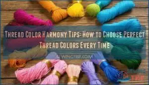
Start with a basic color wheel to identify complementary pairs and analogous groupings. Test your thread choices on fabric scraps first—lighting conditions can make or break your color decisions. Focus on matching undertones between thread and fabric rather than exact color matches.
Build your collection around primary colors, then add neutrals like white, black, and gray. Think of color harmony like cooking—you need the right ingredients in the right proportions. The real magic happens when you understand how metallic threads shift under different lights.
Table Of Contents
- Key Takeaways
- Essential Color Theory for Thread Selection
- Types of Embroidery Threads and Their Effects
- Building a Balanced Thread Color Palette
- Harmonizing Thread Colors With Fabric
- Popular Thread Color Schemes and Combinations
- Tools and Techniques for Color Matching
- Advanced Tips for Stunning Thread Harmony
- Frequently Asked Questions (FAQs)
- Conclusion
Key Takeaways
- Test thread colors on fabric scraps first – You’ll avoid costly mistakes by checking how your thread choices look under your actual working light, since cotton absorbs light differently than silk or rayon.
- Build your collection around primary colors plus neutrals – You’ll create maximum versatility by starting with red, blue, yellow, white, black, and gray threads that work with nearly any fabric combination.
- Match undertones, not exact colors – You’ll achieve better harmony by identifying whether your fabric leans warm or cool, then choosing threads with compatible temperatures rather than trying for perfect color matches.
- Use the color wheel for foolproof combinations – You’ll create stunning results by selecting complementary pairs for bold contrast or analogous groupings for subtle blending effects.
Essential Color Theory for Thread Selection
You’ll want to know why certain thread colors pop against your fabric while others stubbornly fade away, and it all comes down to how the color wheel, value, and saturation interact with your chosen material. Learning to assess these relationships is like figuring out why your favorite blue always steals the show—sometimes fabric is just dramatic like that.
Primary, Secondary, and Tertiary Colors
Starting with Color Harmony in thread, you’ll see how Primary Shades, Secondary Tones, and Tertiary Hues bring life to embroidery. Here’s your cheat sheet:
- Primary Colors: red, blue, yellow
- Secondary Colors: mix primaries—green, orange, purple
- Tertiary Colors: blend primaries and secondaries
- Color Mixing: discover endless thread options
Master Color Theory—skip the thread drama!
The Color Wheel and Its Uses
If you’ve ever spun a color wheel, you know it’s the GPS for Color Harmony. Use Wheel Basics to find a complementary color or pick an analogous color for a smoother look.
Hue Theory helps you bridge Tint Shades and Saturation Levels, making your color wheel your project’s best friend. Color Theory Basics—the cheat code for every fabric artist.
Value and Saturation Explained
Beyond the color wheel’s basics lies value and saturation—your secret weapons for thread color harmony. Value controls how light or dark your threads appear, creating contrast levels that make designs pop or blend seamlessly.
Saturation determines color intensity, affecting shade variety and tone balance. Master these concepts, and you’ll achieve perfect color depth with stunning light effects in every project.
Types of Embroidery Threads and Their Effects
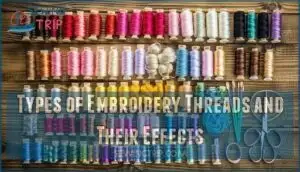
You’ll discover that cotton threads offer matte finishes with consistent color absorption, while silk provides natural luster that makes colors appear deeper and more vibrant.
Rayon mimics silk’s sheen at a lower cost, and metallic threads add sparkle but can shift color appearance under different lighting conditions.
Cotton, Silk, Rayon, and Metallic Threads
Each embroidery thread type brings unique personality to your Thread Color Selection. Cotton threads offer matte coverage perfect for subtle Analogous Color Palette blends. Silk delivers rich depth with natural sheen for vibrant Embroidery Effects. Rayon provides high luster that makes Thread Color Combinations pop dramatically.
Here’s what you need to know:
- Cotton: Consistent Colorfastness with adaptable Thread Weights for everyday projects
- Silk: Premium Yarn Textures with outstanding color depth and natural shine
- Rayon/Metallic: Bold Embroidery Thread options with reflective properties using the Color Wheel strategically
Choose based on your desired Fiber Blends impact. For the best results, understanding silk embroidery techniques is essential for achieving professional-looking embroidery projects.
How Thread Material Influences Color
Thread material dramatically affects how colors appear in your finished embroidery. Cotton’s matte finish softens hues, while silk threads reflect 40% more light, creating vibrant colors. Rayon delivers high sheen but shows color shift under different lighting.
**Thread texture from twisted fibers like perle cotton creates varied highlights.
** Fiber blends and dye lots can cause material effects that alter your expected color wheel results.
Understanding the properties of silk thread types is essential for achieving the desired color harmony in embroidery projects.
Choosing The Right Thread for Your Project
Project planning starts with understanding your fabric’s personality. Match thread weight to your fabric’s thickness—lightweight threads for delicate materials, heavier ones for sturdy fabrics.
Color harmony depends on your goal: choose contrasting embroidery thread colors for bold statements or analogous color palette types for subtle elegance.
Thread selection affects durability too. Fabric matching becomes second nature when you consider both visual impact and practical performance in your embroidery thread selection process.
Building a Balanced Thread Color Palette
You’ll build thread color confidence faster when you organize your collection around color wheel principles and value relationships.
Start with one spool from each primary and secondary color family, then add neutrals like cream and charcoal gray that’ll work with nearly any fabric combination.
Basics of Thread Color Organization
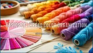
Organizing embroidery thread colors becomes second nature when you master thread sorting by hue grouping. Start with color coding your collection using palette building techniques that mirror the color wheel.
Thread storage systems should separate warm from cool tones, making color matching techniques straightforward. Use a thread palette generator to identify color palette types that work together, then group similar embroidery thread colors accordingly.
Starting a Versatile Thread Collection
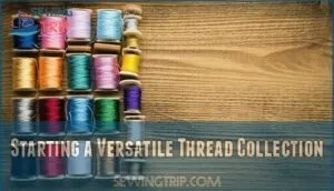
Building your first embroidery thread collection doesn’t require buying every color imaginable. Smart palette building starts with these thread storage essentials:
- Primary colors in cotton embroidery thread (red, blue, yellow)
- Basic neutrals like white, black, and gray for fabric swatching
- One monochromatic color palette in varying thread weights
- Color wheel basics – one warm and cool tone each
- Color coding system for choosing thread colors efficiently
This foundation gives you flexibility without overwhelming your workspace.
Using Thread Color Charts and Cards
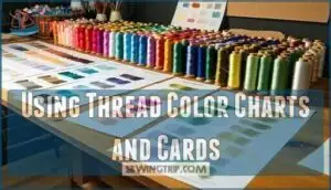
Physical thread color charts become your best friend once you’ve built your collection. Real thread samples beat digital screens every time—your phone can’t show that silk’s natural sheen or rayon’s subtle shimmer.
Here’s how smart stitchers organize their palette creation process:
| Chart Type | Best For | Key Benefit |
|---|---|---|
| Brand Cards | Thread Color Matching | Accurate shade selection |
| DIY Cards | Project Documentation | Custom palette creation |
| Conversion Charts | Multi-brand Projects | Cross-reference compatibility |
| Digital Tools | Planning Phase | Quick color wheel reference |
**Keep your thread swatch books organized by color families or numerical order.
Test combinations on fabric scraps under your usual stitching light**—what looks perfect in daylight might clash under evening lamps.
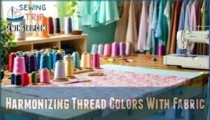
Harmonizing Thread Colors With Fabric
You’ll master thread-to-fabric pairing by understanding how your base fabric’s undertones influence thread color choices, whether you’re matching for subtle blending or creating bold contrast effects.
The key lies in reading your fabric’s color temperature and value, then selecting threads that either harmonize seamlessly or provide purposeful visual pop—think of it like choosing the right paint colors for your living room walls.
Matching Thread to Fabric Tones
Your thread collection sets the foundation, but matching embroidery thread to fabric tones requires understanding Color Harmony Principles. Start with your color wheel to identify your fabric’s undertones—warm or cool. Thread Shade Selection becomes easier when you spot these subtle hints.
- Analyze fabric undertones: Hold fabric near white paper to see if it leans warm (yellow/red) or cool (blue/green)
- Use Tone On Tone techniques: Choose thread 2-3 shades lighter or darker than your fabric for subtle definition
- Consider Neutral Backgrounds: Cream, beige, and gray fabrics pair well with most thread colors from your complementary color palette
- Test lighting conditions: Natural light reveals true Fabric Tone Matching better than artificial lighting
- Sample first: Always test thread on fabric scraps before committing to your final color theory choice
Contrast Vs. Blending Techniques
Color contrast creates bold visual hierarchy using complementary color palettes—think red thread on green fabric. The color wheel shows you opposite pairs that pop.
Blending uses analogous colors for smooth tonal balance, like blue flowing into purple. Different thread weights affect how colors interact.
High contrast demands attention; subtle blending whispers elegance. Your fabric’s value determines which approach works best.
Selecting Neutrals for Versatility
When you’re working between high contrast and smooth blending, neutral shade selection becomes your safety net. Gray, cream, and off-white embroidery thread colors work with nearly any fabric.
These adaptable color schemes won’t compete with your design’s main elements. Neutral thread choices create balanced color palettes that let other colors shine. Think of monochromatic neutrals as your reliable backup singers—they support without stealing the spotlight.
Popular Thread Color Schemes and Combinations
You’ll discover that certain thread color schemes work like magic together, creating stunning embroidery that looks professionally planned rather than randomly chosen.
These tried-and-true combinations, from soothing analogous palettes to bold complementary pairs, take the guesswork out of thread selection and help you achieve beautiful results every time.
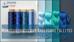
Monochromatic and Analogous Palettes
Three simple approaches create stunning monochromatic schemes and analogous colors. Monochromatic schemes use different values and saturation levels of one hue—think navy, royal blue, and powder blue threads. Analogous colors sit next to each other on the color wheel, creating harmonious hues like blue-green flowing into pure green.
These palette creation methods deliver straightforward color gradation that’s practically foolproof for beginners.
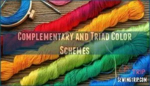
Complementary and Triad Color Schemes
Beyond single-color approaches, you can create striking embroidery thread colors using complementary and triad schemes. These color theory techniques deliver dramatic visual impact through strategic contrast.
Here’s how to master these bold combinations:
- Color Contrast with complementary pairs – Choose opposite colors on the color wheel (red/green, blue/orange) for maximum pop and attention-grabbing details.
- Triad Harmony using three colors – Select three evenly spaced thread color schemes like red, yellow, and blue for balanced yet vibrant embroidery thread colors.
- Split Complementary variations – Pick one base color plus the two colors adjacent to its opposite for softer contrast than pure complementary schemes.
Warm, Cool, and Neutral Thread Choices
Temperature matters when you’re selecting thread colors. Warm colors like reds, oranges, and yellows make your embroidery pop forward, while cool pastels in blues and greens create calming backgrounds.
Warm neutrals such as cream and beige work beautifully with autumn fabrics. Cool neutrals like gray pair perfectly with modern designs.
Understanding color temperature helps you control the mood of your project.
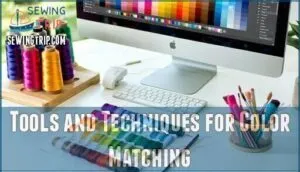
Tools and Techniques for Color Matching
You’ll need reliable tools to match thread colors accurately, whether you’re working on intricate embroidery or simple mending projects.
Physical thread cards and color wheels give you the most precise results, while digital thread palette generators help you explore new combinations from your computer.
Using Color Wheels and Thread Cards
Physical color wheels and thread cards serve as your compass for thread matching mastery. The color wheel reveals complementary pairs and analogous groupings, making palette creation straightforward.
Thread cards like Aurifil’s 270-color collection show actual thread samples under consistent lighting—vital for accurate color harmony decisions. You can’t trust your monitor for precise thread colors.
Keep your color wheel handy during card organization sessions. These tools eliminate guesswork when traversing complex color theory principles for embroidery thread colors.
Digital Tools Like Thread Palette Generators
While physical thread cards provide accuracy, digital tools offer speed and convenience. Thread generators like Palette Scout and online palette builders transform color selection.
These platforms use color theory principles to create harmonious thread color schemes instantly. Simply upload an image or enter color codes for automatic digital palettes. Popular online tools include Stitch Palettes and Thread Bare, supporting major brands like DMC.
Color matching algorithms analyze your inputs against vast thread databases, suggesting complementary combinations. Though digital palettes need physical verification under proper lighting, they’re perfect for initial brainstorming and reducing decision fatigue.
Advanced Tips for Stunning Thread Harmony
You’ve mastered the basics, but now it’s time to polish your skills with professional-level techniques that separate good thread choices from stunning ones.
These sophisticated strategies help you handle tricky color situations, work confidently under different lighting conditions, and keep your thread collection organized for quick decision-making.
Value Matching for Seamless Substitutions
Mastering value matching transforms your embroidery thread substitutions from guesswork into confident choices. Value refers to how light or dark your thread appears, regardless of its actual color or saturation.
- Match the grayscale value when swapping embroidery thread colors to maintain design integrity
- Use Value Contrast strategically—light threads pop against dark fabrics, creating visual depth
- Consider Thread Weights alongside Shade Selection since heavier threads appear darker than lighter ones
- Practice Tint Matching and Color Gradation by squinting to see true values, not just hues
Lighting Considerations in Color Selection
Your Color Temperature choice dramatically impacts thread selection accuracy. Daylight bulbs (5000K-6500K) reveal true embroidery thread colors, while warm Light Sources below 2700K cast misleading yellow tints.
Shadow Effects from poor Illumination Levels cause matching errors. Test your color wheel selections under consistent Ambient Lighting—at least 800 lumens prevents costly color theory mistakes when choosing thread for projects.
Organizing Threads for Easy Access
Once you’ve chosen your perfect thread colors, smart thread organization keeps them at your fingertips. Use storage bins with color coding systems and clear thread labels. Thread organizers with numbered slots work perfectly for embroidery thread organization.
Group thread colors by family—reds together, blues together. Digital thread tools can track your collection, making future projects smoother.
Frequently Asked Questions (FAQs)
How do seasonal trends affect thread color choices?
Ironically, while you’re perfecting color harmony, seasonal trends will completely flip your palette upside down. Spring brings vibrant florals and metallic accents, while fall demands burnt orange and rich burgundy hues.
You’ll constantly chase trending shades, making your careful theory practically useless.
Whats the best thread storage for color preservation?
Store your threads in dark drawers or closed containers to prevent fading from UV exposure. Steel drawer cabinets maintain color integrity by protecting threads from light and dust contamination.
Can you mix different thread brands together successfully?
You can definitely mix thread brands together successfully! Different brands often complement each other beautifully. Just watch for tension differences and test compatibility on scraps first to guarantee smooth stitching.
How do you fix thread color bleeding issues?
Your vibrant threads can turn into muddy disasters if colors bleed. To prevent bleeding mishaps, you’ll need to take some precautions. Pre-wash questionable threads, use color-catcher sheets, or switch to colorfast options like quality cotton or polyester threads.
Which thread colors work best for beginners?
Start with neutrals like cream, gray, and off-white—they’re forgiving and match everything. Add basic primary colors: red, blue, yellow. These foundational shades let you practice without overwhelming color choices.
Conclusion
Mastering these thread color harmony tips will transform your embroidery from amateur hour to absolutely stunning masterpieces. You’ll never second-guess color choices again when you understand how thread materials interact with light and fabric.
Start with a solid color wheel foundation, build your collection systematically, and always test combinations before committing. Remember that perfect harmony comes from understanding undertones, not just matching surface colors.
With practice, you’ll develop an instinctive eye for beautiful thread combinations that enhance every project.
- https://threadlogic.com/blogs/logo-embroidery/color-theory-what-embroidery-color-chart-items-go-well-together
- https://www.youtube.com/watch?v=N5xXzDzssgw
- https://www.caydo.com/blogs/trends/embroidery-thread-colors
- https://www.maggieframes.com/blogs/embroidery-blogs/mastering-thread-coloring-techniques-matching-optimization-for-embroidery
- https://www.stadriemblems.com/color_chart/

