This site is supported by our readers. We may earn a commission, at no cost to you, if you purchase through links.
 When tackling sewing fabric color considerations, start with the basics. Use the color wheel to pick harmonious combinations—complementary colors add contrast, while analogous hues feel cohesive.
Think about the mood you want. Warm tones like reds and yellows feel energetic, while cool blues and greens create calm.
Don’t forget about undertones! A mismatched undertone can make fabrics clash. Mixing patterns? Keep it balanced—pair bold prints with solids or subtle textures.
If you’re unsure, grab fabric swatches and lay them together in natural light—it’s like auditioning your fabrics. Looking for more tips? Stick around and discover how to make colors truly shine.
Table Of Contents
Key Takeaways
- Use the color wheel to create harmonious combinations, balancing complementarity and cohesion for professional-looking designs.
- Test fabric swatches in natural light to confirm undertones and ensure colors complement your project’s mood.
- Pair bold patterns with solids or subtle textures to avoid visual overwhelm and add balance to your designs.
- Consider fabric value (lightness and darkness) and texture to create depth and contrast that make your projects pop.
Color Wheel Basics
You’ll gain fabric selection confidence once you understand the color wheel’s three layers: primary colors (red, yellow, blue) form the foundation, while secondary and tertiary colors expand your creative palette.
Understanding the color wheel transforms fabric selection into an art—master the basics to unlock endless creative possibilities!
Just like building a recipe from basic ingredients, mastering these color relationships helps you create fabric combinations that look professionally designed rather than randomly thrown together, which leads to a more professionally designed look.
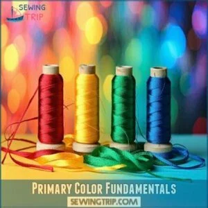
Primary Color Fundamentals
The foundation of fabric color theory starts with the three primary colors: red, yellow, and blue.
These building blocks can’t be created by mixing other colors—they’re the starting line on your color wheel journey.
When you understand primary colors, you’ll discover countless fabric color combinations.
Think of them as the ABCs of color relationships before diving into more complex color schemes.
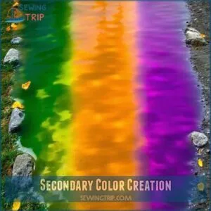
Secondary Color Creation
Secondary colors emerge when you mix two primary colors together on the color wheel. Think of them as the children of red, yellow, and blue.
When combining primary colors, you’ll create:
- Green: Mix blue and yellow in equal amounts
- Orange: Blend red and yellow together
- Purple: Combine red and blue to achieve this royal hue
These color wheel blending basics help you understand fabric color theory. Understanding analogous color schemes can further refine your fabric choices.
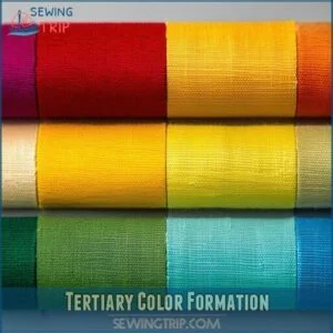
Tertiary Color Formation
Six beautiful tertiary colors emerge when you mix a primary color with its neighboring secondary color.
These in-between hues add depth to your fabric selections.
| Tertiary Color | Formation | Example | Common Fabric Use |
|---|---|---|---|
| Red-Orange | Red + Orange | Coral | Summer quilts |
| Yellow-Orange | Yellow + Orange | Amber | Fall projects |
| Yellow-Green | Yellow + Green | Lime | Spring designs |
| Blue-Green | Blue + Green | Teal | Coastal themes |
You’ll find tertiary colors create sophisticated, nuanced palettes that elevate your sewing projects beyond basic color combinations.
Fabric Color Selection
You’ll save yourself countless headaches by carefully selecting fabric colors that work together before you cut a single piece.
The right combination of dominant, accent, and neutral colors will transform your sewing project from amateur to professional-looking in an instant.
Choosing Dominant Colors
Now that you understand the color wheel, let’s pick your dominant color—the star of your fabric show.
Your dominant color creates the palette foundation and sets the tone for your entire project.
This color typically covers 60% of your design’s visual weight and establishes the project hierarchy.
Choose a color that speaks to you and aligns with your project’s mood through color psychology and makes your project stand out with its unique visual weight.
Selecting Accent Colors
After establishing your dominant fabric choices, it’s time to add accent colors for visual interest.
Think of accent colors as the jewelry of your fabric palette – they create color pop without overwhelming.
Choose 1-2 shades that complement your main fabrics while providing palette contrast. For maximum impact, select colors opposite your dominant shade on the color wheel.
Consider exploring different accent fabric options to find the perfect match. These small color combinations can dramatically shift your project’s mood alignment while maintaining harmony.
Considering Neutral Colors
While accent colors bring energy to your project, neutral colors are your project’s backbone.
Think of neutrals like white, beige, gray, and black as the supporting cast that lets your star fabrics shine.
These versatile fabric choices create breathing room between bold patterns and colors.
When combining neutrals, pay attention to their undertones—warm beige variations pair beautifully with cream, while cool off-white shades complement gray scale options in your fabric selection, creating a harmonious balance with neutral colors and breathing room.
Color Harmony Principles
You’ll find your sewing projects look more professional when you understand how colors work together through basic harmony principles.
Understanding color harmony transforms your sewing projects, making them look polished, cohesive, and truly professional with effortless creativity.
Whether you’re mixing monochromatic shades for elegance or pairing complementary colors for eye-catching contrast, these techniques will help you create fabric combinations that actually make sense.
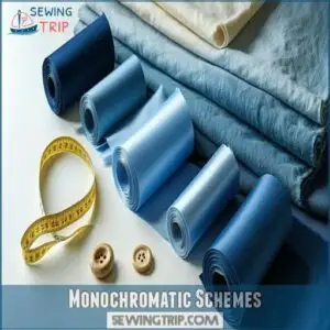
Monochromatic Schemes
Simplicity shines brightest in monochromatic schemes, where you’ll work with different tints and shades of a single color to create subtle elegance in your projects.
Here’s how to master single-color harmony:
- Choose one base color you absolutely love
- Incorporate at least 5 different value variations of that color
- Mix textures to prevent monotony
- Add neutral accents for breathing room
- Layer light to dark fabrics for dimensional depth
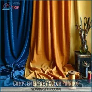
Complementary Color Pairing
When you place opposites on the color wheel together, magic happens. Complementary color pairing creates vibrant contrast that makes both colors pop.
Think blue with orange or purple with yellow – these combinations create color tension that draws the eye.
For balanced tetradic harmony, try using split complements or tone variations of true complementary colors. Exploring fabric color options can further enhance your understanding of color relationships.
This technique follows color theory principles while keeping your sewing projects visually exciting without overwhelming.
Analogous Color Selection
While complementary colors create bold contrast, analogous colors offer a gentler approach to color harmony.
You’ll find these colors sitting side by side on the color wheel, creating a smooth, natural flow in your sewing fabric projects.
When working with analogous color theory in your fabric combinations:
- Choose three adjacent colors on the wheel (like blue, blue-green, and green)
- Use varying intensities for depth and interest
- Balance your color palette with one dominant shade for cohesion
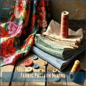
Fabric Pattern Mixing
You’ll transform your sewing projects when you mix patterns that share common colors while varying their scale.
Combining florals with stripes or dots creates visual interest, just like pairing chocolate and peanut butter makes a treat that’s more exciting than either alone, with the combination of patterns being similar to mixing chocolate and peanut butter.
Balancing Pattern Scale
Many successful fabric designs rely on balancing pattern scale properly.
When mixing patterns, combine large, medium, and small scales for visual interest without overwhelming your project.
Think of pattern scale like a family—you need different sizes to create harmony.
Large florals pair beautifully with tiny dots, while medium-scale patterns bridge these extremes.
This balanced distribution creates a cohesive look that’s pleasing to the eye.
Choosing Patterns With Common Elements
Now that you’ve got pattern scale under control, let’s find those common threads that tie your fabric patterns together.
Look for shared color motifs that create natural harmony between different prints. When fabrics share elements—like similar colors, themes, or motifs—they create a cohesive story in your project.
Trust your eye to spot these connections; you’ll know when patterns just "click" together through their common elements, forming a natural harmony that creates a sense of balance.
Texture Blending Techniques
Now that you’ve learned about choosing patterns with shared elements, let’s explore texture blending.
When mixing fabric textures, use low opacity applications with soft brushes for seamless results. Consider fabric grain and scale when combining different textures.
You’ll create visual interest by pairing smooth satins with textured linens or adding subtle texture to solid fabrics. Understanding fabric drape is essential for achieving the desired effect.
Think of texture as another layer of contrast in your sewing projects.
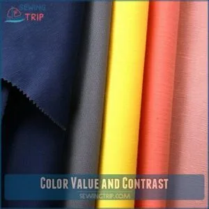
Color Value and Contrast
You’ll transform your sewing projects when you understand how light and dark fabrics create eye-catching visual interest.
Mastering color value lets you confidently pair fabrics that pop against each other, turning ordinary projects into designer-worthy creations that friends will think came from a boutique.
Understanding Color Value
Color value boils down to how light or dark a fabric appears.
Think of it as the "weight" your fabric carries in your project.
When you’re looking at a printed fabric, step back or squint your eyes—this trick helps you see its true value.
Understanding value creates depth in your designs, regardless of which colors you’ve chosen.
It’s the secret sauce that makes quilts and garments pop!
Creating Contrast With Fabric
Effectively creating contrast with fabric transforms ordinary projects into eye-catching masterpieces. When fabrics lack value contrast, your design may appear flat and uninteresting.
- Pair light and dark fabrics to create dramatic value contrast that makes designs pop
- Mix smooth solids with textured prints for engaging texture contrast
- Combine large florals with tiny geometrics for appealing pattern contrast
- Adjust color saturation levels to control visual impact
- Consider fabric undertones when building color schemes for perfect coordination
To achieve a pleasing look, remember to utilize analogous color schemes and create dramatic effects by balancing different elements.
Tips for Selecting Fabrics With Confidence
To gain confidence in fabric selection, look into using fabric swatch testing before committing to large purchases.
Check fabrics under different lighting considerations, as colors shift between natural daylight and indoor lighting.
Designer collections often pair perfectly with complementary fabric colors, taking the guesswork out of matching.
Remember to evaluate fabric value (lightness/darkness) rather than focusing solely on color—this is one secret professional sewists swear by, and it helps in making informed decisions about complementary fabric colors.
Finding Fabric Color Inspiration
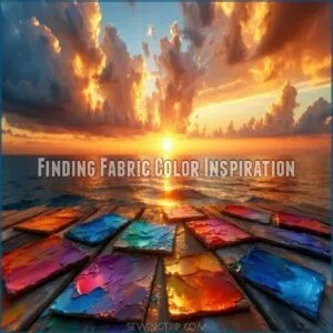
You’ll find color inspiration in the most unexpected places, from a vibrant sunset photo to the packaging of your favorite snack.
When you’re stuck in a creative rut, just look around at paint chips, nature scenes, or even that funky patterned shirt your neighbor wore last week for fresh fabric color combinations that’ll make your next sewing project truly shine.
You can discover new ideas by exploring different sources, and using them to create unique and interesting color combinations, which can be inspired by vibrant elements such as a sunset.
Using Paint Schemes for Inspiration
Paint schemes offer fantastic inspiration for sewing projects.
By analyzing a color palette from artwork or interior design, you can extract harmonious combinations that translate well to fabric.
Adapting these schemes to textiles can pose challenges, but matching tones with fabric swatches guarantees a cohesive appearance.
This design style transfer bridges creativity with functionality, sparking fresh ideas effortlessly.
Selecting Fun Fabric as Inspiration
Start with a fabric that sparks joy—something bold, quirky, or with a charming motif.
Let its colors guide you creatively. Think about how print scale and texture variety can complement your project.
Use the color wheel for harmony and consider how the fabric reflects your personal style.
Trust your instincts; sewing’s all about making it yours.
Considering Warm and Cool Colors
Warm colors like red and orange add energy, while cool blues and greens bring calm.
Think of color temperature as mood lighting for your projects.
Don’t forget fabric undertones—they can shift how hues feel.
Warm color impact creates visual weight, while cool color effects recede, use color theory and fabric color psychology to balance harmony and vibrancy.
Finalizing Fabric Choices
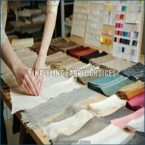
When finalizing fabric choices, it’s all about narrowing down your options with confidence.
Test swatches, check how colors work together, and don’t skip making those last-minute tweaks for a polished result.
Visualizing Fabric Choices
Picture how fabrics work together by testing color visualization tools or sneaky digital design mockups.
Move fabric swatches around to see placement magic unfold. Think about lighting effects—natural light changes everything!
Adjust your color palette for harmony and fab coordination. It’s like matchmaking but for fabrics!
Aim for fabric color schemes that spark joy, not regret.
Ordering Fabric Swatches
When ordering fabric swatches, aim for larger swatch sizes to see true patterns and textures.
Test them under different lighting to check their impact on color matching. Organize by shades or project themes for easy color coordination.
Consider costs carefully; ordering smaller quantities saves money but limits flexibility. Swatches are key to finalizing perfect fabric selection and color combinations.
Understanding the fabric’s drape is essential for visualizing the final garment, and it helps in making a final decision.
Making Final Adjustments
Take a moment to review your color palette and swatch comparison under different lighting.
A final fabric check confirms color coordination and matching are spot-on for your project.
Visualize the finished piece to assess color balance and contrast, and adjust any mismatched fabrics now—it’s easier than reworking later, ensuring smooth sailing during sewing, which is the key to perfect fabric selection.
Coordinating Fabric Colors
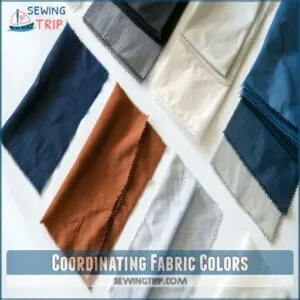
When coordinating fabric colors, start by picking a backing fabric that complements your main design.
From there, match solids and low-volume prints that tie the palette together for a cohesive look.
Choosing Backing Fabric First
Start fabric color combinations by choosing backing fabric first.
Think about color balance and how your quilting design will look.
Use these tips:
- Match backing fabric value with your quilt top.
- Factor in fabric weight impact for smooth draping.
- Consider pattern considerations for harmony.
- Pre-wash backing for shrinkage control.
- Use backing color psychology to enhance the quilt’s feel, considering the impact of color psychology.
Selecting Coordinating Solids
When picking solid fabrics, consider color value and texture.
A richer texture can add depth, even with neutral fabric colors.
Test dye lot matching for consistent shades.
Fabric weight matters too; heavier solids anchor projects, while lighter ones soften designs.
Colorfastness testing guarantees long-lasting fabric coordination.
You may also want to research solid fabric options online.
Nailing color harmony makes sewing fabric matching less stressful and more satisfying, ensuring long-lasting results with the right fabric coordination.
Pulling Low Volume Fabrics in Colors Found
Low-Volume bring subtle charm to your fabric color combinations.
Look for fabric undertones matching your palette—whether creamy whites or soft grays.
Small Print Scale adds quiet detail, while Texture Variety creates richness.
Focus on Color Placement to balance bold prints.
Master fabric selection by blending hues seamlessly, making color coordination sewing feel effortless and creative during your projects, using complete concepts.
Frequently Asked Questions (FAQs)
How do you set color in fabric before sewing?
Rinse your fabric in cold water mixed with vinegar or salt.
Both help lock in dye.
Air dry it afterward.
This process minimizes bleeding and fading, saving you surprises later during sewing or washing, with complete concepts like these being crucial.
What are the 4 things to consider when choosing fabric?
Measure twice, cut once" applies to fabric too!
Think about color harmony for a cohesive look, fabric type for project durability, texture for depth, and the design pattern to tie everything together beautifully.
What is the best color thread for sewing?
Go for a thread color that matches your fabric or blends well.
Neutrals like gray or beige work wonders for multi-colored fabrics.
If stitching stands out, contrasting colors like red on blue can pop beautifully.
How do lighting conditions impact fabric colors?
Good lighting matters as much as good fabric—natural light shows true colors, while artificial light might alter hues.
Always test swatches where you’ll use them to avoid surprises.
It’s like trying on sunglasses indoors, and natural light shows true colors.
What factors affect fabric color perception over time?
Fabric colors shift over time due to sunlight fading, washing frequency, and fabric type.
Harsh light bleaches hues, while detergents and water lead to fading.
Natural fibers often fade faster than synthetics, altering your design’s balance.
How can thread color complement fabric designs?
Match thread color by balancing blend and contrast.
Choose a thread that softly complements or sharply accents fabric.
Don’t stress too much—seaming mistakes hide better with neutral threads, and bold ones add stylish character!
How do multi-colored prints influence design balance?
Multi-colored prints add energy to your designs, but they can steal the spotlight if you’re not careful.
Balance them with solid fabrics or subtle patterns.
Let one key color lead, and the rest will follow.
What role does fabric texture play in color appeal?
Imagine a soft velvet catching light—its texture deepens colors, adding richness.
Texture affects color appeal by creating dimension and contrast.
Pairing rough with smooth fabrics balances light reflection, making designs pop and feel dynamic.
Conclusion
Think of sewing fabric color considerations like painting a masterpiece. Every shade, tone, and pattern tells a story.
Use the color wheel to guide your choices, and don’t shy away from experimenting with undertones and contrasts. Trust your instincts, but rely on swatches and natural light to confirm.
Keep harmony in mind—complement bold prints with subtle textures. With these tips, your fabric selections won’t just work—they’ll steal the show.
Ready to make your colors pop? Let’s sew!

