This site is supported by our readers. We may earn a commission, at no cost to you, if you purchase through links.
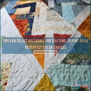 You’ll find selecting fabric for quilting isn’t rocket science once you know the secrets.
Start with a color scheme that makes your heart sing, then mix prints in three sizes: large showstoppers, medium supporters, and small accent pieces.
Think about your quilt’s purpose – a baby’s blanket needs different fabric than a wall hanging.
Don’t shy away from combining patterns, but make sure you’ve got enough contrast to make each piece pop. Trust your instincts, but use the squint test to check if your fabrics play well together.
The magic happens when you understand how value and scale work together in your design.
Table Of Contents
- Key Takeaways
- Choosing Fabric for Quilting
- Selecting The Right Fabric for Your Quilt
- Understanding Fabric Selection and Mixing
- Tips for Mixing and Matching Fabrics
- Working With Pre-Curated Fabric Collections and Stash Building
- Adding Visual Interest and Texture to Your Quilt
- Incorporating Texture for Added Depth
- Scrap Quilting and Themed Quilts
- Working With Precut Fabrics and Shopping With Purpose
- Finalizing Your Fabric Selection
- Frequently Asked Questions (FAQs)
- Conclusion
Key Takeaways
- You’ll create visual interest by combining fabrics in three different scales: large showstoppers for focal points, medium prints for support, and small patterns for depth.
- You should photograph your fabric combinations in black and white to check contrast levels between light, medium, and dark values before committing to your design.
- You’ll benefit from starting with pre-curated collections as a beginner, since they eliminate the guesswork of coordinating prints and colors that work well together.
- You can prevent a chaotic look by using solid fabrics and sashing to neutralize busy prints, giving the eye a place to rest between bold patterns.
Choosing Fabric for Quilting
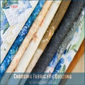
You’ll be amazed at how the right fabric choices can transform your quilt from ordinary to extraordinary, just like finding the perfect ingredients for your favorite recipe.
Whether you’re drawn to bold prints that make a statement or soft solids that whisper elegance, choosing your quilt fabric is your chance to express your unique creative voice.
Starting With Inspiration and Color Palette
Ever stared at your fabric stash wondering where to begin? Finding your perfect color palette starts with what catches your eye. Here’s how to kickstart your quilting journey:
- Snap a photo of something that makes you smile – maybe your garden or favorite mug
- Pull colors from a fabric print you absolutely love
- Check those tiny color dots along your fabric’s edge
- Browse Pinterest boards for color combinations that spark joy
Exploring Color Theory for Guidance
After finding your perfect inspiration piece, let’s tap into color theory to make your quilt sing.
Think of colors like musical notes – they work together to create harmony.
Warm colors (reds, oranges, yellows) bring energy, while cool colors (blues, greens, purples) calm things down.
Understanding color temperature helps you create quilts that match your mood, whether you’re going for cozy and inviting or fresh and serene.
Utilizing a Color Wheel for Color Combinations
A color wheel can open up endless possibilities for your quilting projects.
Think of it as your trusty sidekick in fabric selection, helping you create harmonious combinations that’ll make your quilts pop.
Here’s how to make the most of your color wheel:
- Pick analogous colors (three colors next to each other) for a subtle, cohesive look
- Choose complementary colors (opposite on the wheel) for bold contrast
- Try triadic colors for balanced vibrancy
- Experiment with split-complementary schemes for sophisticated depth
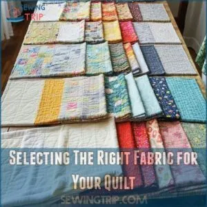
Selecting The Right Fabric for Your Quilt
You’ll find that choosing the right fabrics for your quilt is like putting together a winning recipe, where each print and color plays its own special role in creating something amazing.
Whether you’re drawn to bold, dramatic prints or soft, subtle patterns, you’ll discover that the key to success lies in mixing different scales and creating the perfect balance of light and dark fabrics that speak to your style.
Considering The Quilt’s Purpose and Theme
Before diving into fabric selection, carefully consider your quilt’s ultimate purpose and recipient.
Here’s a quick guide to match your project with the perfect fabric choices:
| Purpose | Fabric Considerations |
|---|---|
| Baby Quilt | Soft, washable materials |
| Wedding Gift | Elegant, heirloom-quality fabrics |
| Everyday Use | Durable, easy-care options |
| Holiday Decor | Seasonal prints and themes |
| Wall Hanging | Show-stopping statement pieces |
Think about durability, washing requirements, and whether it’ll be displayed or used daily.
Choosing Fabrics Based on Color and Scale
Why do some quilts catch your eye while others blend into the background? It all comes down to smart color and scale choices.
Think of your quilt like an orchestra – you need different instruments playing together harmoniously.
Here’s what makes fabric combinations sing:
- Choose a bold, large-scale print as your conductor
- Add medium prints for the melody
- Mix in small prints for harmony
- Include solids to give the eye a rest
Your fabric choices should dance together, creating rhythm through contrasting sizes and complementary colors.
Developing a Go-to Color Palette
Building a go-to color palette starts with understanding your favorite colors and how they make you feel.
Take a look at your wardrobe or home decor – these choices often reveal your natural color preferences.
If you’re drawn to ocean blues and sandy neutrals, embrace that coastal vibe in your quilting.
You’ll find that working with colors you naturally gravitate toward makes the creative process more enjoyable and leads to quilts you’ll cherish.
Understanding Fabric Selection and Mixing
You’ll feel like a fabric-mixing pro once you learn to blend prints of different sizes with just the right mix of light and dark shades.
Whether you’re working with florals, geometrics, or solids, you’ll discover that creating eye-catching contrast is as simple as snapping a black-and-white photo on your phone to check your fabric combinations.
Incorporating a Range of Large, Medium, and Small Prints
The secret to eye-catching quilts lies in mastering print sizes.
Like orchestrating a symphony, you’ll want to blend different scales to create visual harmony.
Here’s how to nail the perfect mix:
- Anchor your design with 1-2 large prints (6-12 inches) as focal points
- Layer in medium prints (2-4 inches) to bridge the gap
- Sprinkle small prints (under 1 inch) throughout to add depth
Think of it as building blocks – each size plays its unique role.
Ensuring Sufficient Contrast With Light, Medium, and Dark Fabrics
Utilizing free quilt design software like quilt design tools can help simplify the process of selecting fabrics by allowing you to visualize your quilt before stitching. Creating stunning quilts hinges on mastering the interplay between light, medium, and dark fabrics.
You’ll want to mix values strategically – think of it like composing a symphony where each note plays its part.
Start with your lightest fabrics as highlights, incorporate medium tones for balance, and use dark pieces to anchor your design.
When fabrics blend too closely, your pattern’s details can get lost in the mix.
Utilizing a Black and White Filter for Contrast Assessment
When your fabric choices seem uncertain, snap a quick photo and switch it to black and white mode on your phone.
This clever trick instantly reveals the contrast levels between your fabrics, helping you spot potential issues before they’re sewn into your quilt.
You’ll be amazed at how fabrics that look different in color can appear similar in grayscale, guiding you to make better design decisions.
Tips for Mixing and Matching Fabrics
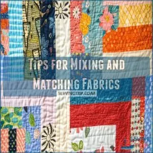
You’ll find that mixing and matching fabrics is like creating your own recipe, where you can combine different prints, colors, and textures to cook up something uniquely yours.
Just as you’d taste-test a new dish, you’ll want to experiment with fabric combinations using a test block first, letting you see how your chosen fabrics work together before committing to the full quilt.
Creating a Test Block for Color Placement and Quilting Techniques
Just like a chef samples their dish before serving, crafting a test block lets you preview your quilt’s potential.
You’ll want to cut small squares of your chosen fabrics and arrange them in your pattern’s layout.
To make sure the fabric holds up to the quilting process, consider pre-washing fabric for quilting, which helps prevent shrinkage and color bleeding.
This mini-version helps you catch color clashes, adjust fabric placement, and experiment with different quilting techniques before committing to your full project. By utilizing budget-friendly quilting materials like discount fabric stores, you can save money while still achieving the perfect color choices. – saving you time, fabric, and potential headaches down the road.
Considering Color and Fabric Placement for Pattern Highlighting
The magic of proper fabric grain and pattern placement is crucial for creating flawless designs that prevent distortion and misaligned seams. The magic of pattern highlighting comes alive through smart color and fabric placement.
Your test block might look great, but now it’s time to think about the bigger picture.
You’ll want to place darker fabrics strategically to make your secondary design pop.
Think of it like painting with fabric – each piece builds contrast and depth.
By playing with light and dark values, you’re creating visual pathways that guide the eye through your quilt’s story.
Experimenting With Fabric Combinations Without a Specific Project
Playing with fabric combinations without a project in mind lets your creativity flow freely.
Start by pulling fabrics that catch your eye and lay them together like you’re solving a puzzle.
You can even repurpose old fabric scraps for quilting, turning them into a unique aspect of your design.
Mix unexpected prints, swap colors in and out, and don’t worry about "rules."
Take photos of combinations you love – they’ll spark ideas for future projects.
It’s like having a fabric playground where you can experiment until something clicks.
Working With Pre-Curated Fabric Collections and Stash Building
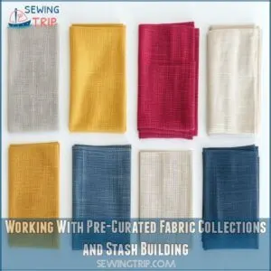
You’ll love how pre-curated fabric collections take the guesswork out of color matching, offering perfectly coordinated prints and patterns that work together like magic.
Building your fabric stash doesn’t have to feel overwhelming when you start with these designer bundles, which give you a solid foundation of colors and scales to mix and match with confidence.
Starting With a Curated Fabric Collection for Beginners
For beginners feeling overwhelmed by fabric choices, pre-curated collections are your quilting lifeline. Think of them as your personal color consultant, taking the guesswork out of matching prints and patterns. They’re designed to work together seamlessly, giving you a head start on creating stunning quilts.
- Each collection includes perfectly coordinated prints in varying sizes
- Colors are pre-matched for the best contrast and harmony
- Prints come in complementary shapes like dots, stripes, and florals
- Collections eliminate the stress of breaking design "rules
Choosing Fabrics Based on Color and Scale for Coordinated Palettes
Moving beyond pre-curated collections, let’s explore how to pair fabrics like a pro.
You’ll create stunning combinations by mixing colors and scales that complement each other perfectly.
| Scale Type | Visual Impact | Best Uses | Print Examples | Tips |
|---|---|---|---|---|
| Large | Bold statement | Focal points | Florals, geometrics | Limit to 1-2 per project |
| Medium | Balance | Supporting elements | Stripes, dots | Use 3-4 for harmony |
| Small | Texture | Background | Pin dots, specks | Add depth with 4-5 pieces |
| Blenders | Unity | Connectors | Tone-on-tone | Connect different prints |
| Solids | Rest points | Frames | Single color | Ground busy patterns |
Maintaining a Consistent Vibrancy in Colors
When maintaining color vibrancy in your quilt, think of it as orchestrating a visual symphony – every piece should sing in the same key.
You’ll want to stick with either warm or cool hues throughout your project, like keeping sunset colors with other sunset colors.
Mix different shades within your chosen color family, but keep the energy level consistent.
If you’ve started with bold, vibrant fabrics, don’t suddenly throw in muted tones.
Adding Visual Interest and Texture to Your Quilt
You’ll be amazed at how mixing fabrics of different scales and prints can transform your quilt from simple to stunning, just like adding spices to your favorite recipe.
Whether you’re working with bold florals or subtle textures, you’ll find that combining large-scale prints with smaller patterns creates the perfect balance of visual interest that’ll make your quilt uniquely yours.
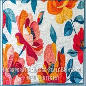
Incorporating Large-Scale Prints for Visual Interest
Large-scale prints can transform your quilt from nice to spectacular, but you’ll need a game plan for using them effectively.
Think of these bold beauties like the stars of your quilt show – they deserve the spotlight but shouldn’t steal every scene.
When selecting large prints, consider the fabric’s texture and drape as well, choosing the right natural fibers to create a cohesive look.
Try placing your large prints in focal areas where they’ll catch the eye naturally.
You’ll want to use them sparingly though, as too many competing patterns can overwhelm your design.
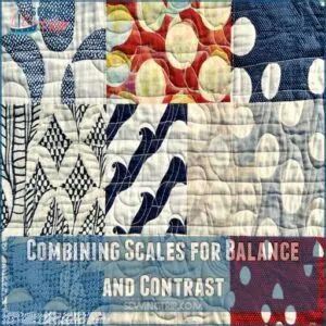
Combining Scales for Balance and Contrast
Balancing different print sizes in your quilt is like orchestrating a visual symphony.
Your large-scale prints shine brighter when paired with medium and small-scale patterns that complement rather than compete.
Think of it as creating a perfect playlist – you wouldn’t want all power ballads!
Mix in some tiny dots or delicate florals with your bold prints, and you’ll create that sweet spot where every fabric plays its part perfectly.
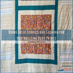
Using Solid Fabrics and Sashing for Neutralizing Busy Prints
Between those eye-catching prints in your quilt, solid fabrics and sashing work like a peaceful breather for your eyes.
You’ll love how they can tame even the wildest patterns while highlighting your favorite prints.
Here’s how to use them effectively:
- Frame busy prints with solid sashing to create distinct separation
- Choose neutral solids that complement your prints’ colors
- Use white or cream sashing to brighten bold patterns
- Add wider sashing strips for more visual rest
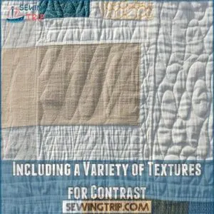
Incorporating Texture for Added Depth
You’ll love how mixing different fabric textures can transform your quilt from flat to fabulous, adding layers of visual interest that catch both light and attention.
Just like adding spices to your favorite recipe, you can blend smooth cotton prints with textured linens or woven materials to create a quilt that’s not just beautiful to look at, but also interesting to touch.
Including a Variety of Textures for Contrast
Three key texture combinations can transform your quilt from flat to fabulous. When you mix smooth cottons with textured linens or woven fabrics, you’ll create depth that catches both light and attention.
| Texture Type | Visual Impact | Best Uses | Mixing Tips |
|---|---|---|---|
| Smooth Cotton | Clean, crisp | Background | Pair with rough |
| Textured Linen | Rich, organic | Focal points | Mix with smooth |
| Woven Pattern | Dynamic, layered | Borders | Blend gradually |
| Printed Design | Bold, striking | Accents | Use sparingly |
Think of texture like seasoning in cooking – it’s the secret ingredient that makes everything pop.
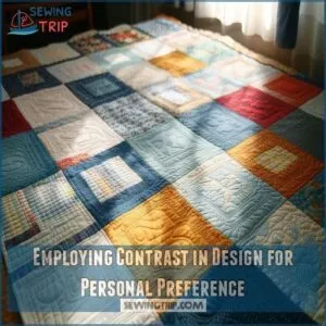
Employing Contrast in Design for Personal Preference
Your quilting journey is uniquely yours, and contrast preferences play a huge role in your design choices.
While some quilters love bold, high-contrast combinations that make patterns pop, others prefer subtle, tone-on-tone variations that whisper rather than shout.
When selecting fabrics, consider the benefits of natural fiber options like cotton and linen for breathability and ease of care.
There’s no right or wrong – it’s about what speaks to you.
Try playing with different levels of contrast in small test blocks to discover your sweet spot in texture and color combinations.
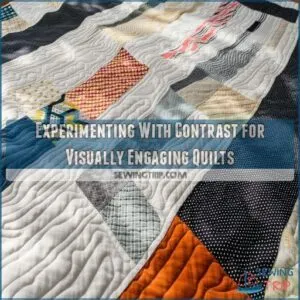
Experimenting With Contrast for Visually Engaging Quilts
Ready to experiment with contrast? Start by placing light and dark fabrics side by side, testing how they interact.
Mix bold patterns with subtle textures, like pairing a striking floral with a gentle crosshatch.
Try different scale combinations – a large geometric print next to tiny dots can create stunning visual impact.
Don’t be afraid to break traditional rules; sometimes the most unexpected combinations create quilts that truly sing.
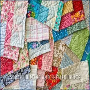
Scrap Quilting and Themed Quilts
You’ll find endless creative possibilities in scrap quilting and themed projects, where even those lonely fabric remnants can become stunning masterpieces.
Whether you’re working with a collection of cherished scraps or creating a themed quilt that tells a story, you’ll discover that the key to success lies in finding the right balance between variety and cohesion.
Defining Scrap Quilting and Its Guidelines
Diving into scrap quilting opens up a world of creative possibilities, where every fabric piece tells its own story.
You can use quilting fabric scraps from your stash or explore various online marketplaces like quilting fabric scraps to find unique additions.
While you don’t need fabrics that perfectly match, consider the overall impact of fabric weight and pattern alignment on your design, for example, calculating sew fabric can affect the look and feel of your quilt, aim for an overall mood that ties your design together.
Pay attention to contrast between neighboring pieces to make your pattern pop, and don’t feel obligated to use fabrics you dislike.
Sometimes, leaving out certain colors can actually create a more cohesive look.
Creating Themed Quilts With Focal Point Fabrics
If you’re thinking about themed quilts, start with a single stunning fabric that captures your vision perfectly.
Let’s say you’re making a dinosaur quilt – pick that perfect T-Rex print as your focal point, then build around it.
Consider the distinct techniques involved in quilting, like layering three fabric layers for warmth and insulation, as seen in traditional quilting techniques.
Look for fabrics that subtly support the theme, like black and white bone prints or textured browns for "dirt."
Remember, you don’t need every fabric to scream "dinosaur" – it’s all about creating harmony.
Avoiding Too Many Themed Fabrics for a Chaotic Look
Too many themed fabrics can turn your beautiful quilt into a chaotic mess, like trying to host a party where everyone’s talking at once. You’ll want to maintain visual harmony by carefully selecting complementary prints that enhance your focal fabric without overwhelming it.
- Mix one main themed fabric with two supporting prints
- Add subtle texture through small-scale patterns
- Include solid fabrics as design breathers
Remember, your quilt’s theme should whisper, not shout – let each fabric play its part in the story.
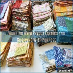
Working With Precut Fabrics and Shopping With Purpose
You’ll love how precut fabric bundles take the guesswork out of coordinating colors and patterns, giving you perfectly matched pieces that work together like best friends at a quilting bee.
When you’re ready to expand beyond precuts, you’ll discover the joy of purposeful fabric shopping, where each piece you select builds a stash that’s both practical and inspiring for your quilting adventures.
Understanding Precut Fabrics and Their Convenience
Starting with precut fabrics feels like having training wheels on your quilting journey. These convenient bundles come pre-coordinated in specific sizes, taking the guesswork out of fabric selection.
When working with fabric, understanding its properties, such as fabric recovery techniques, is crucial for selecting the right material for your project, especially when working with precut fabrics, it’s important to pay attention to the fabric handling for quilting techniques to make sure your project turns out as desired.
While they’re perfect for beginners and quick projects, they can limit your creative expression and cost more than buying yardage.
Think of them as your quilting starter pack – great for building confidence before branching out into more adventurous fabric combinations.
Shopping for Fabrics With a Specific Purpose in Mind
Smart quilters always shop with clear project goals in mind, helping you stay focused and avoid impulse buys.
Before hitting the fabric store, jot down your project requirements, including yardage needs and budget limits.
Keep a small swatch of your main fabric in your wallet for perfect matching, and don’t forget to snap photos of potential combinations.
This targeted approach guarantees you’ll bring home exactly what your quilt needs.
Avoiding Stash Building for a Cohesive Fabric Collection
Building a fabric stash without a plan can leave you with a chaotic collection that rarely works together.
Instead of impulse-buying pretty prints, consider these strategic approaches:
- Set specific fabric goals based on upcoming projects
- Join local fabric swaps to refresh your collection
- Document your existing fabrics with photos or swatches
- Schedule quarterly stash purges to maintain organization
When shopping, bring swatches of fabrics you already own to make sure new purchases coordinate perfectly with your collection.
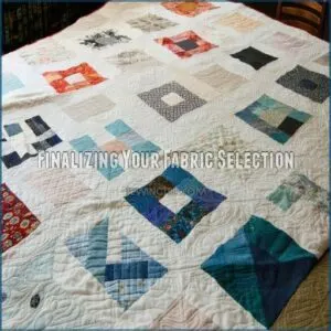
Finalizing Your Fabric Selection
You’ve spent hours picking fabrics, and now it’s time to trust your creative instincts to make those final choices for your quilt.
While you might feel tempted to second-guess your selections, remember that the fabrics you’re naturally drawn to will create a quilt that’s uniquely yours.
Trusting Your Judgment for a Quilt You Love
You’ve gathered your precuts and materials, but now comes the fun part – trusting your creative instincts.
Remember, quilting isn’t about following rigid rules; it’s about expressing your unique vision.
Consider exploring websites like quilt fabric bundles to spark inspiration and discover new combinations.
Here’s a quick guide to boost your fabric confidence:
| Feeling | Trust It When | Ignore It When |
|---|---|---|
| Excitement | A fabric combo makes you smile | Others say it’s "too bold" |
| Doubt | Something feels off | You’re comparing to Pinterest |
| Curiosity | You want to try something new | Fear holds you back |
Don’t second-guess those happy accidents – some of the most stunning quilts come from unexpected combinations.
Your instincts are your best guide, and that inner voice saying "this works" is usually right.
Creating a Cohes
Like a master chef assembling ingredients, creating a cohesive fabric collection requires patience and vision.
Start by laying out your chosen fabrics on a neutral surface, stepping back to view them from different angles and lighting conditions.
You’ll want to make sure there’s a natural flow between colors, prints, and textures.
Don’t be afraid to swap pieces in and out until everything clicks – trust your instincts when something feels off.
Remember, fabric harmony isn’t about perfect matching; it’s about creating a balanced composition that tells your story.
Take photos of your final arrangement to reference while working on your quilt.
Frequently Asked Questions (FAQs)
How do I choose a quilt fabric?
Ready to make your quilt pop?
Start with one fabric you love, then mix large and small prints in light and dark shades.
Test combinations in natural light, and don’t forget to include a solid for balance.
What fabric should I choose for my quilt?
Start with a vibrant print you love as your main fabric, then pick coordinating fabrics in light, medium, and dark shades.
Mix different scales of prints and include a solid for balance and visual rest.
How do I choose a fabric for a baby quilt?
Pick soft, washable cotton fabrics in cheerful colors and simple patterns.
You’ll want medium-scale prints that aren’t overwhelming, plus a mix of light and dark tones.
Consider gender-neutral options for versatility.
How do I choose a quilt pattern?
Like choosing a dance partner, find a pattern that matches your skill level and style.
Consider the quilt’s purpose, your time constraints, and start with beginner-friendly designs if you’re new to quilting.
How do I choose a quilt color scheme?
Draw inspiration from your favorite photos, existing prints, or nature to build your color scheme.
Consider mixing contrasting shades with a focal fabric as your guide.
Don’t forget to include light and dark values.
How do you make a good quilt?
Start with quality fabric and a simple pattern you love.
Focus on accurate cutting and consistent seam allowances.
Build your skills through practice, and don’t rush the process – quilting’s about enjoying every stitch.
How do you choose fabric for a quilt?
Building your quilt’s palette is like painting a canvas.
Choose a main fabric you love, then mix in complementary prints and solids.
Balance light and dark tones, varying print sizes for visual interest.
How can you tell good quality quilting fabric?
When choosing fabric for quilting, consider the ideal characteristics of quilting cotton, structured and durable quilting cotton, which helps prevent stretching and wrinkling. Check fabric quality by feeling its weight and density – quality quilting cotton feels crisp yet smooth.
You’ll notice tighter weave patterns, minimal fraying when cut, and colors that don’t bleed during washing.
How many different fabrics should you use in a quilt?
Perfectly plan your patchwork with 5-15 fabrics for a starter quilt.
You’ll want enough variety to create interest, but not so many that it’s overwhelming.
For scrap quilts, you can use 30+ fabrics.
How to match fabrics for quilts?
Start with a focus fabric you love, then pull coordinating prints in varying scales – large, medium, and small.
Mix light and dark values for contrast, and don’t forget to include a solid for balance.
How do seasonal trends affect fabric choices?
Seasonal trends influence your fabric choices through colors and motifs.
You’ll notice autumn brings warm tones and leaf patterns, while spring features pastels and florals.
Winter showcases cool hues and holiday themes.
When should I pre-wash quilting fabrics?
Pre-wash your quilting fabrics when using dark colors, vintage materials, or fabrics that might bleed.
Pre-washing is not necessary if you’re working with pre-cuts or plan to achieve a crinkled look.
Embrace the natural aging process.
What fabrics work best for outdoor quilts?
Tough as nails and ready for Mother Nature’s mood swings, outdoor quilts shine with water-resistant fabrics like Sunbrella, polyester canvas, or marine-grade materials.
They’ll keep their color and won’t get musty.
How to test fabric colorfastness before quilting?
Cut a small fabric swatch and soak it in hot water with regular detergent.
Blot with white paper towels to check for bleeding.
If colors run, pre-wash your fabric separately before quilting.
Which backings pair well with lightweight fabrics?
For lightweight fabrics, you’ll want to pair them with muslin, lightweight cotton, or batiste backings.
These options provide stability without overwhelming your delicate top fabrics, keeping your quilt balanced and beautiful.
Conclusion
Like a painter selecting their perfect palette, mastering tips for selecting fabric for quilting transforms your creative vision into reality.
You’re now equipped with the knowledge to confidently mix prints, balance colors, and create stunning quilts that tell your unique story.
Remember, there’s no wrong choice when you trust your instincts and follow these guidelines.
Whether you’re starting with precuts or diving into your stash, each fabric selection is a step toward crafting something truly memorable.

