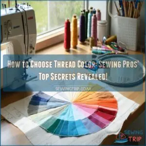
This site is supported by our readers. We may earn a commission, at no cost to you, if you purchase through links.
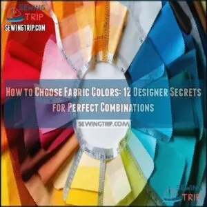
You’ll want to take into account your space’s lighting, as those perfect blues can look completely different under fluorescent versus natural light.
Pick a foundation color you love, then build complementary or analogous colors around it.
Don’t be afraid to test swatches in your actual environment—what looks harmonious in the store might clash at home.
Remember that neutrals (beiges, grays) play well with nearly everything, while bold colors make statements.
The magic often happens when you balance contrast with cohesion, much like orchestrating a visual symphony where every hue has its role.
Table Of Contents
Key Takeaways
- You’ll make better fabric choices by starting with a foundation fabric you love, then building complementary colors around it, using the color wheel as your guide to find harmonious combinations.
- You’ll need to consider lighting conditions when selecting fabrics, as colors can appear dramatically different under natural versus artificial light, so always test swatches in your actual environment.
- You’ll create more visually interesting projects by understanding fabric value (lightness/darkness) and incorporating contrast, which matters more for visual impact than the specific colors you choose.
- You’ll gain confidence in your selections by studying color schemes like monochromatic, complementary, and analogous combinations, or by using designer-curated collections that take the guesswork out of coordination.
Fabric Color Basics
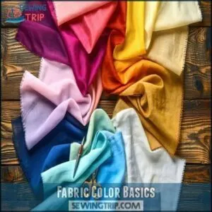
You’ll discover the secret language of fabric colors once you understand the basics of primary, secondary, and tertiary hues and how they create harmony on your projects.
Just like you wouldn’t mix plaids with polka dots without careful consideration, you’ll need to grasp color vocabulary and relationships to create combinations that wow rather than wince, which is key to understanding the secret language of fabric colors.
Mastering fabric colors unlocks endless creative possibilities, turning ordinary projects into visual symphonies that sing with harmony and intention.
Without careful consideration, mixing plaids with polka dots is like speaking two languages at once—you need color’s secret language to create harmony rather than chaos.
Primary and Secondary Colors
The building blocks of fabric color selection rest on understanding primary and secondary colors. When you’re choosing fabric colors, start with these fundamentals:
- Red, yellow, and blue form the primary color trinity – think of them as fabric’s DNA
- Mixing primaries creates secondary colors: orange, green, and purple
- Color intensity varies depending on proportions used in mixing
The combination of these colors offers a wide range of possibilities for your designs, including secondary variations that provide infinite possibilities for your quilts.
Additionally, color psychology suggests that blues calm while reds energize your designs, making the choice of fabric colors a crucial aspect of the design process.
Tertiary Colors and Harmonious Combinations
Tertiary colors—those color-wheel gems like red-orange and blue-green—create magic in your quilting projects.
When you mix a primary with a secondary color, you’ll discover these subdued accents that bring harmony to your fabric combinations. They’re not as bold as primaries but offer more complexity and interest.
For natural tertiary harmony, place these colors strategically between their "parent" colors. Understanding color wheel basics is essential for effective color selection.
Most quilting masterpieces use tertiary dominance for sophisticated color combinations that won’t overwhelm your design.
Color Vocabulary and Definitions
Mastery of color vocabulary transforms your quilting journey.
When discussing fabric colors, remember: hue is a pure color without white, black, or gray added; tint results from adding white to lighten; shade comes from adding black to darken; tone emerges when adding both black and white; and value describes relative lightness or darkness compared to surrounding colors.
Understanding these terms helps you communicate clearly and make confident fabric selections.
"That’s not purple—it’s a lavender tint!
Choosing Fabric Colors
You’ll stop feeling overwhelmed by fabric options when you understand the simple science behind color combinations that work every time.
Whether you’re creating a quilt that pops with contrast or flows with harmony, choosing the right fabric colors starts with identifying a foundation piece.
Building relationships around it using the trusty color wheel as your matchmaker is key to making the right choices.
Selecting a Foundation Fabric
Now that you understand color fundamentals, it’s time to pick your foundation fabric. This dominant fabric serves as your quilt’s anchor, guiding all other fabric color choices.
Look for a print you absolutely love, then start color pulling from it. You don’t need exact complementary shades—just ones that harmonize well.
Limit yourself to one or two foundation fabrics to avoid overwhelming your design. The right foundation quantity makes your fabric selection process much smoother.
Getting Inspiration From Color Wheels
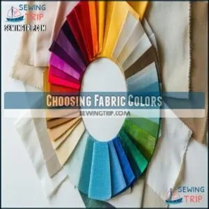
With a good color wheel in hand, you’ll never feel lost in a sea of fabric choices again.
Color wheels reveal perfect color relationships that transform chaotic selections into masterful combinations.
They’ll help you analyze fabric prints by showing which hues naturally complement each other.
When you’re stuck, just consult your wheel to find harmonious schemes or exciting contrasts.
Color theory isn’t just for artists—it’s your secret weapon for quilt color inspiration, and with it, you can create masterful combinations.
Considering Personal Style and Preferences
Your personal style is the compass that guides your fabric color choices. Trust your intuitive choices rather than following rigid rules.
- Create a "color journal" to track your evolving preferences and successful combinations
- Display fabric samples in different lighting before committing
- Mix one unexpected color into your palette to build confidence in breaking rules
- Start with colors you naturally gravitate toward in your wardrobe or home
Quilting Color Schemes
You’ll find your quilting project transforms from a fabric jumble to a masterpiece when you understand key color schemes like monochromatic, complementary, and triadic combinations.
Just as a chef knows which flavors work together, you’ll learn to pair colors that create harmony or striking contrast, making your quilt sing instead of shout.
Monochromatic and Complementary Schemes
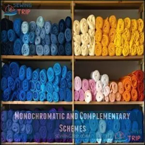
A quilter’s easiest entry point to color theory is through monochromatic and complementary schemes.
For single-color harmony, choose varying shades and tints of one color—like navy, royal, and sky blue.
It’s like painting with one color and just adding white or black.
Complementary colors (opposites on the color wheel) create high contrast effects—think purple and yellow or blue and orange.
These "opposite attracts" combinations create color dominance that makes your quilt pop, utilizing the principle that opposites on the color wheel attract.
Analogous and Triadic Color Combinations
Frequently, quilters discover that analogous and triadic color combinations reveal endless creative possibilities.
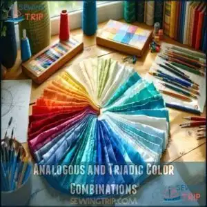
Analogous harmony creates a gentle flow using colors that sit side-by-side on the wheel, like blue, blue-green, and green.
Three key points about these schemes:
- Analogous colors create soothing, cohesive quilts without jarring shifts
- Triadic balance uses three colors evenly spaced on the wheel for vibrant contrast
- Wheel spacing determines the scheme’s visual impact and versatility
Split-Complementary and Spectrum Schemes
Two powerful color schemes can transform your quilting projects.
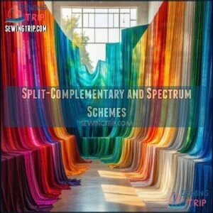
Split-complementary schemes use a base color plus two colors adjacent to its opposite, creating Visual Harmony with less tension than pure complementaries.
| Scheme Type | Vibrancy Level | Best Used For |
|---|---|---|
| Split-Complementary | Medium-High | Modern quilts |
| Spectrum | Very High | Art quilts |
| Rainbow Gradient | High | Show pieces |
Spectrum schemes incorporate the entire color wheel for maximum Fabric Palette expression.
I like to call them "color parties" where every hue gets an invitation, creating a unique quilting experience.
Fabric Selection Techniques
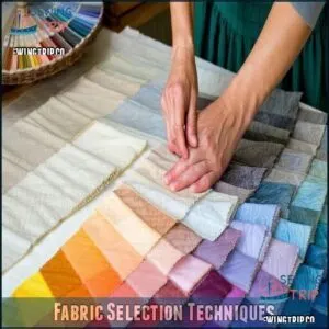
You’ll save hours of frustration when you master these fabric selection techniques that professional designers use daily.
From choosing curated collections to understanding contrast values, these methods will transform your next quilting project from a color gamble to a guaranteed showstopper.
Using Designer Curated Fabric Collections
For quilting newcomers and veterans alike, designer curated fabric collections offer a lifesaver when color choices feel overwhelming.
These pre-coordinated palettes feature built-in contrast and collection variety, taking the guesswork out of fabric coordination. You’ll save time while gaining beginner confidence through harmonious designs that professional textile designers have already perfected.
It’s like having a color expert in your pocket—no need to stress about fabric choices when you can rely on these thoughtfully assembled fabric color combinations.
To guarantee sufficient contrast, use a black and white filter to assess values, ensuring a harmonious design with the right level of visual appeal.
Choosing Fabrics by Color Family and Scale
While designer collections make fabric selection easy, exploring your own color family choices adds personal flair.
When selecting fabrics, consider both color and scale for visual balance:
- Choose a dominant color family and add 1-2 accent colors
- Mix small, medium, and large print sizes in equal proportions
- Include texture variations like batiks alongside smooth cottons
- Maintain 60% dominant color, 30% secondary, 10% accent
- Arrange fabrics by scale before purchasing to check harmony.
Understanding fabric color trends can further refine your choices and help achieve visual balance.
Considering Fabric Value and Contrast
Beyond selecting colors by family, understanding fabric value is like having a secret weapon in your quilting arsenal.
Value—how light or dark a fabric appears—creates the contrast that makes patterns pop.
Try using a Value Finder Tool (or simply squint at fabrics) to identify light, medium, and dark values.
Remember, a medium value fabric appears light next to dark fabrics and dark next to light ones.
This contrast creates visual interest that simplifies selection and elevates your designs.
Many quilters find a fabric value finder helpful for this process.
Color Inspiration Sources
You’ll find color inspiration in the most unexpected places, from stunning sunset photos on your phone to that vintage teacup collection gathering dust in your grandmother’s china cabinet.
When you’re stuck in a fabric selection rut, simply look around at the world’s natural color palettes and designer-curated combinations that surround you every day, and find color inspiration.
Online Platforms and Color Palette Websites
While expert fabric collections offer convenience, the digital world opens a treasure trove of color inspiration.
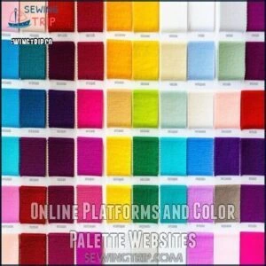
Websites like Coolors.co and Adobe Color CC let you generate endless fabric color ideas with just a spacebar tap. Khroma uses machine learning to personalize color matching based on your preferences.
For quilt-specific inspiration, Paletton offers harmonious combinations using the traditional RYB color wheel. Realtime Colors even lets you visualize your virtual swatches on actual website layouts!
You can also find various color tools online for purchase, which can be a great resource to explore digital color options.
Interior Designer Color Palettes and Paintings
From professional interior designer color palettes, you can discover fabric combinations that flow seamlessly throughout your home.
These expertly curated schemes offer tested color psychology for perfect mood creation.
Try these palette inspiration techniques:
- Grab paint chips from home improvement stores and arrange them with your fabric swatches
- Study artwork analysis from favorite paintings to extract harmonious color coordination
- Take photos of designer showrooms for room harmony ideas
When choosing fabrics, remember to keep in mind sustainability factors for environmental consciousness and consider the overall color psychology to ensure perfect mood and harmony in your home.
Vintage Items and Nature-Inspired Colors
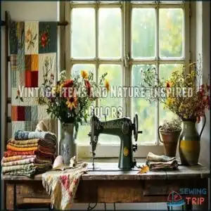
From the faded elegance of Antique Textiles to the timeless charm of Retro Palettes, vintage items offer a treasure trove of fabric color inspiration.
Vintage treasures whisper color secrets from the past, offering timeless palettes waiting to be rediscovered in your next project.
You’ll find delightful color combinations in grandmother’s quilts, old postcards, and 1950s kitchen appliances.
Similarly, nature’s Botanical Hues provide perfect fabric color schemes—photograph autumn leaves, spring flowers, or sunset skies.
Even Found Objects like seashells and Natural Dyes can spark unexpected yet harmonious vintage quilt colors.
Applying Color Theory
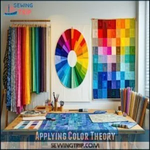
You’ll find fabric selection much less overwhelming when you apply simple color theory principles, transforming what feels like guesswork into confident choices based on color wheel relationships.
With the right knowledge of complementary, analogous, and triadic combinations at your fingertips, you’ll create quilt palettes that look like they were designed by a pro, even if you’ve previously just grabbed fabrics that "looked good together.
Using The Color Wheel for Harmonious Combinations
With all those color inspiration sources in mind, let’s put theory into practice.
The color wheel is your quilting compass for harmonious combinations, whether you prefer the RYB wheel based on paint pigments or the RGB wheel that mimics light perception.
Both help you analyze fabric prints and create stunning pairings by understanding color relationships—complementary, analogous, or something in between—you’ll move beyond copying to confidently inventing your own signature combinations that wow.
Creating Visual Interest With Fabric Value and Contrast
Beyond simply selecting beautiful colors, understanding fabric value creates the magic in your quilts.
Use value finder tools (like red filters) to determine if fabrics are light, medium, or dark.
Remember, fabric contrast levels matter more than actual colors, and medium value fabrics can appear light next to dark pieces and vice versa.
For visual depth creation, pair various values strategically, as the color relationships and visual contrast will transform your quilt from flat to fascinating.
Tips for Selecting Fabrics With Confidence
You’ll develop color confidence when you trust your instincts rather than following rigid rules.
Embrace these fabric color tips to select combinations with ease:
- Start with one fabric you absolutely love and build around it
- Squint at fabrics to see how values (light/dark) interact rather than focusing on specific colors
- Create a mini test block before committing to your entire project
Remember, personal expression matters most—embrace imperfection and experiment freely.
To guarantee sufficient contrast, try using a black and white filter.
Frequently Asked Questions (FAQs)
How do you choose a quilt fabric?
Like selecting the perfect puzzle piece, choose quilt fabric by starting with a foundation print you love.
Then pull complementary colors from it. Consider your style, the pattern’s needs, and how values (light/dark) create contrast.
How do I Choose fabric colors?
Select a foundation fabric you love, then pull colors from it for your palette.
Consider using a color wheel to find complementary or analogous combinations.
Trust your instincts—if it pleases your eye, it works!
How do I choose a fabric for a project?
Ah, fabric shopping—where you’ll spend hours fondling textiles while questioning life choices!
Consider your project needs, match colors to your style, and test swatches in different lighting before committing to your fabric relationship.
Do you need a color chart for fabric?
A color chart isn’t essential for fabric selection, but it’s incredibly helpful.
You’ll find it easier to visualize combinations, identify complementary colors, and make confident choices without second-guessing your fabric pairings, which will help you make confident choices.
How do I choose a quilt color?
Begin with a foundation fabric you love, then pull colors from its design.
Consider your personal style, use the color wheel for harmonious combinations, and don’t forget to mix values for visual interest.
How do you choose a patterned fabric?
Choose a patterned fabric that speaks to you, then pull colors from it for coordinating pieces.
Squint to identify dominant hues and consider scale—small prints work differently than large ones when paired together.
How do seasonal trends affect fabric selection?
Seasonal trends introduce new color palettes that you’ll find readily available in stores.
You can follow these trends for contemporary quilts or mix them with timeless fabrics for a unique, personalized look.
How to adapt colors for different lighting conditions?
Test fabrics in your actual quilting space as lighting dramatically affects how colors appear.
Natural daylight shows true colors, while artificial lighting can make blues appear greenish and yellows more muted.
Consider portable light boxes when shopping.
Can colorblindness impact fabric color choices?
Yes, colorblindness affects how you perceive fabric combinations.
You’ll need to rely on values (light/dark contrast) rather than hues, or use digital tools that simulate how your quilt will appear to you.
How to photograph fabrics for accurate colors?
Natural daylight works best for capturing true fabric colors.
Use a neutral background, disable flash, and adjust white balance on your camera.
You’ll get much more accurate results than with artificial lighting.
Conclusion
Perfectly paired patterns and pleasing palettes await when you know how to choose fabric colors confidently.
Remember, your personal preferences matter most—trust your instincts while applying these design principles.
Whether you’re quilting, upholstering, or crafting, the right color combinations create spaces that feel uniquely yours.
Test swatches, play with contrast, and don’t fear experimenting.
Your fabric choices tell your story, so make them intentional.
Now go create something beautiful with your newfound color wisdom!
- https://www.eobquiltdesign.com/blog2/fhea8mywhdrtpbtxgf6cgmrw6e2pmn
- https://www.stringandstory.com/blog/fiveandsixcolorquilts
- https://www.diaryofaquilter.com/choosing-fabric-for-a-quilt/
- https://www.incolororder.com/2011/01/art-of-choosing-recognizing-fabrics.html
- https://www.quora.com/How-do-you-choose-a-colour-style-and-fabric-that-works-for-you

