This site is supported by our readers. We may earn a commission, at no cost to you, if you purchase through links.
Grab a spool without thinking, and you’ll pay for it later—thread that’s a shade off practically screams "homemade" in the worst way. Fabric never lies flat under bad lighting or wrong undertones, and that mismatch shows up the second sunlight hits your seam. Your sewing thread color choices matter way more than pattern or price tag.
Here’s the good news: this isn’t guesswork. Once you get warm and cool undertones, thread weight, and a few color wheel basics, matching becomes second nature. Grab your fabric scraps—you’re about to make thread selection your new superpower.
Table Of Contents
Key Takeaways
- Match your fabric’s undertone (warm or cool) and choose a shade slightly darker than the fabric to hide stitches without deadening the color.
- Always test thread on fabric scraps first, checking colorfastness, seam behavior, and color value under consistent daylight before committing.
- Use color theory—complementary, analogous, monochromatic, triad, or split-complementary schemes—to decide whether your thread should blend in or make a statement.
- Match thread type and weight (polyester, cotton, rayon, metallic) to your fabric’s texture and finish, since bulk and sheen change how color reads.
How to Choose Sewing Thread Color
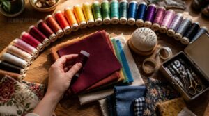
Picking thread color isn’t just eyeballing a spool and hoping for the best. There’s a real method to it, and once you know the tricks, you’ll never second-guess yourself at the fabric store again. Here’s exactly how the pros nail it every time.
If you want a deeper dive into matching shades for visible seams, this guide on how to choose thread color for top stitching breaks down the pros’ go-to techniques.
Match or Contrast
Want your seams to whisper or shout? That’s the whole game here.
Matching thread creates a smooth look—polished, traditional, safe. Contrasting colors bring bold visual interest through complementary color pairing or texture contrast.
Try subtle edge techniques: place accent color only at cuffs or hems. That’s color balance with a wink, not a shout.
Choose Slightly Darker Shades
Here’s a trick that beats true black every time: go a shade darker than your fabric, not darker still.
- Reduces stitch contrast on pale fabrics
- Adds subtle visual weight without shouting
- Hides lint along seams
- Preserves fabric texture
- Defines curves smoothly
Your seams show up—just don’t steal the spotlight.
Match Fabric Undertones
Getting the shade right isn’t enough if the undertone fights back. Identifying warmth versus coolness in your fabric first saves you from muddy results later.
Warm undertones (yellow, gold) pair with warm thread. Cool undertones (blue, gray) need cool matches. Check in daylight—lighting shifts can trick you. Grab a reference card for testing, and keep fiber balance in mind when mixing materials. To make sure everything is accurate, try matching color values to see how lightness or darkness affects the shade.
Test on Fabric Scraps
Undertones only get you so far—a scrap test seals the deal. Sew a quick line of stitches on your fabric scrap and see how the thread really behaves once it’s embedded.
While you’re at it, run a colorfastness rub test with a damp cloth. No transfer? You’re golden. Check seam slippage too—tug gently. Scraps don’t lie!
Check Color Value
Ever squint at two "matching" colors and still feel off? That’s value playing tricks on you—it’s about lightness, not hue.
- Try a grayscale comparison: squint or snap a black-and-white photo
- Check value against a neutral gray card
- Watch lighting effect variables shift perception
- Reassess after pressing—heat alters value
Value affects contrast more than color itself. Nail that, and accuracy follows.
If you’re unsure where to start, this guide to choosing embroidery thread shades by value breaks down how to spot light-to-dark differences before worrying about hue.
Matching Thread Color to Fabric
Every fabric has its own personality, and your thread needs to play along. Solids, prints, textures, pastels, and darks each throw a different curveball. Let’s break down how to handle each one.
Solid Fabric Colors
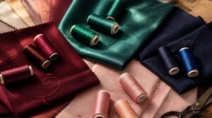
Solid colors are the easiest test for your color-matching skills—no prints, no texture tricks, just pure hue and value doing all the work.
| Factor | Why It Matters |
|---|---|
| Value depth | Prevents muddy contrast |
| Fabric finish | Matte deepens, satin brightens |
| Undertone shifts | Changes look under light |
Match thread to fabric finish, not just color name—glossy sateen reads brighter than matte cotton in the same shade.
Patterned Fabric Prints
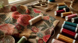
What do you do when a fabric throws five colors at you at once? Pick the background hue or the most dominant color in the print—that’s your anchor.
For busy motifs, match the ground color, not a random accent. Multicolor prints need real color management, so test scraps first. When patterns get wild, neutral thread often keeps color coordination sane and stitches invisible.
Textured Fabric Surfaces
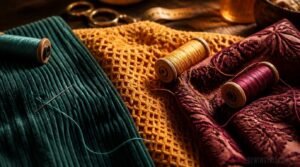
Bumpy fabrics play games with light, so your thread needs to keep up. Waffle weaves and corduroy bounce shadows across the surface—match thread weight to that texture, not just color. Too fine, and stitches vanish into the relief. Too heavy, and you fight the fabric’s natural bounce.
Cotton pique or jacquard motifs? Test scraps first. Texture always changes how color reads.
Light and Pastel Fabrics
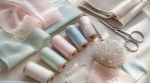
Pastels whisper instead of shout, so your thread needs a light touch too. These desaturated dyes create soft mint, blush, and powder tones with higher color value—think airy, not bold.
- Match thread undertones softly
- Pick lightweight, breathable threads
- Let sheer diffusion guide you
- Choose neutrals like ivory or taupe
For sheer cotton voile or linen, test scraps first. Bright thread overwhelms; soft blending wins every time.
Dark Fabric Colors
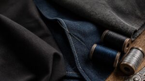
Black isn’t just black—it’s got secrets. Navy, charcoal, and true black all hide subtle undertones that shift under different lights.
| Fabric | Best Thread | Watch For |
|---|---|---|
| Black cotton | Jet black | Warm undertones |
| Navy denim | Navy/indigo | Blue-purple shift |
| Charcoal wool | Cool gray | Fading in sun |
Match undertones carefully—dark fabrics reward precision, not guesswork.
Using Color Theory for Thread Choices
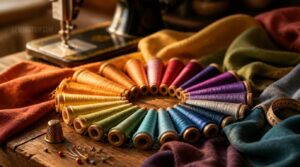
Ready to think like a designer instead of just a stitcher? The color wheel isn’t just for paint—it works wonders on thread too. Here’s how each scheme can level up your next project.
Complementary Color Schemes
Ever want a design that practically shouts "look here"? Grab colors straight across the color wheel. Complementary pairs create vibrant contrast—red thread on green fabric, blue on orange. That’s mood-shifting opposites in action.
Keep hue intensity balance in check though: let one color dominate around 60-70%, accent with its partner. Visual tension management is the real skill—too much, and your seams scream instead of sing!
Analogous Thread Palettes
Want things to look good together instead of tension? Pick neighbors, not opposites. Choose a base hue, then grab the two colors sitting right beside it on the wheel—like teal, blue, and blue-violet.
Keep the temperature consistent (all warm or all cool), and vary lightness so one thread pops, one sits midtone, and one stays deep. That’s your smooth, well-matched trio.
Monochromatic Sewing Designs
Sticking to one color? That’s not boring, it’s smart. Tonal value depth does the heavy lifting—light to dark shades of a single hue create real dimension. Mix textures too: satin against matte adds texture contrast effects and light reflection shifts.
Stitch rhythm, motifs, even topstitching stay unified, giving you that clean, polished look without a single color clash.
Triad Color Combinations
Ready for bold moves? Triads pick three colors sitting 120 degrees apart on the color wheel—way punchier than complementary pairs. Think red, blue, yellow: think toy branding, playful energy!
Use triad hue spacing for geometric color blocks on collars or pockets. Balance values so nothing overpowers. Lighting shifts perception, so test swatches first. Cultural color meanings matter too—choose wisely for the vibe you’re after.
Split Complementary Accents
Split complementary accents give you drama minus the clash. Pick a base color, then grab the two hues flanking its opposite—instant color balance. Keep accents lighter, saturated just enough to pop.
Follow the 60-30-10 rule: base fabric, one accent for trim, one for stitching details. Alternate placement for rhythm, and always balance warm against cool for mood modulation that feels intentional, not accidental.
Thread Type, Weight, and Color Finish
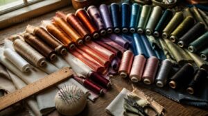
Color isn’t the only thing that matters here. The thread itself—its material, weight, and finish—changes how that color actually looks on your fabric. Let’s break down what each type brings to the table.
Polyester All-purpose Thread
Polyester all-purpose thread is your workhorse. Its synthetic fiber durability and inner spun strength handle everyday wear, while moisture resistance keeps mildew away. Lint reduction means smoother stitching, and that high sheen finish adds subtle polish.
For thread color matching, stick with neutral thread colors—they mix across cotton, synthetics, and mixes without a mixes without a hitch!
Cotton Thread Colors
Cotton thread brings serious color depth—think 100 to 500 shades per brand, from bold primaries to rich natural earth tones. Mercerized versions add subtle sheen for extra pop.
Want variety? Variegated cotton transitions shift hues mid-spool for cool effects. Some brands even offer specialty glow finishes.
For sturdy cotton thread on quilts or garments, matching thread to fabric keeps seams invisible and stitches sharp.
Rayon Embroidery Thread
Want that showstopper shine? Rayon’s your answer. This regenerated cellulose fiber gives silk-like luster and a softer hand, so satin stitches lay flat and glow.
- Vivid, saturated colors even in dark hues
- Uniform dye uptake for consistency
- Smooth surface reduces friction while stitching
Watch tension closely and skip high heat when pressing—rayon’s gorgeous, but it demands gentle care.
Metallic Thread Effects
Metallic thread turns plain stitching into pure eye candy. Gold and silver wraps deliver bright reflective surfaces, while iridescent finishes shift color as light moves, adding a rainbow sheen. On dark fabrics, that reflective light contrast really pops!
Use titanium needles and lighter presser pressure to avoid shredding. A little maintenance keeps that sparkle alive—handwash, air dry, and skip harsh heat.
Heavy Versus Fine Thread
Thick or thin, thread weight changes everything about how color reads on fabric.
- Thread bulk shows color bolder, so heavy thread looks more saturated
- Bigger needle sizing prevents fraying and keeps stitches clean
- Watch tension balance to dodge fabric pucker on denim or canvas
- Fine thread suits thread and needle compatibility with delicate weaves
Match thread strength to fabric density, and stitch visibility takes care of itself!
Keeping Thread Colors Consistent
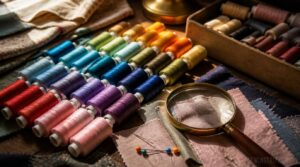
Picking the perfect thread is only half the battle. The real test comes later, when lighting, washing, and storage all get a say. Here’s how to keep your color match solid from spool to finished seam.
Buy Matching Dye Lots
Ever grab two spools that look identical in the store, then hate them together at home? That’s dye lot drift. Buy all your thread in one order—same batch, same recipe, zero surprises.
Always ask suppliers for the dye lot number. It’s your traceability lifeline for reorders.
| Check | Why | Action |
|---|---|---|
| Batch number | Verifies dye run | Record it |
| Lighting | Reveals true color | Test in daylight |
| Yardage | Prevents shortages | Buy extra |
Use Physical Color Cards
Screens lie. Physical color cards don’t.
A screen can lie about color, but a physical thread card never will
Get your hands on real thread swatches and lay them right against your fabric. Tactile comparison beats screens every time. Organize cards by hue in a labeled binder—laminated ones resist smudges and last for years.
Wipe patches clean with a soft cloth to stop drift from oils and lint. Accuracy stays sharp that way.
Check Lighting Conditions
Clean cards mean nothing under bad light. That fluorescent bulb over your machine? It’s shifting cool, making warm thread look off.
Stick to one light source—mixing daylight and lamps creates conflicting color cues. Aim for neutral white, 5000K-6500K, with even brightness.
- Avoid glare on swatches
- Skip mixed temperatures
- Check for even shadows
- Test under a gray card
Consistent light equals accurate matches, every time.
Test for Colorfastness
Good lighting gets you a perfect match today. But will it last through laundry day?
Colorfastness testing is your insurance policy. Wash a scrap, check for fading or dye bleed onto neighbors. Rub it dry and wet—crocking transfer signals trouble on denim or bright prints. Sweat and solvent exposure matter too if the piece gets worn hard or dry cleaned.
Store Thread Properly
Rarely does thread damage happen at the sewing machine—it happens sitting in a drawer. Humidity control matters most: keep spools between 40-60% humidity, away from heat.
Use labeled, opaque containers with fiber separation (cotton, poly, metallic all stored apart) to dodge dust and tangles. Rotate stock, log your inventory, and your sewing notions stay sharp for every future project!
Frequently Asked Questions (FAQs)
How to choose thread color for sewing?
Picking perfect thread starts simple: match for invisible seams, contrast for topstitching. Check fabric undertones, test on scraps under real light, and pick shades slightly darker than your fabric. Trust your eyes, not guesswork!
What color thread matches everything?
Medium gray is your universal neutral—it mimics shadows, blends multi-pattern prints, and works across light-to-dark fabrics.
Keep beige and taupe nearby too, since these magic colors handle warm undertones gray can’t quite match.
Stock all three, and you’re covered.
What are the different colors of thread?
Thread comes in nearly every shade you can imagine, from primary color families to natural fiber hues, plus variegated thread effects and shimmering accent shades with metallic shine—giving you endless options for matching thread to fabric.
Which color thread is best?
Honestly? Neutral thread colors like gray or beige win most often. They go well with almost any fabric, nail undertone matching, and skip guesswork.
For accents, check color theory charts—contrast pops for topstitching, blending suits seams needing to disappear.
How do I choose the best thread color for piecing & sewing?
Think of your seam like a chameleon blending into leaves. Match your fabric’s undertone, or go slightly darker for hidden stitches. Patterns? Follow the dominant hue. Neutrals work like magic across almost any fabric colors.
How to select the correct color thread?
Pick a shade matching your fabric’s dominant color, checked in daylight for accuracy. No exact match? Go darker, never lighter. Want your stitches to pop? Choose a contrasting or complementary color—pure visual balance through intentional balance.
How do I choose the right thread for my fabric?
Picking the wrong thread is like sending your fabric into battle unarmed! Match the dominant color for a smooth look, go a shade darker to hide stitches, and adjust weight—fine for chiffon, heavy for denim—so tension stays even and seams don’t pucker.
What type of thread is best for sewing?
All-purpose polyester wins for most projects—strong, stretchy, and resists breaking. Cotton suits linen and quilting for that natural feel. Match thread weight to fabric thickness, and check needle compatibility to prevent puckering and skipped stitches.
How do I choose a thread color for topstitching?
Want topstitching that pops? Go bold with contrasting colors—complementary or triad hues on the color wheel. Test on scrap fabric first to nail color matching accuracy before committing to your final, professional finish.
What are the different types of sewing threads?
Your sewing kit is basically a toolbox—every thread has its job!
All-purpose polyester covers everyday needs, cotton suits natural fabrics, and silk glides through delicates. Heavy-duty threads tackle upholstery, while specialized threads like metallic or embroidery thread add flair to standout projects.
Conclusion
Funny thing about thread: the tiniest spool on your table makes the biggest statement in your whole garment. Nobody compliments a perfect match—they just don’t notice, and that’s the win.
Bad sewing thread color choices shout; good ones stay silent and let your fabric shine. Test scraps, trust undertones, respect the color wheel.
Once this clicks, you won’t just sew seams—you’ll disappear them. That’s the real magic.
- https://charlottekan.com/blogs/sewingblog/6-tips-for-matching-thread-to-fabric
- https://blog.wardrobesupplies.com/how-to-choose-sewing-thread
- https://www.quiltingparlour.com/7-tips-for-choosing-thread-colors-that-make-your-quilt-pop
- https://zolliemakes.com/blogs/notes/color-theory-for-embroidery-how-to-choose-thread-colors
- https://www.threadsmagazine.com/2020/05/15/dont-match-your-thread